

Varsity letter fonts serve as the visual heartbeat of school athletic programs—instantly recognizable bold typography that communicates tradition, strength, and competitive spirit across banners, jerseys, digital displays, and every touchpoint where schools celebrate athletic achievement. Whether designing championship banners for gymnasium walls, creating digital recognition displays, or developing cohesive athletic branding, selecting the right varsity letter font establishes immediate visual impact while reinforcing institutional identity that resonates with students, athletes, alumni, and communities for generations.
The challenge facing athletic directors, graphic designers, and school administrators lies in navigating the vast landscape of collegiate-style fonts—distinguishing authentic varsity typography from generic alternatives, understanding which styles complement specific sports and institutional identities, and implementing consistent typographic systems across print banners, embroidered apparel, vinyl signage, and modern digital displays that demand both traditional aesthetic appeal and technical functionality.
This comprehensive guide explores varsity letter font fundamentals, popular style categories from classic block letters to contemporary athletic scripts, practical selection criteria matching fonts to specific applications, effective pairing strategies, technical implementation considerations, and proven approaches for maintaining typographic consistency across the complete spectrum of school athletic recognition displays and promotional materials.
Choosing appropriate varsity letter fonts requires balancing aesthetic tradition with practical functionality—selecting typography that honors athletic heritage while remaining legible across diverse applications from embroidered varsity jackets to 55-inch digital recognition displays mounted in school lobbies.

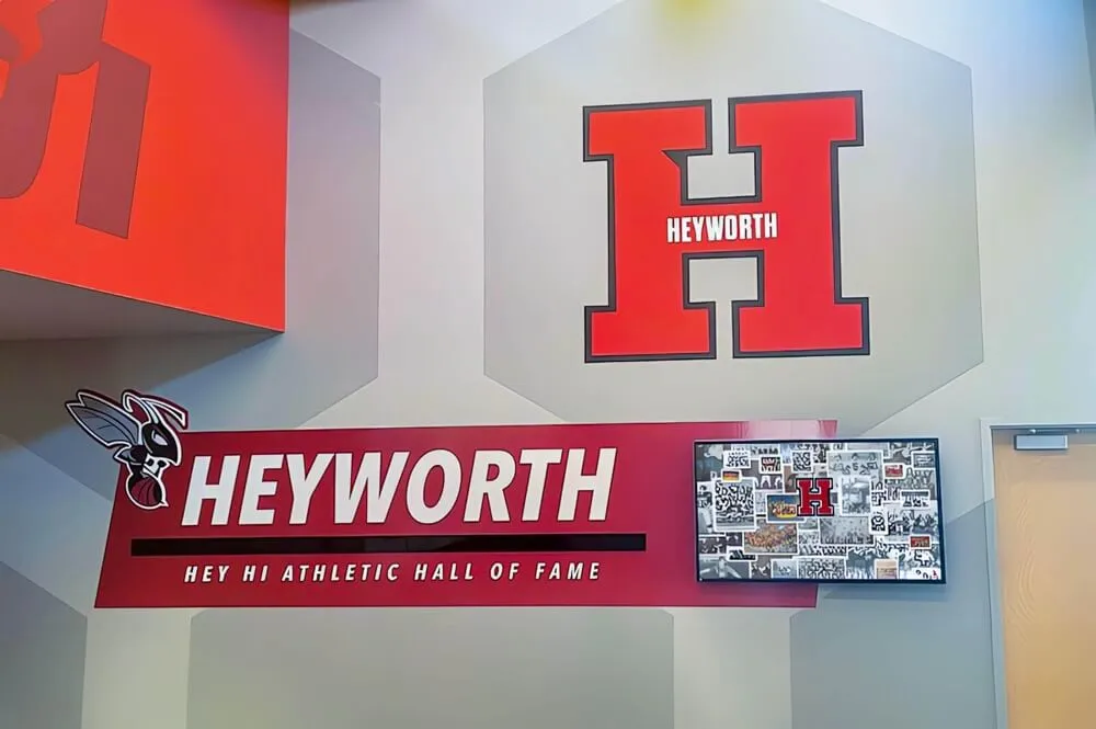
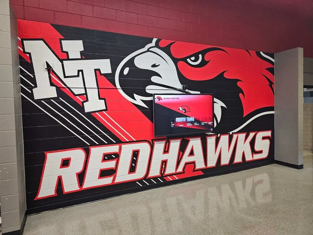
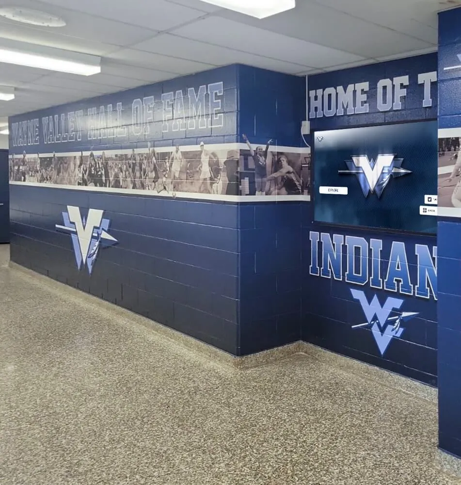
Bold varsity letter fonts establish immediate visual identity across school athletic hallways and recognition displays
Understanding Varsity Letter Font Fundamentals
Before exploring specific font families and implementation strategies, understanding the defining characteristics that make typography authentically “varsity” helps designers and administrators make informed selection decisions.
Defining Characteristics of Varsity Typography
Varsity letter fonts share distinct visual attributes that differentiate them from standard bold or athletic typefaces.
Structural Design Elements
Authentic varsity typography typically features:
- Thick, bold letterforms maximizing visibility from distance
- Block construction with strong vertical and horizontal elements
- Consistent stroke weight throughout letterforms
- Wide proportions creating imposing visual presence
- Strong geometric shapes rather than organic curves
- Minimal contrast between thick and thin stroke elements
- Slab or block serifs on traditional collegiate styles
- Clean, readable counters (interior spaces within letters)
These design characteristics evolved specifically for applications requiring maximum legibility across gymnasium walls, outdoor stadium signage, and athletic uniforms where viewing distances and lighting conditions vary dramatically.
Cultural and Historical Context
Varsity letter fonts carry specific cultural associations:
- American collegiate athletics tradition dating to early 20th century
- Letterman jacket embroidery heritage establishing bold block styles
- Championship banner aesthetics celebrating athletic achievement
- School pride and identity through distinctive typography
- Competitive spirit communicated through strong letterforms
- Nostalgia and tradition connecting current programs to athletic history
Understanding these cultural dimensions helps designers select fonts that authentically represent institutional values rather than generic athletic aesthetics lacking meaningful connection to school identity and tradition.
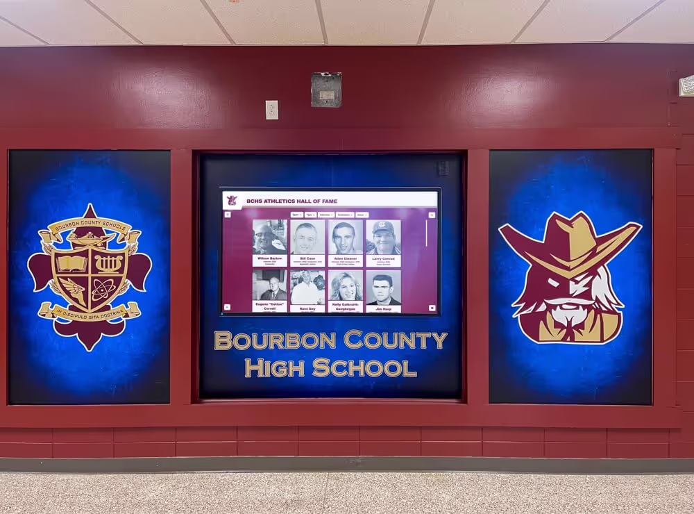
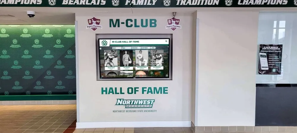
Explore how digital displays maintain school history timelines while incorporating consistent varsity typography throughout recognition systems.
Primary Varsity Font Categories
Varsity letter fonts generally fall into several distinct stylistic categories, each serving different aesthetic and functional purposes.
Classic Block Varsity Fonts
Traditional block styles represent the quintessential varsity aesthetic:
- Strong rectangular construction with minimal ornamentation
- Uniform stroke weight throughout letterforms
- Slab serifs or clean sans-serif terminals
- Wide letter spacing for maximum impact
- Excellent legibility at all sizes and distances
- Conservative, authoritative institutional character
- Ideal for traditional schools emphasizing heritage
Examples include fonts like Varsity, College Block, and similar traditional collegiate typefaces that have defined athletic branding for decades.

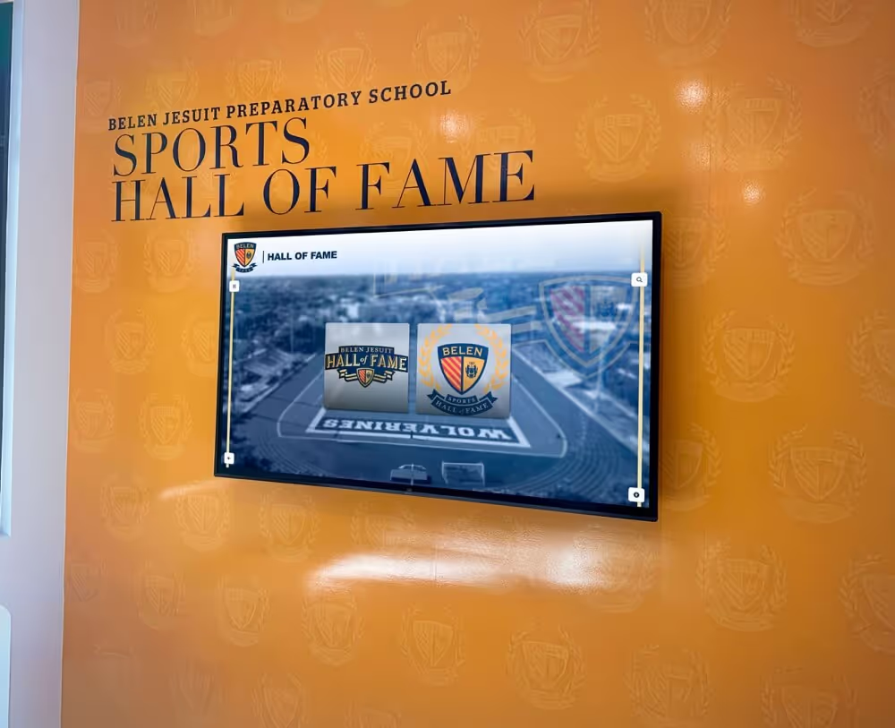
Classic varsity typography anchors athletic department branding across digital and traditional display elements
Athletic Script and Brush Fonts
Contemporary programs often incorporate dynamic script elements:
- Slanted, energetic letterforms suggesting motion and speed
- Brush stroke characteristics adding organic texture
- Varying stroke weights creating visual rhythm
- Flowing connections between letters in script versions
- Modern, aggressive competitive character
- Particularly popular for basketball and football programs
- Effective for creating visual contrast with block fonts
Athletic scripts work well as accent typography paired with traditional block styles rather than primary typefaces for body text or detailed information.
Condensed Tall Varsity Styles
Vertical-emphasis fonts create distinctive visual impact:
- Extremely tall letterforms with narrow widths
- Vertical stress emphasizing height over width
- Space-efficient for fitting longer school names
- Strong upward visual movement
- Particularly effective for basketball-oriented branding
- Creates elegant, refined athletic aesthetic
- Excellent for vertical banner orientations
Schools with longer names often benefit from condensed varsity fonts that maintain visual presence while accommodating extended text strings without excessive width.
Modern Geometric Athletic Fonts
Contemporary interpretations update traditional varsity aesthetics:
- Clean geometric construction with precise angles
- Minimal ornamentation focusing on letterform purity
- Often incorporate angular cuts and distinctive terminals
- Balance tradition with contemporary design sensibility
- Excellent technical rendering in digital applications
- Appeal to modern athletic programs and younger audiences
- Maintain legibility while offering visual distinction
These modern approaches honor varsity traditions while providing fresh visual identity that resonates with contemporary school communities.
Learn how schools implement consistent branding across digital hall of fame displays and traditional recognition systems.
Font Selection Criteria by Application
Different recognition and branding applications demand specific typographic characteristics.
Large-Format Banners and Wall Graphics
Championship banners and gymnasium murals require:
- Maximum legibility from 50+ feet viewing distance
- Strong contrast ratios for visibility
- Simple letterforms without fine details
- Adequate letter spacing preventing visual crowding
- Consideration of wall color and lighting conditions
- Bold weights that maintain clarity when scaled large
- Testing at intended viewing distances before production
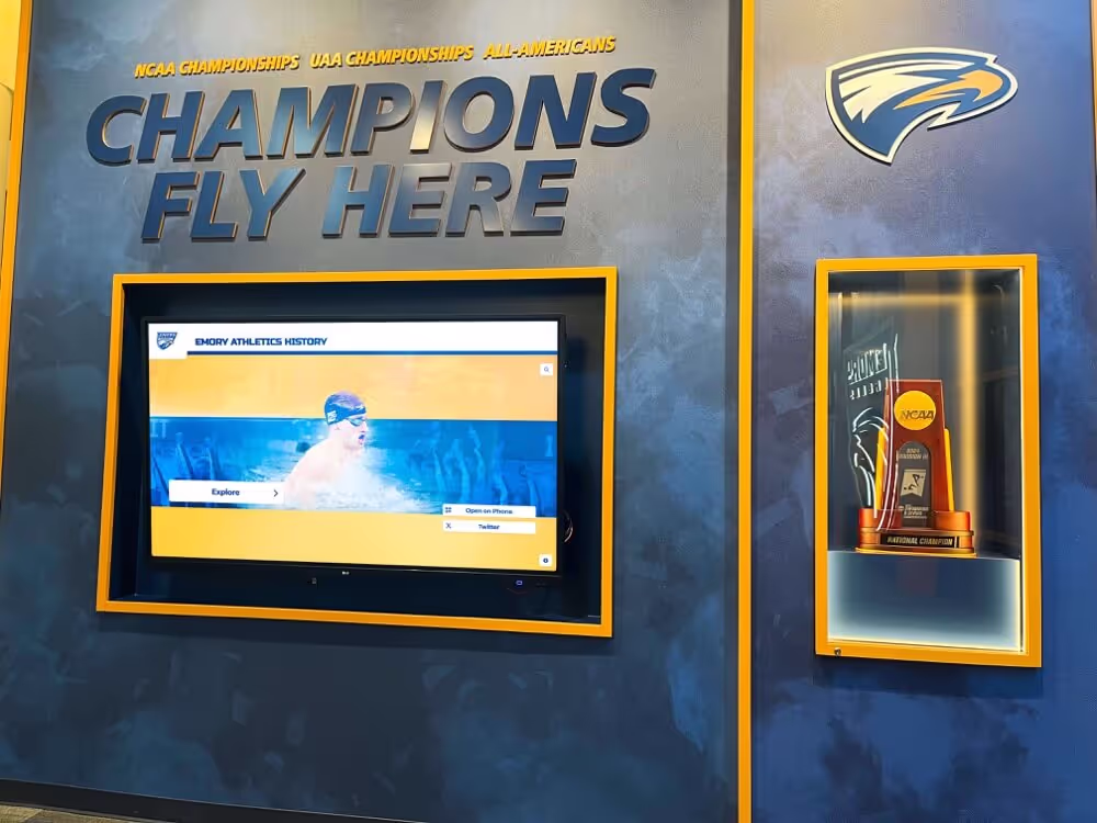
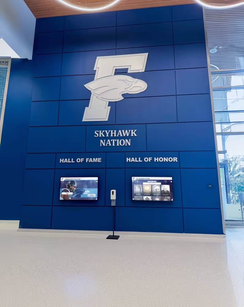
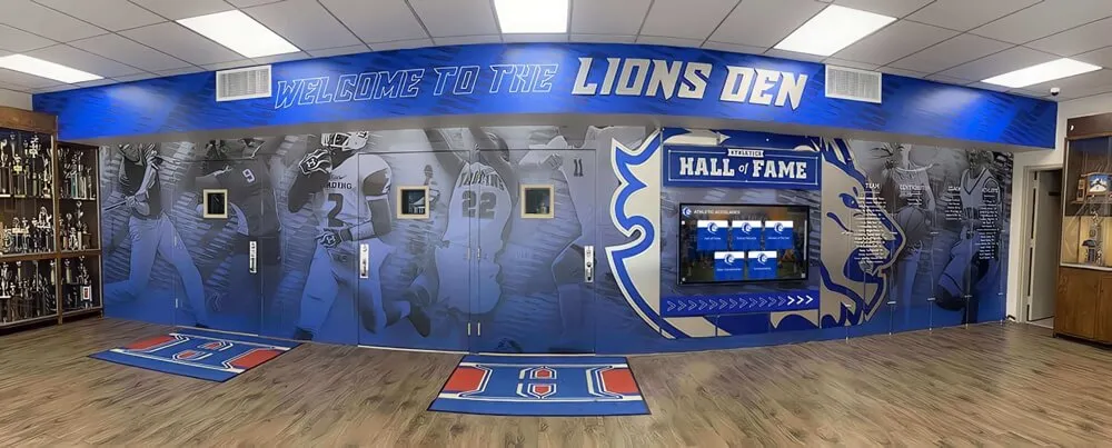
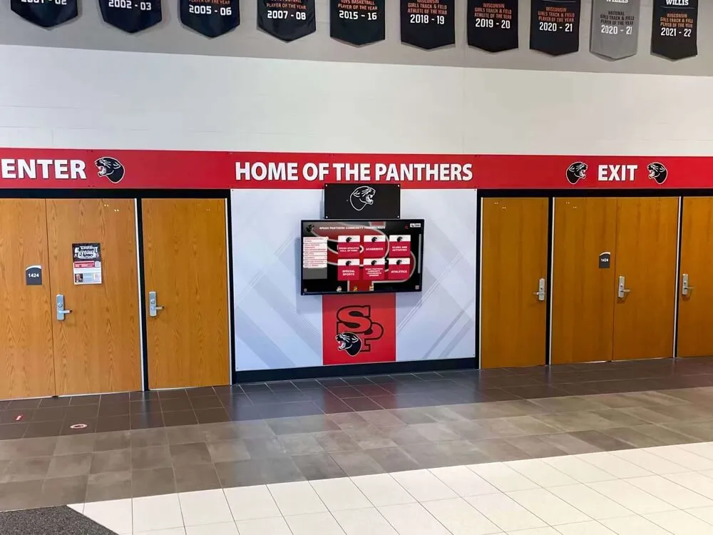
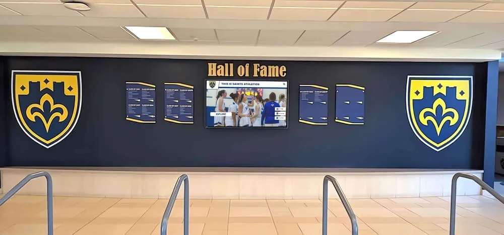
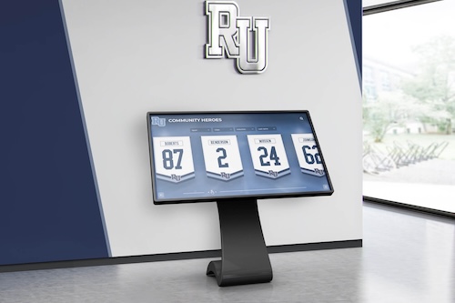
Digital Recognition Displays
Interactive touchscreen systems need fonts optimized for:
- Screen resolution rendering without pixelation
- Readability at varied viewing distances (2-15 feet)
- Compatibility with digital display technology
- Clear rendering at standard display sizes
- Effective contrast against digital backgrounds
- Consistent appearance across different screen types
- Hierarchy supporting both headlines and body text
Understanding application-specific requirements prevents selecting visually impressive fonts that fail functionally in intended contexts.
Choosing Varsity Fonts for Specific Sports and Programs
Different athletic programs benefit from typography matching sport-specific characteristics and cultural associations.
Sport-Specific Font Recommendations
Certain varsity font styles naturally complement specific sports aesthetics.
Football Program Typography
Football branding traditionally employs:
- Bold, aggressive block fonts conveying strength and power
- Wide letterforms suggesting physical dominance
- Slab serifs adding traditional collegiate character
- Minimal ornamentation maintaining masculine aesthetic
- Often paired with italic or slanted versions for jersey numbers
- Strong horizontal emphasis matching field orientation
- Colors and contrast supporting visibility under stadium lighting
Football programs typically benefit from the boldest, most imposing varsity fonts available, reflecting the sport’s physical nature and cultural prominence within most school athletic programs.
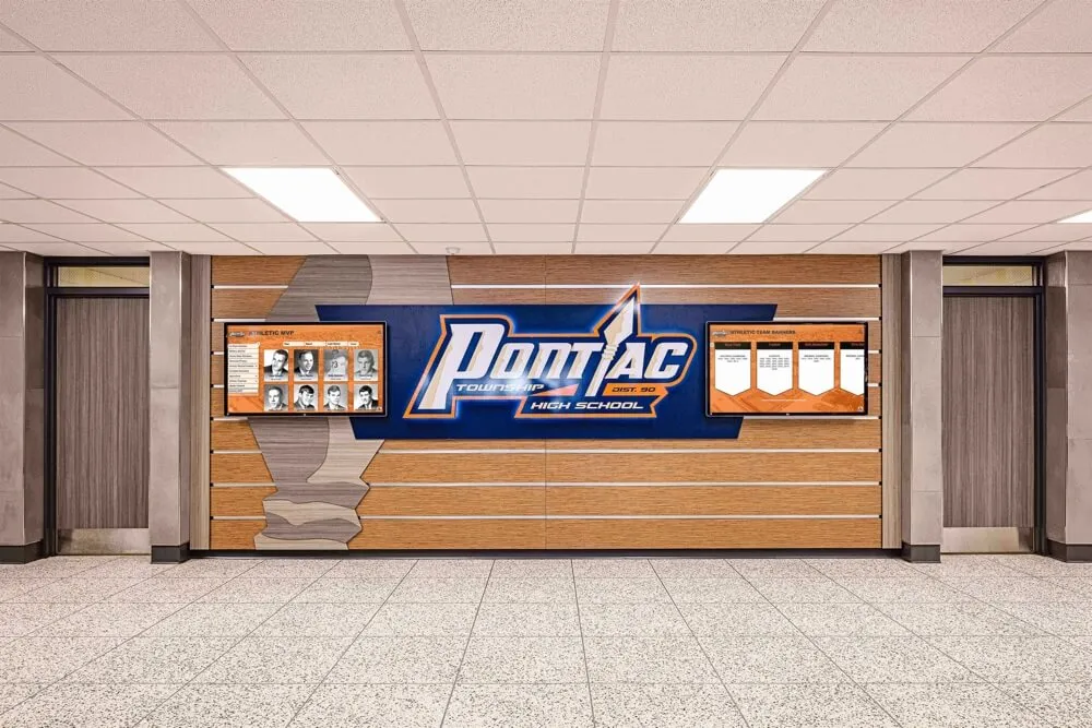
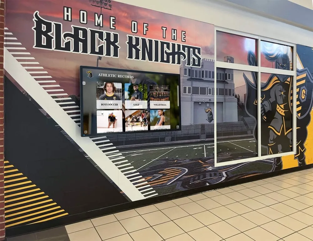
![]()
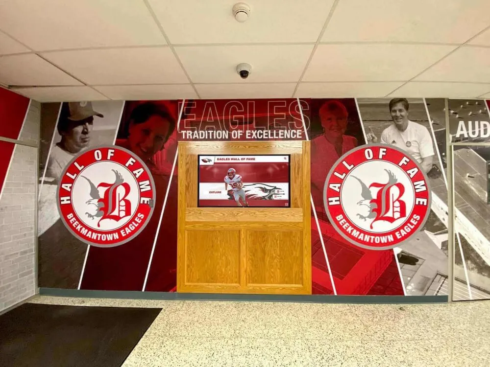
School athletic branding integrates varsity typography with mascot imagery and digital display technology
Basketball Program Typography
Basketball aesthetics favor:
- Tall, condensed letterforms emphasizing vertical movement
- Dynamic scripts suggesting speed and athleticism
- Modern geometric styles appealing to contemporary audiences
- Often incorporating slanted or italicized elements
- Energetic, aggressive character matching game pace
- Strong vertical orientation complementing court geometry
- Balance between traditional varsity and modern athletic fonts
Basketball programs frequently lead typographic innovation within athletic departments, adopting contemporary interpretations of varsity styles that influence broader institutional branding.
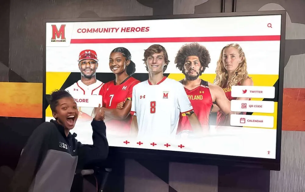
Discover comprehensive approaches to team recognition awards incorporating consistent varsity typography across all athletic programs.
Baseball and Softball Typography
Diamond sports traditionally utilize:
- Classic script fonts reflecting baseball heritage and tradition
- Elegant curved letterforms suggesting ball movement
- Often incorporating “tail” elements extending from terminals
- Traditional collegiate aesthetics honoring sport history
- Balance between script accent fonts and block primary typography
- Nostalgic character connecting to sport’s cultural heritage
- Colors and treatments referencing vintage baseball aesthetics
Baseball and softball programs often maintain more traditional typographic approaches than basketball or football, honoring the sports’ deep historical roots and traditional aesthetics.
Multi-Sport Athletic Department Typography
Comprehensive athletic branding systems require:
- Primary varsity font flexible across all sports
- Complementary secondary font for supporting information
- Consistent typographic hierarchy across programs
- Sport-specific accent fonts within unified system
- Clear usage guidelines maintaining consistency
- Template systems ensuring proper application
- Regular audits preventing typographic fragmentation
Successful multi-sport typography balances visual consistency with allowing individual program identity within established institutional frameworks.
Institutional Identity Considerations
Beyond sport-specific characteristics, font selection must align with broader school identity and community character.
Traditional vs. Contemporary School Identity
Institution age and culture influence appropriate typography:
Traditional Schools (Established 50+ Years)
- Classic block varsity fonts honoring heritage
- Conservative color schemes and applications
- Consistency with historical branding materials
- Serif fonts suggesting academic tradition
- Restrained, dignified typographic treatments
- References to founding era and institutional history
- Resistance to frequent rebranding or style changes
Schools with established traditions typically benefit from varsity fonts that maintain continuity with historical identity rather than pursuing contemporary trends that may feel disconnected from institutional character.
Contemporary Schools (Newer Institutions)
- Modern geometric athletic fonts suggesting innovation
- Bold color applications and dynamic treatments
- Flexibility to establish fresh visual identity
- Sans-serif approaches feeling current and accessible
- Willingness to embrace contemporary design trends
- Opportunity to create distinctive rather than traditional identity
- Less constraint from historical branding expectations
Newer schools enjoy greater freedom to select distinctive varsity typography without historical precedent constraints, enabling creation of unique visual identities that differentiate programs within competitive markets.

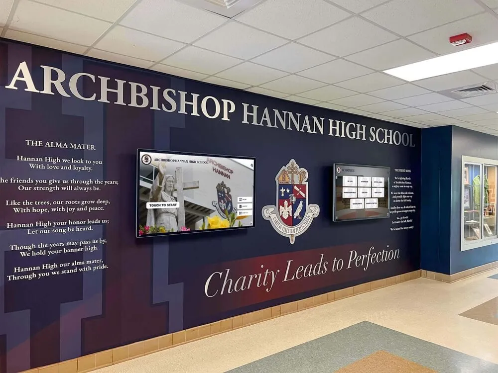
School lobby recognition displays showcase varsity letter fonts establishing immediate institutional identity
Geographic and Demographic Factors
Regional culture and community demographics affect typography appropriateness:
- Rural communities often prefer traditional, conservative varsity styles
- Urban and suburban areas may embrace contemporary interpretations
- Regional typography traditions vary across different U.S. regions
- Community demographic composition influences aesthetic preferences
- Competitive positioning against local rival schools
- Alumni expectations shaped by historical branding exposure
- Recruitment considerations appealing to prospective student-athletes
Understanding your specific community context prevents selecting fonts that feel disconnected from local culture and expectations, regardless of broader design trends or professional recommendations.
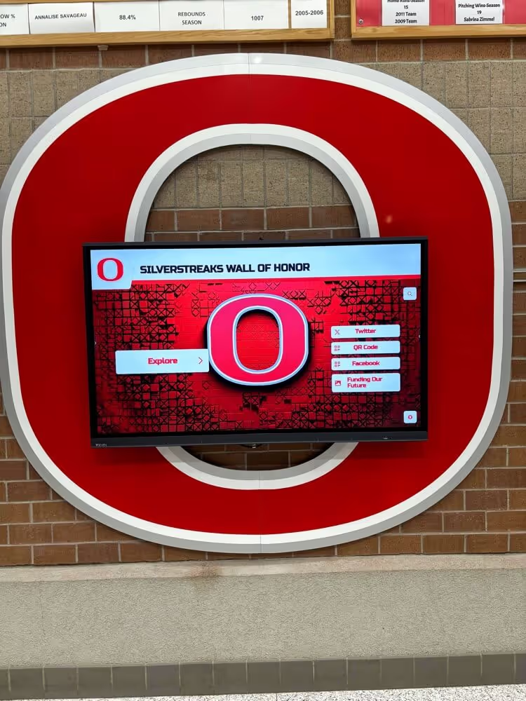
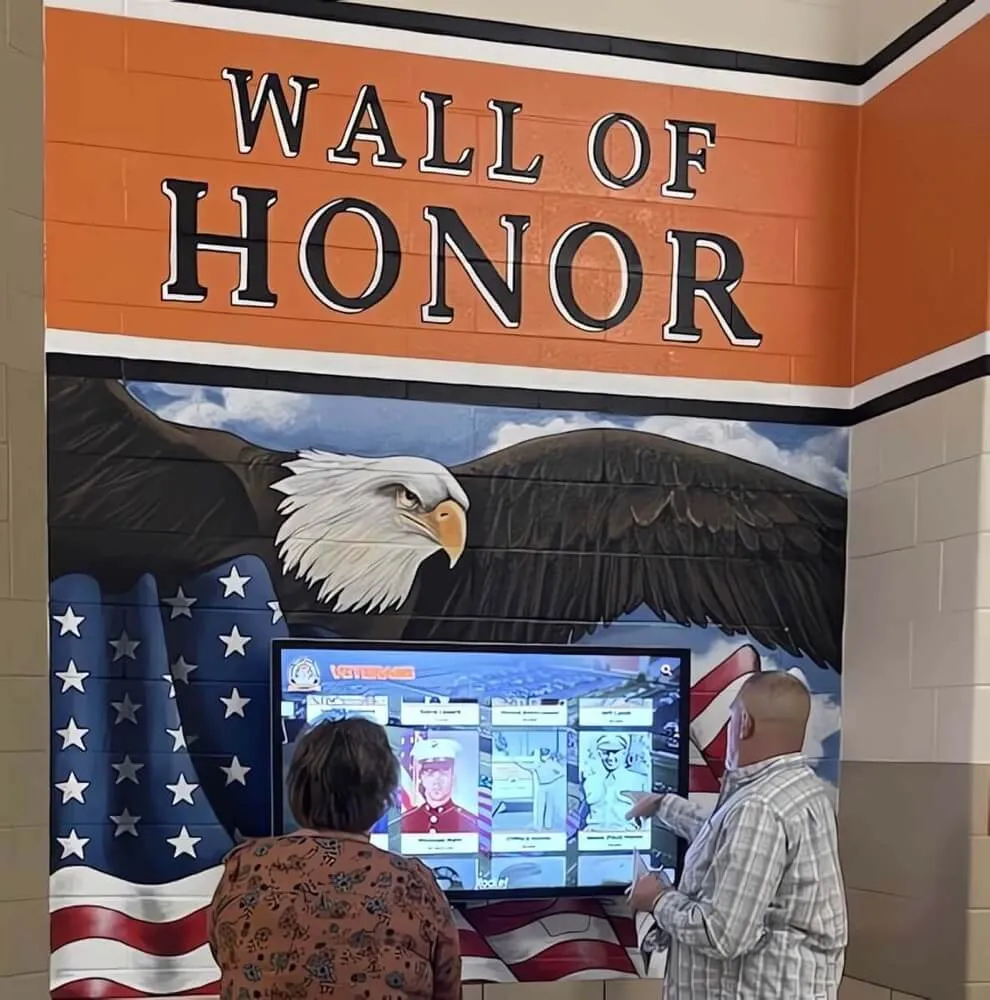
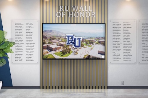
Explore approaches to athletic hall of fame recognition that maintain consistent varsity typography across generations.
Implementing Varsity Typography Across Media Types
Effective varsity font implementation requires understanding technical considerations across diverse production methods and display technologies.
Physical Signage and Banner Production
Traditional athletic displays demand specific technical approaches ensuring font quality and longevity.
Vinyl Banner Production
Printed vinyl banners require:
- Vector font files preventing pixelation when scaled large
- Consideration of viewing distance determining minimum font sizes
- Adequate contrast ratios between text and background
- Accommodation for grommets and hanging hardware
- Wind load considerations for outdoor championship banners
- UV-resistant printing maintaining color over years
- Bleed areas preventing edge cropping during production
- Testing proofs at reduced scale before full production
Most varsity fonts render well in vinyl applications given their bold, simple letterforms designed for large-scale visibility and impact.
Embroidery and Apparel Applications
Letterman jackets and athletic apparel require:
- Fonts with sufficient stroke weight for embroidery thread
- Elimination of fine details that won’t render in thread
- Consideration of letter size limitations in embroidery
- Testing samples on actual fabric before volume production
- Digitizing fonts specifically for embroidery machines
- Accounting for thread pull and fabric stretch
- Matching thread colors to institutional brand standards
- Durability testing ensuring embroidery longevity
Not all varsity fonts that work well in print translate effectively to embroidery—testing actual samples prevents expensive production runs that fail quality standards.
Wall Murals and Painted Signage
Gymnasium and hallway murals demand:
- Scaled templates ensuring accurate letter proportions
- Consideration of wall texture affecting paint application
- Adequate paint contrast against wall base colors
- Projection or grid systems for accurate letter placement
- Durable paint formulations withstanding traffic and cleaning
- Clear edges requiring careful masking and application
- Professional installation preventing amateurish appearance
- Regular maintenance preserving appearance over years
Hand-painted varsity lettering requires skilled application—poor execution of excellent typography creates worse results than simpler fonts applied professionally.

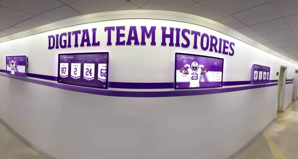
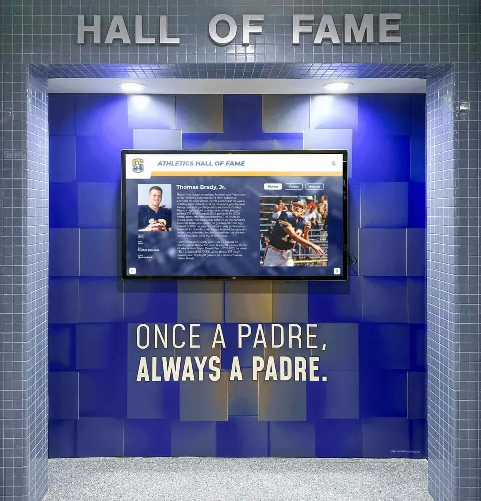
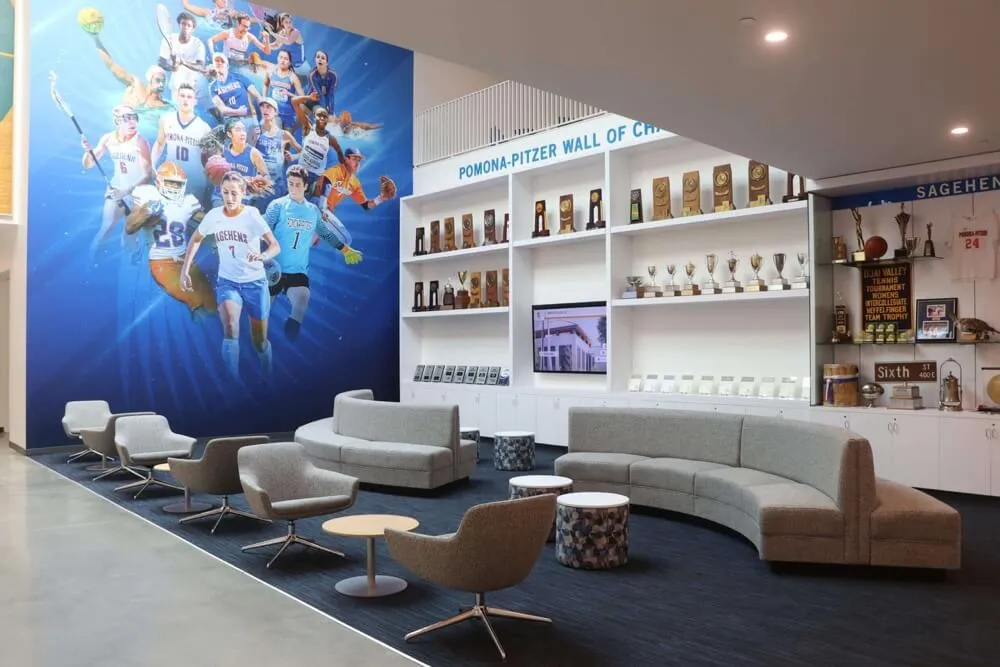
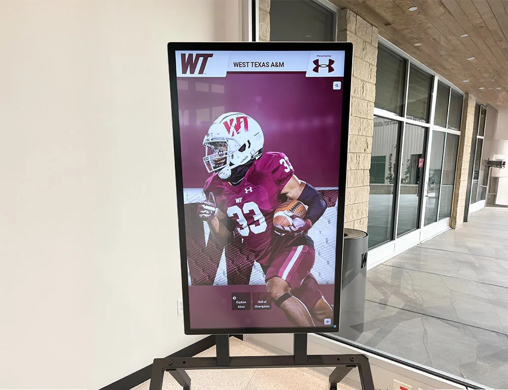
Digital recognition displays integrate varsity typography with touchscreen technology for modern athletic recognition
Digital Display Implementation
Modern recognition systems require fonts optimized for screen rendering and interactive technology.
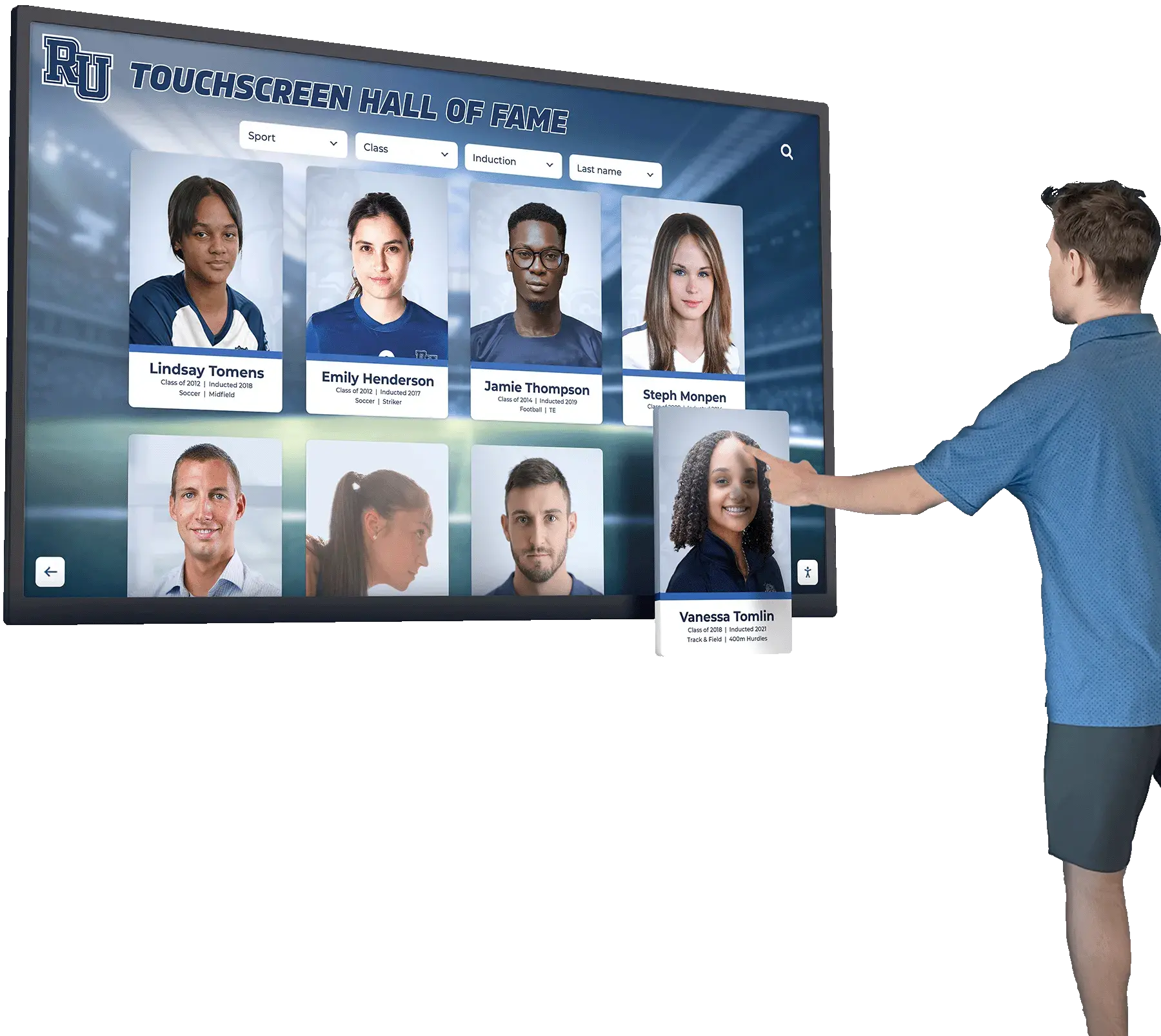
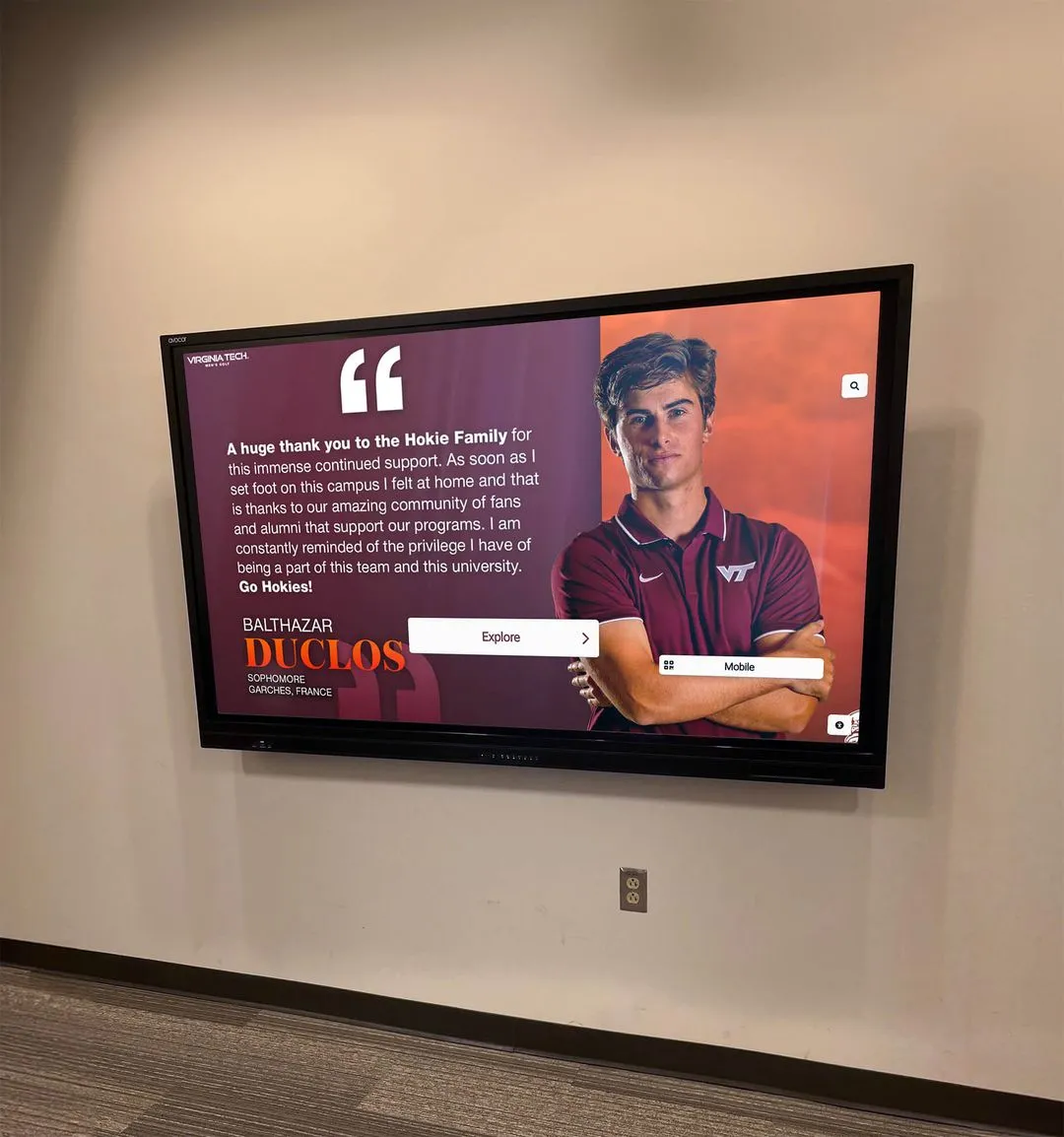
Touchscreen Display Typography
Interactive recognition systems need:
- Web fonts or system fonts ensuring reliable rendering
- Adequate size hierarchy from headlines to body text
- Sufficient contrast ratios meeting accessibility standards
- Testing across different screen sizes and resolutions
- Consideration of ambient lighting affecting readability
- Touch target sizing for interactive navigation elements
- Consistent rendering across different device types
- Fallback fonts if primary typeface fails to load
Digital displays expand varsity font applications beyond traditional banners, requiring consideration of technical rendering requirements alongside aesthetic appropriateness.
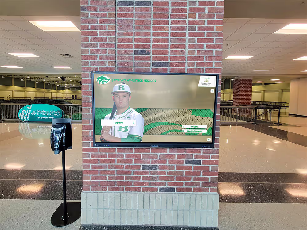
Learn how schools implement comprehensive digital trophy case systems featuring consistent varsity typography across athlete recognition displays.
Web and Social Media Applications
Online athletic promotion requires:
- Web-safe font alternatives matching print varsity styles
- Font loading optimization preventing page performance issues
- Mobile-responsive sizing maintaining readability on small screens
- Social media template systems ensuring brand consistency
- Image overlays balancing text legibility with visual appeal
- Animation considerations for video and motion graphics
- Copyright compliance for commercial font usage
- Cross-platform consistency across website, apps, and social channels
Digital typography extends varsity fonts far beyond traditional applications, requiring technical implementation expertise alongside design sensibility.
Digital Signage and Video Boards
Stadium scoreboards and lobby displays need:
- Extremely high contrast ratios for outdoor visibility
- Consideration of viewing distance determining minimum sizes
- Limited animation preserving legibility during motion
- Resolution-appropriate sizing preventing pixelation
- Color selections visible in bright sunlight or dark conditions
- Testing actual display hardware before content production
- Template systems enabling consistent content updates
- Accessibility considerations for viewers with visual impairments
Large-format digital displays present unique technical challenges requiring specialized expertise beyond standard graphic design practice.
Typography Pairing and Hierarchy Systems
Varsity letter fonts rarely work alone—effective athletic branding requires complementary typography creating clear information hierarchy.
Primary and Secondary Font Combinations
Successful typographic systems pair bold varsity fonts with complementary supporting typefaces.
Pairing Principles
Effective font combinations follow established design principles:
- Contrast without conflict: Secondary fonts should differ clearly from primary varsity styles while maintaining aesthetic harmony
- Legibility hierarchy: Body text fonts must be more readable than display varsity headlines
- Visual balance: Font weights should create appropriate emphasis across content hierarchy
- Personality consistency: Supporting fonts should complement varsity character rather than contradicting it
- Technical compatibility: All fonts must render properly across intended applications
- Limited typeface families: Most systems work best with 2-3 total font families maximum
Overcomplicated typographic systems with excessive font families create visual chaos rather than sophisticated branding.
Recommended Pairing Strategies
Common successful combinations include:
Classic Varsity Block + Clean Sans Serif
- Bold varsity font for headlines, team names, and championships
- Simple sans-serif (Arial, Helvetica, Open Sans) for body text, athlete names, statistics
- Creates clear hierarchy with excellent readability
- Traditional, conservative aesthetic
- Universal compatibility across applications
- Easy implementation without specialized fonts
This pairing represents the most common and reliable approach for school athletic branding systems.
Athletic Script + Modern Geometric Sans
- Dynamic script varsity font for primary identity and emotional impact
- Contemporary geometric sans-serif for information and navigation
- Modern, energetic aesthetic appealing to younger audiences
- Strong visual contrast creating clear hierarchy
- Requires careful balance preventing excessive stylistic clash
- Works particularly well for basketball and contemporary programs
This approach feels more current than classic block combinations while maintaining professional appearance.
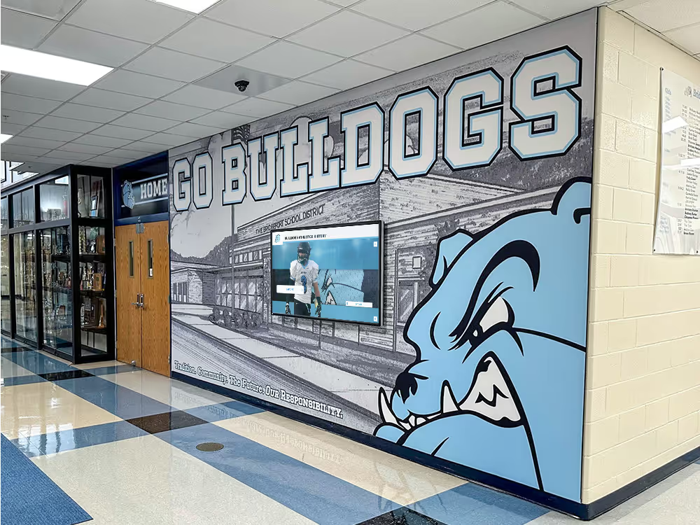
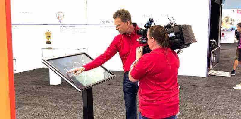
Discover how schools implement touchscreen athletic information displays with sophisticated typography systems.
Slab Serif Varsity + Traditional Serif Body
- Strong slab serif varsity font for athletic headers
- Classic serif font (Times, Garamond, Georgia) for descriptive text
- Academic, traditional character
- Excellent for schools emphasizing scholar-athlete identity
- Works well for hall of fame displays and historical content
- Slightly formal aesthetic may not suit all sports
This combination particularly suits schools with strong academic traditions emphasizing the student dimension of student-athlete identity.
Typographic Hierarchy Best Practices
Clear hierarchy ensures viewers quickly understand information organization and relative importance.
Size and Weight Relationships
Establishing clear visual hierarchy requires:
- 3-5 distinct hierarchy levels: Title, subtitle, heading, body, caption
- Sufficient size differentiation: Minimum 2-point differences between levels
- Consistent application: Same hierarchy level always uses same formatting
- Logical progression: Size and weight decrease as content becomes less important
- Testing at actual viewing distances: What works on computer screens may fail at 10 feet
- Adequate spacing: Proximity and whitespace reinforcing relationships
- Color and contrast: Additional differentiation beyond just size
Well-executed hierarchy enables viewers to quickly scan and locate desired information without confusion or excessive visual searching.
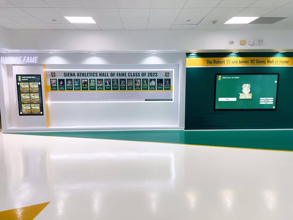
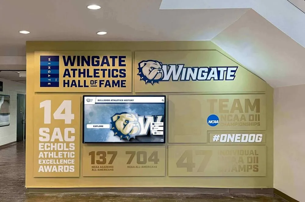
![]()
Comprehensive athletic hallway branding demonstrates effective varsity typography hierarchy and consistent application
Color in Typographic Systems
Strategic color application reinforces hierarchy and brand identity:
- Primary school colors for main varsity typography
- Neutral colors (black, white, gray) for body text and supporting content
- Accent colors sparingly for emphasis and calls-to-action
- Sufficient contrast meeting WCAG accessibility guidelines (minimum 4.5:1 ratio)
- Consistency with established institutional brand standards
- Background considerations ensuring legibility across varied contexts
- Testing in actual lighting conditions and display environments
Color decisions significantly impact both aesthetic appeal and functional readability—testing prevents selections that fail in actual implementation contexts.
Maintaining Varsity Typography Consistency
Establishing excellent varsity typography proves worthless without systems ensuring consistent application across time, applications, and personnel changes.
Brand Guidelines and Standards
Comprehensive documentation prevents typographic fragmentation and quality decline.
Essential Documentation Components
Effective athletic brand guidelines include:
- Approved font families with specific font files and licensing information
- Usage examples showing correct implementation across major applications
- Size and spacing specifications preventing improper scaling or crowding
- Color specifications with exact Pantone, CMYK, RGB, and hex values
- Prohibited uses with examples of common mistakes to avoid
- Approval workflows clarifying who authorizes exceptions or variations
- Digital asset libraries providing ready-to-use templates and files
- Revision procedures enabling updates while maintaining version control
Well-organized brand guidelines empower staff, volunteers, and vendors to correctly apply varsity typography without requiring constant oversight or specialized design expertise.
Template Systems
Pre-designed templates ensure consistency while enabling efficient content creation:
- Banner templates for championships and recognition displays
- Social media templates maintaining brand consistency online
- Print program templates for athletic event publications
- Digital display templates for touchscreen recognition systems
- Presentation templates for athletic department communications
- Certificate templates for individual athlete awards
- Apparel design templates for uniforms and spirit wear
- Signage templates for wayfinding and facility identification
Templates democratize design quality—enabling non-designers to create professional materials while maintaining brand integrity.
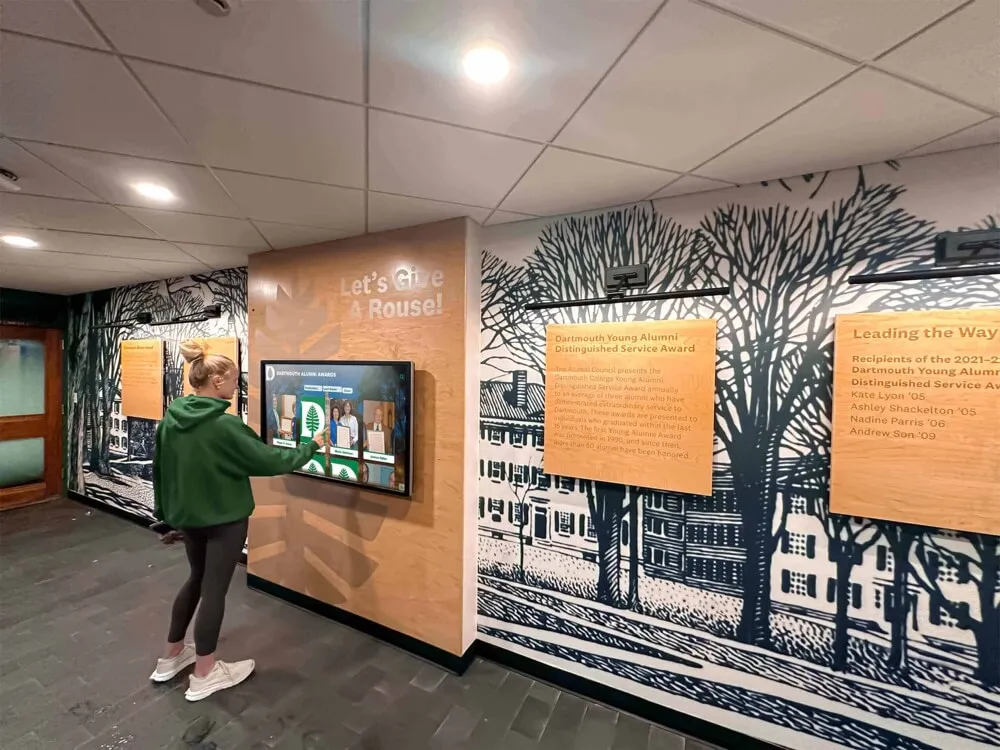
Explore comprehensive college signing wall recognition incorporating consistent varsity typography.
Quality Control and Governance
Even excellent guidelines fail without enforcement mechanisms and quality oversight.
Approval Workflows
Structured processes prevent unauthorized variations:
- Centralized design approval through athletic director or brand manager
- Vendor requirements mandating guideline compliance in contracts
- Pre-production reviews catching errors before expensive production runs
- Exception documentation when legitimate needs require guideline deviations
- Regular audits identifying non-compliant materials requiring replacement
- Stakeholder education helping everyone understand brand importance
- Consequence frameworks for persistent non-compliance issues
Quality control requires both clear standards and organizational commitment to enforcement—guidelines without accountability become ignored suggestions rather than binding requirements.
Refresh and Update Cycles
Typography systems require periodic evaluation and evolution:
- Annual reviews assessing system effectiveness and identifying issues
- Major refresh cycles every 5-10 years preventing dated appearance
- Incremental improvements rather than disruptive complete overhauls
- Stakeholder input from coaches, athletes, alumni, and administrators
- Competitive analysis understanding peer institution branding evolution
- Technology updates incorporating new display and production capabilities
- Archive systems preserving historical branding for retrospective displays
Strategic evolution maintains contemporary relevance while honoring tradition—neither stagnating nor abandoning equity built through years of consistent application.
Common Varsity Typography Mistakes to Avoid
Even schools with good intentions frequently make predictable typography errors undermining brand effectiveness.
Technical Implementation Errors
Poor execution ruins excellent typography selections.
Font Licensing Violations
Common legal and ethical issues include:
- Using commercial fonts without proper licensing
- Exceeding license terms (desktop vs. web vs. embroidery usage)
- Providing font files to unauthorized vendors or users
- Assuming “free” fonts lack usage restrictions or attribution requirements
- Failing to verify licensing when inheriting files from predecessors
- Ignoring educational institution licensing considerations
- Not budgeting for legitimate font purchases in brand development
Font licensing violations expose schools to legal liability while undermining the creative professionals who develop the typography that strengthens athletic branding.
Scaling and Proportion Issues
Improper sizing creates amateur appearance:
- Disproportionate horizontal or vertical scaling distorting letterforms
- Inadequate size for intended viewing distances
- Excessive crowding without adequate letter spacing
- Inconsistent sizing across related applications
- Scaling raster/bitmap fonts creating pixelation
- Ignoring minimum size requirements in font documentation
- Poor kerning in custom text arrangements
Maintaining proper proportions requires vector fonts, appropriate scaling techniques, and understanding application-specific size requirements.
Low Contrast and Legibility Problems
Aesthetic choices sometimes compromise functionality:
- Insufficient contrast between text and background colors
- Busy background images or patterns behind text
- Overly aggressive texture or effects obscuring letterforms
- Color combinations creating accessibility issues
- Neglecting lighting conditions in actual display environments
- Translucent or semi-transparent text treatments
- Excessive effects (shadows, outlines, glows) reducing clarity
Typography must be readable first, beautiful second—decorative treatments that compromise legibility fail regardless of aesthetic appeal.
Strategic and Aesthetic Errors
Broader strategic mistakes undermine athletic brand effectiveness.
Excessive Font Proliferation
Typography fragmentation creates brand confusion:
- Different fonts used across various sports within same school
- Frequent changes following coaching or administrative turnover
- Lack of centralized brand governance and approval
- Individual teams or boosters creating independent branding
- Inherited files from multiple designers lacking coordination
- Missing documentation preventing consistent application
- Treating typography as trivial rather than strategic decision
Consolidated, consistent typography creates exponentially stronger brand recognition than visually impressive but fragmented approaches lacking cohesive identity.
Trend-Chasing Without Strategic Purpose
Following design trends often proves counterproductive:
- Adopting contemporary styles inappropriate for institutional character
- Frequent rebranding disrupting established brand equity
- Prioritizing novelty over appropriateness and longevity
- Lacking clear strategic rationale for typography changes
- Ignoring stakeholder (especially alumni) brand attachment
- Underestimating costs of comprehensive rebrand implementation
- Failing to distinguish lasting design principles from temporary trends
Successful athletic brands balance contemporary relevance with strategic consistency—evolutionary refinement typically outperforms revolutionary overhaul.
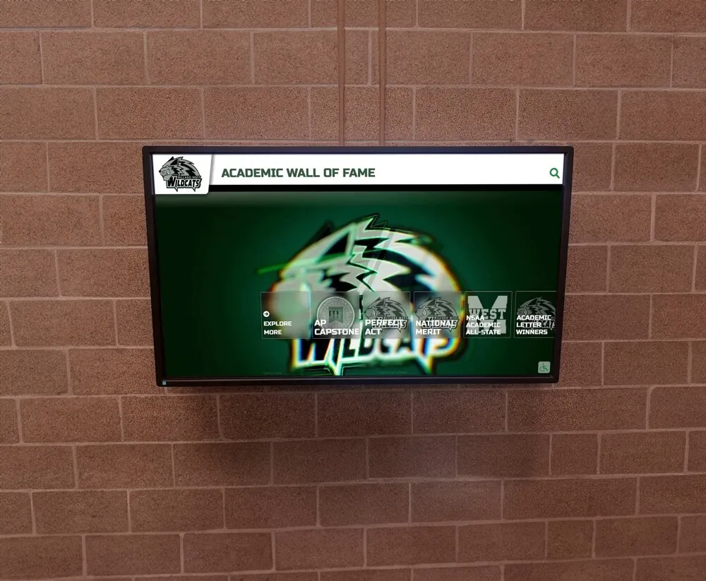
Explore systematic approaches to academic recognition programs featuring consistent varsity typography across achievement displays.
Neglecting Accessibility Considerations
Inclusive design ensures recognition serves all community members:
- Inadequate contrast ratios creating barriers for vision-impaired viewers
- Excessively decorative fonts hindering readability for dyslexic individuals
- Missing alt text descriptions for digital typography images
- Inaccessible color-only information encoding
- Neglecting font sizing for aging alumni and community members
- Complex visual treatments creating cognitive load
- Failing to test with diverse user groups before implementation
Accessible typography isn’t “nice to have”—it’s ethical imperative ensuring athletic recognition serves entire school community regardless of visual or cognitive differences.
Conclusion: Building Lasting Athletic Identity Through Strategic Typography
Varsity letter fonts represent far more than aesthetic decoration—they communicate institutional values, honor athletic tradition, strengthen school identity, and create visual continuity connecting current programs to generations of athletic achievement. When schools implement thoughtful varsity typography systems balancing heritage with contemporary relevance, maintaining consistency across applications while allowing appropriate flexibility, and prioritizing functional legibility alongside visual impact, they create powerful brand assets that energize athletic programs and strengthen community pride.
The most effective varsity typography implementations combine authentic style selection matching institutional character, comprehensive application across traditional banners and modern digital displays, clear hierarchy systems ensuring information clarity, and robust governance preventing fragmentation that undermines brand equity. By establishing clear standards, creating enabling templates, educating stakeholders, and maintaining strategic consistency, athletic programs build recognition that compounds over years rather than dissipating through inconsistent application and frequent unnecessary changes.
Showcase Your Varsity Typography on Modern Digital Displays
Discover how Rocket Alumni Solutions helps schools extend varsity typography beyond traditional banners—implementing comprehensive digital recognition displays that honor athletic achievement with your distinctive fonts and branding while providing interactive engagement, easy content updates, and permanent recognition that strengthens program culture.
Explore Digital Athletic Recognition SolutionsWhether developing comprehensive athletic department branding systems, refreshing outdated varsity aesthetics, or implementing digital recognition displays requiring optimized typography, the font selection frameworks, pairing strategies, implementation techniques, and governance approaches explored in this guide provide actionable direction for creating typography that authentically represents your program. Start by auditing current typography applications identifying inconsistencies and opportunities, then systematically implement strategic improvements building toward comprehensive systems that serve athletic recognition needs across all contexts and applications.
Your school deserves varsity typography that honors tradition while embracing contemporary technology—bold letterforms that strengthen identity across championship banners hanging in gymnasiums, digital displays celebrating athlete achievements in school lobbies, and every touchpoint where your athletic programs connect with students, families, alumni, and communities. With strategic selection, thoughtful implementation, and committed governance, you can create typography systems that become treasured visual identifiers strengthening athletic programs and school pride for generations to come.