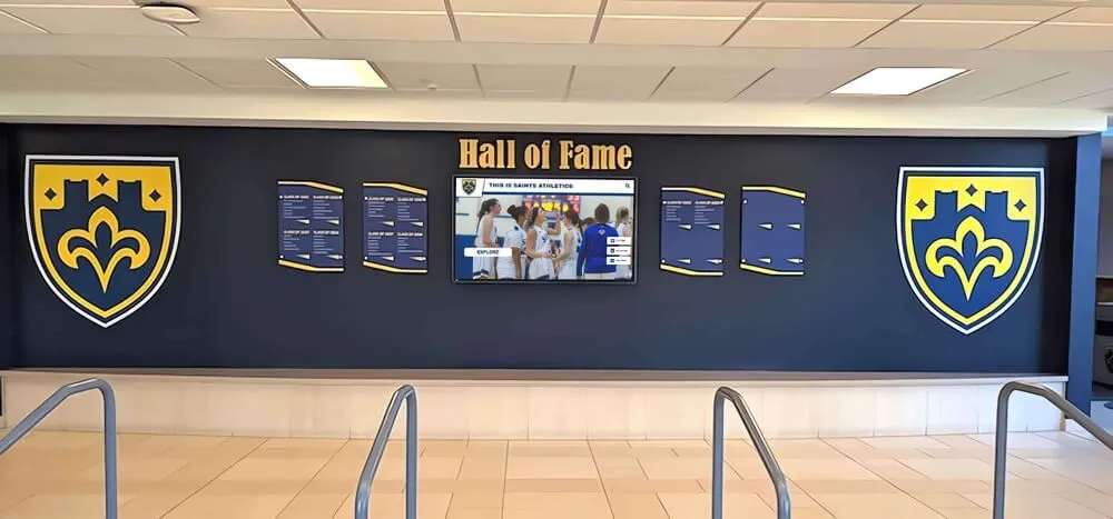


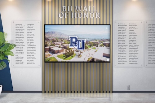
Digital hall of fame touchscreen displays have revolutionized how schools, universities, athletic programs, and community organizations celebrate achievement—but the difference between displays that captivate audiences and those that sit unused often comes down to a single critical factor: layout design. While sophisticated hardware and powerful software provide the foundation, strategic layout design determines whether visitors engage deeply with your recognition content or walk past without a second glance.
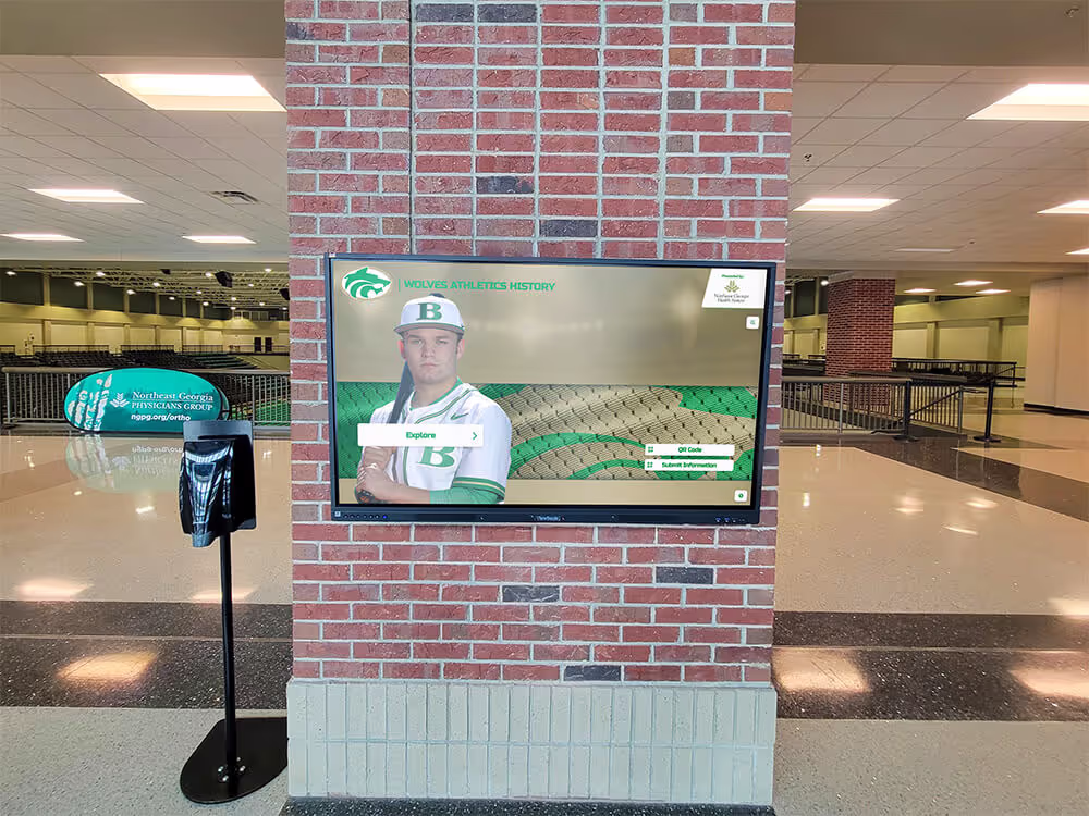
Walk through facilities with newly installed touchscreen displays and you’ll observe two dramatically different patterns: some displays attract constant engagement—students exploring alumni profiles, visitors searching for familiar names, community members discovering achievement stories they never knew existed. Others collect dust after initial novelty fades—confusing navigation driving users away, overwhelming content creating decision paralysis, or uninspired design failing to communicate value worth the effort to explore.
This comprehensive guide explores how to design stunning digital hall of fame touchscreen display layouts that maximize engagement, accessibility, and visual storytelling impact through strategic user experience planning, evidence-based interface design, and systematic content organization that transforms recognition displays into captivating centerpieces of institutional culture.
Layout design isn’t decoration—it’s the strategic architecture determining how effectively your recognition content reaches audiences, whether diverse visitors find the interface intuitive or frustrating, how long community members engage versus glancing briefly, and ultimately whether your investment in touchscreen technology delivers meaningful return through strengthened institutional culture, enhanced recognition impact, and sustained community engagement.

Strategic layout design creates intuitive navigation that enables effortless content exploration and discovery
Understanding Layout Design Fundamentals for Interactive Displays
Before exploring specific design strategies, understanding how touchscreen display layout differs from traditional design disciplines establishes foundations for creating effective recognition interfaces.
The Unique Context of Public Touchscreen Design
Digital hall of fame displays operate in fundamentally different contexts than the phones, tablets, and computers that inform most design experience.
Critical Environmental Factors
Public touchscreen displays present unique challenges requiring specialized design approaches:
- Distance and scale: Users typically stand 1-3 feet from displays ranging from 43 to 75 inches diagonal
- Viewing angles: Multiple people may view simultaneously from various positions and heights
- Ambient lighting: Displays must remain legible in bright hallway lighting or variable natural light
- Brief attention windows: Initial engagement happens within 3-5 seconds before users continue walking
- No instructions: Interfaces must communicate functionality without explanatory text or training
- Diverse users: Designs must serve everyone from young students to elderly alumni with varying technical comfort
- Physical interaction: Touch targets must accommodate imprecise finger taps rather than precise mouse clicks
These contextual factors mean that design principles working beautifully on personal devices often fail completely when scaled to public touchscreen displays. Successful layouts accommodate these unique constraints from initial concept through final implementation.
The Psychology of Touchscreen Engagement
Understanding how people approach and interact with public touchscreens informs layout decisions that either facilitate or obstruct engagement.
Engagement Decision Sequence
Research on interactive kiosk usage reveals a predictable sequence of micro-decisions determining whether casual viewers become engaged users:
Initial Awareness (1-2 seconds):
From several feet away, potential users unconsciously assess whether displays warrant attention. Layout elements communicating “this is interactive” through visual cues including motion or animation, recognizable touch interface patterns, compelling imagery suggesting interesting content, and clear institutional branding indicating relevance determine whether people approach or continue walking.
Displays failing this initial awareness phase never achieve engagement regardless of content quality—visitors simply don’t recognize the opportunity to interact.

Strategic placement in high-traffic areas combined with inviting design creates natural engagement opportunities
Interaction Decision (2-5 seconds):
Upon approaching, potential users rapidly assess whether interaction will be rewarding or frustrating. Layout clarity indicating what the display does and how to use it, visible value through compelling preview content, low perceived effort through obvious starting points, and social safety through unambiguous interaction methods influence whether people touch or observe passively.
Displays optimized for this decision phase convert curious observers into active users through design that reduces uncertainty and communicates clear value.
Continued Engagement (5+ seconds):
After initial interaction, layout determines whether users explore deeply or abandon quickly. Responsive feedback confirming touch input registration, logical navigation matching mental models, progressive content revealing maintaining interest, intuitive search enabling goal-directed exploration, and clear exit paths preventing trapped feelings sustain engagement once initiated.
Successful layouts move users smoothly through this engagement sequence—from awareness to interaction to sustained exploration—through strategic design addressing each phase’s psychological dynamics.
According to research in user experience design for interactive kiosks, minimum target sizes of approximately 44×44 pixels (about 20mm) with at least 5mm padding between tappable elements help ensure reliable touch interaction, demonstrating the importance of sizing considerations for public touchscreen interfaces.
Learn comprehensive approaches to interactive display design that address these fundamental engagement principles.
Strategic Layout Planning: Foundation for Design Success
Effective touchscreen display layout begins not with visual design but with strategic planning that defines organizational priorities, content structure, and user needs before a single pixel is placed.
Defining Display Objectives and Success Metrics
Clear objectives provide criteria for evaluating every layout decision throughout the design process.
Common Recognition Display Objectives
Different institutions emphasize various objectives requiring different layout priorities:
- Comprehensive recognition: Honoring all deserving achievements across programs and eras
- Storytelling depth: Sharing rich biographical narratives beyond basic achievement listings
- Community engagement: Creating gathering spaces for alumni connections and institutional pride
- Historical preservation: Documenting institutional legacy for future generations
- Inspirational motivation: Showcasing achievement possibilities to current students
- Donor stewardship: Demonstrating appreciation for philanthropic support
- Recruitment support: Impressing prospective families during campus tours
Your layout design should prioritize interface elements and navigation structures that best serve your primary objectives. Institutions emphasizing storytelling might feature large imagery and video integration, while those prioritizing comprehensive recognition might emphasize efficient browsing and powerful search capabilities.
Measurable Success Indicators
Defining success metrics creates accountability for layout decisions:
Layout Effectiveness Measures:
- Average session duration (longer indicates engaging layouts)
- Interaction depth (pages viewed per session)
- Search utilization rates (percentage of sessions using search)
- Feature adoption (which interface elements users actually use)
- Mobile web extension (continuation beyond physical display)
- Community feedback (direct user experience assessment)
- Maintenance efficiency (ease of content updates)
These metrics inform post-launch optimization while providing design phase decision criteria.
Explore systematic approaches to measuring digital hall of fame success including layout performance indicators.
Understanding Your Audience and Content
Strategic layout design requires deep understanding of both who will use displays and what content they’ll explore.
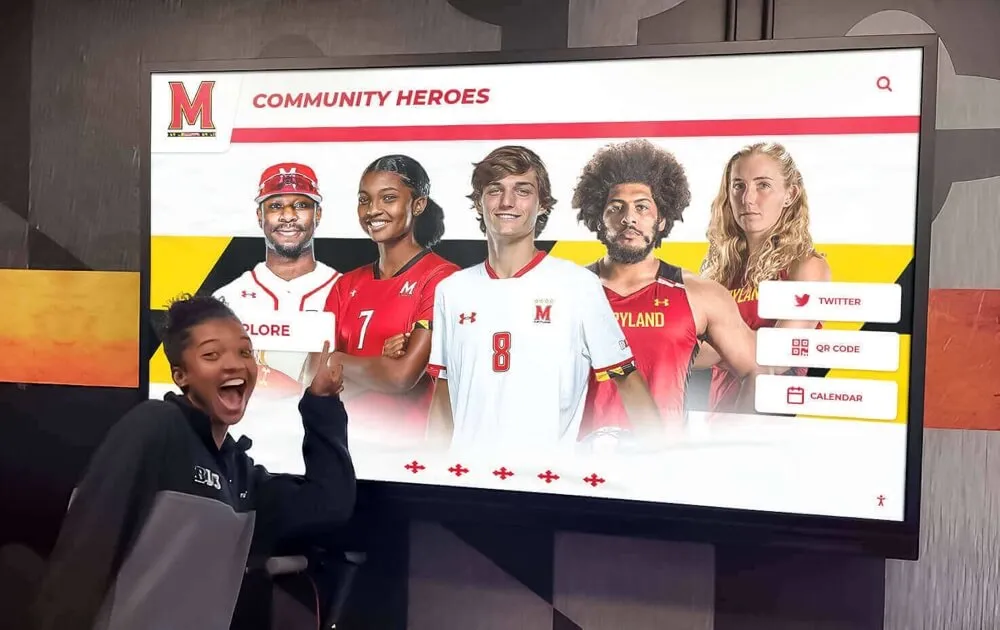
Audience Segmentation
Different user groups bring different needs, technical comfort levels, and content interests requiring flexible layouts serving diverse audiences:
Primary User Segments:
- Current students: Technology-native users seeking role models and institutional culture understanding
- Alumni: Varying technical comfort searching for personal connections and classmate memories
- Families and prospective students: Visitors assessing institutional quality and community strength
- Staff and faculty: Community members with deep institutional knowledge exploring colleague achievements
- Donors and supporters: Stakeholders assessing recognition quality and organizational professionalism
- Elderly visitors: Users potentially requiring accessibility accommodations and larger touch targets
Layouts must accommodate the least technical user segments while providing efficiency features satisfying sophisticated users—typically achieved through simple primary navigation with progressive disclosure of advanced features.
Content Inventory and Organization
Understanding content volume, types, and natural organizational structures informs navigation architecture before visual design begins.
Content Assessment Framework
Systematically inventory recognition content across categories:
- Individual profiles: Total honorees by program, achievement type, and era
- Team achievements: Championship teams, record-setting groups, ensemble accomplishments
- Historical milestones: Significant institutional moments worth preserving
- Multimedia assets: Photos, videos, audio recordings, document scans
- Organizational hierarchies: Natural groupings by sport, department, decade, award level

Content organization reflects natural institutional structures enabling intuitive navigation
This inventory reveals whether your layout needs emphasis on browsing (extensive honorees requiring efficient navigation) versus deep storytelling (rich biographical content), search functionality (large databases), or visual galleries (extensive multimedia). Organizations with hundreds of profiles require different interface strategies than those with dozens of richly documented honorees.
Many institutions discover during content inventory that their recognition database exceeds initial expectations—making layout decisions prioritizing scalability and efficient navigation critical for long-term success.
Visual Hierarchy: Guiding Attention and Understanding
Strategic visual hierarchy directs user attention through interfaces, communicating functionality and importance without requiring explanatory text.
Establishing Clear Information Architecture
Information architecture—the organizational structure underlying visible design—determines whether layouts feel intuitive or confusing to users.
Navigation Structure Options
Different navigation architectures suit different content collections and user patterns:
Flat Navigation (2-3 levels maximum):
- Best for: Smaller collections (under 100-200 profiles)
- Structure: Home → Category → Individual Profile
- Advantages: Simple, fast access to any content
- Considerations: Can feel overwhelming with extensive content
Hierarchical Navigation (3-5 levels):
- Best for: Large collections organized by multiple dimensions
- Structure: Home → Era/Program → Subcategory → Achievement Type → Profile
- Advantages: Scalable to thousands of profiles
- Considerations: Requires clear visual breadcrumbs preventing disorientation
Hub-and-Spoke Navigation:
- Best for: Multiple distinct content types (profiles, teams, history, media)
- Structure: Central home hub connecting to specialized sections
- Advantages: Clear separation of different experience types
- Considerations: May reduce cross-category exploration
Hybrid Approaches:
Most successful implementations combine navigation patterns—providing browse structures for exploratory visitors alongside powerful search for goal-directed users seeking specific individuals.
Your information architecture should match how users naturally conceptualize your content. Athletic programs might organize by sport first, then chronologically. Academic recognition might prioritize departments and degree programs. Alumni associations might emphasize graduating class above all other dimensions.
Discover comprehensive content planning strategies that inform layout architecture decisions.
Typography and Readability at Scale
Text treatment dramatically impacts whether touchscreen displays feel professional and legible or amateur and frustrating.
Size Requirements for Distance Viewing
Unlike personal devices held at comfortable reading distances, public touchscreens are viewed from varying distances requiring larger typography than designers accustomed to mobile or web design typically consider:
Recommended Minimum Sizes (on 55" display at 1080p resolution):
- Primary navigation labels: 60-80px (approximately 24-30mm physical height)
- Section headings: 48-60px (approximately 18-24mm)
- Body text: 32-40px (approximately 12-16mm)
- Supporting details: 24-32px (approximately 10-12mm minimum)
These sizes assume viewers standing 2-3 feet from displays. Installations where users may stand further back (mounted higher or in wide spaces) require proportionally larger type.
According to UX guidelines for kiosk interfaces, important text should maintain approximately 4mm physical height or more (roughly 20-24px font on a 1080p 21-inch display) to ensure readability, with scaling adjusted for larger displays.
Font Selection Criteria
Touchscreen displays benefit from typefaces optimized for screen legibility at scale:
Choose fonts with generous x-height (tall lowercase letters), clear distinction between similar characters (1/I/l, 0/O), medium to wide character spacing, and sufficient weight without delicate thin strokes. Sans-serif typefaces typically perform better than serif fonts at touchscreen sizes, though contemporary serif designs with robust features can work effectively for headings.
System fonts like Arial, Helvetica, or platform-native alternatives provide reliable legibility, while custom institutional typefaces should be tested carefully on actual hardware before committing to layouts.
Text Contrast and Legibility
Ensure minimum 4.5:1 contrast ratios between text and backgrounds to maintain legibility under varying lighting conditions and for users with vision impairments. Online contrast checkers help validate color combinations during design development.
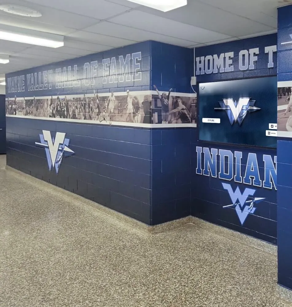
Color Strategy for Recognition and Navigation
Strategic color use reinforces organizational hierarchies, communicates interactive elements, and strengthens institutional branding without creating visual chaos.
Institutional Branding Integration
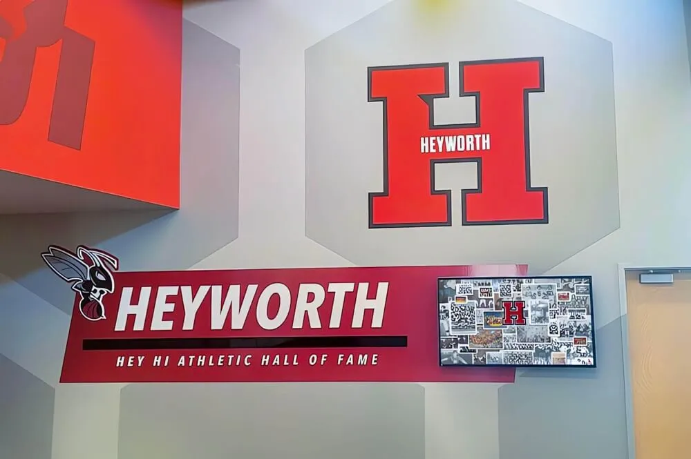
Touchscreen displays present prominent institutional representation opportunities—visitors should immediately recognize displays as official institutional communication through consistent brand color application:
Use primary brand colors for main navigation elements and headers, incorporate secondary palette colors for supporting elements and categorization, ensure backgrounds provide sufficient contrast with brand colors, and maintain brand color proportions matching institutional guidelines.
Brand consistency creates professional impressions while subtly reinforcing institutional identity throughout exploration sessions.
Color Coding for Content Organization
Systematic color application helps users navigate complex content collections:
Assign consistent colors to major content categories (e.g., athletics in school colors, academics in secondary palette, historical content in neutral tones), use color intensity or saturation to indicate hierarchical levels, maintain sufficient contrast between adjacent color-coded elements, and limit total colors to 5-7 maximum preventing visual confusion.
Color coding should supplement rather than replace text labels—ensuring accessibility for colorblind users while providing additional visual cues for quick comprehension.
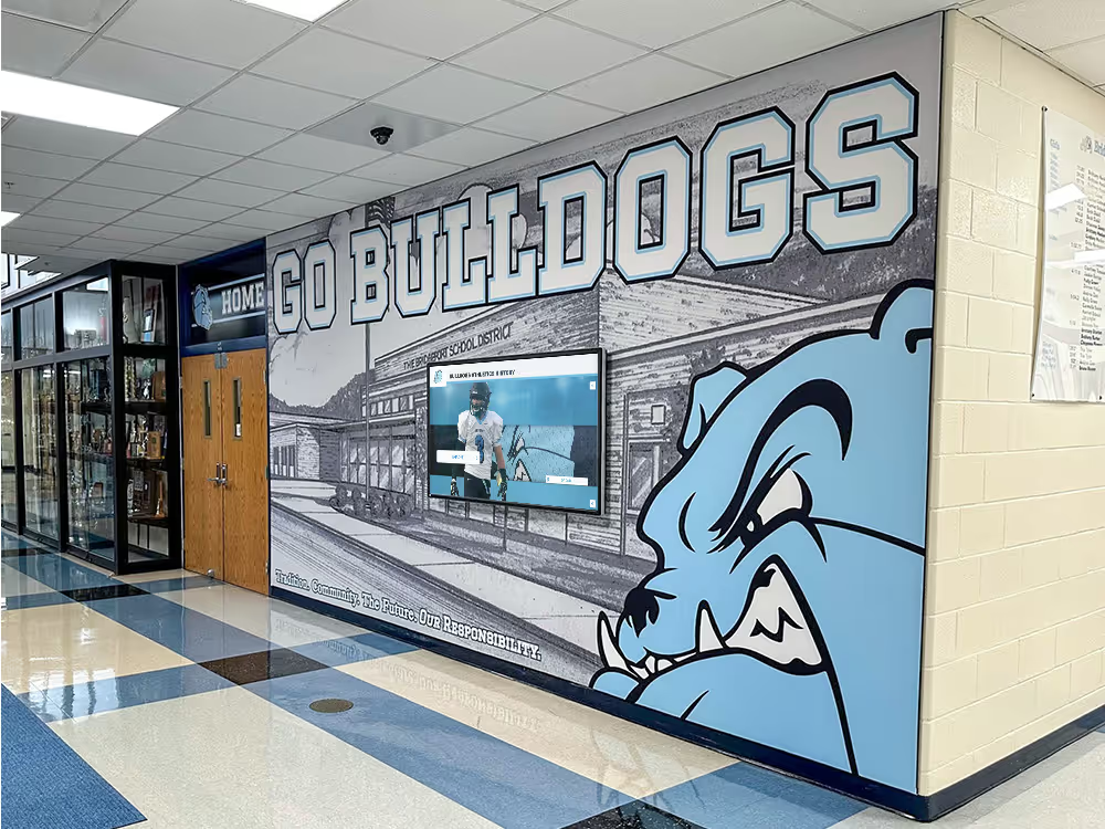
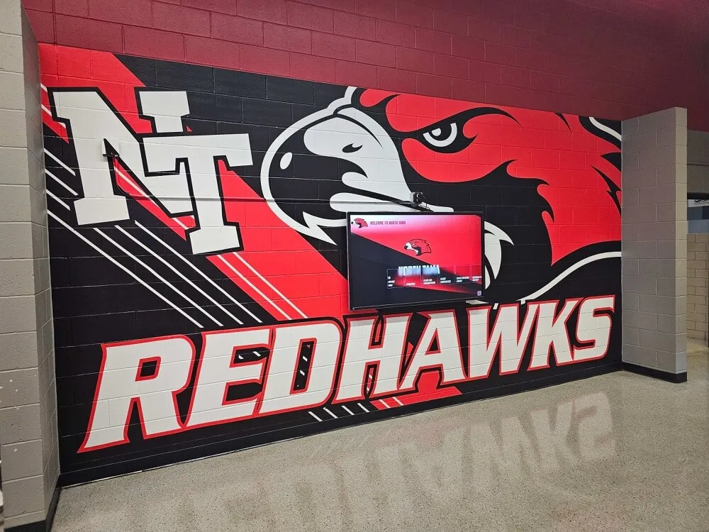
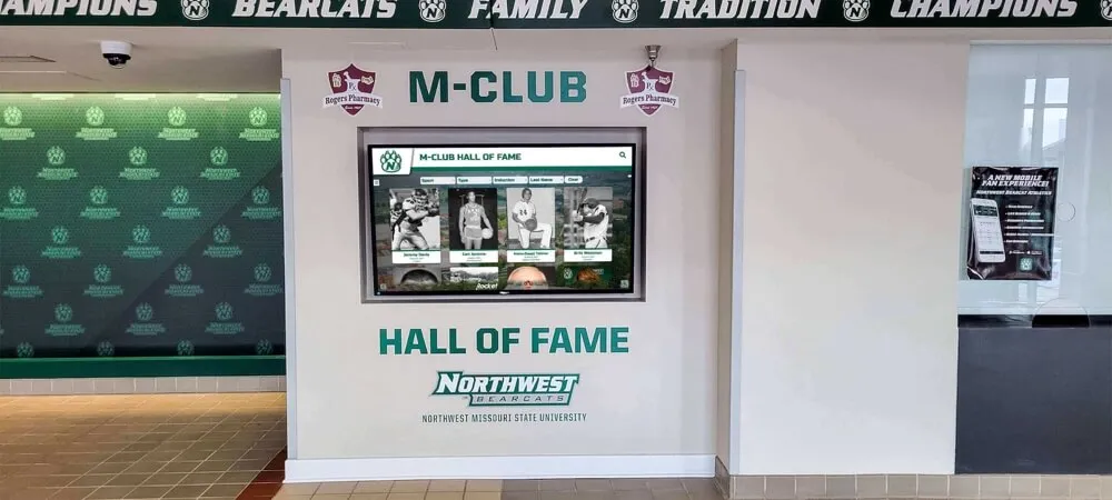
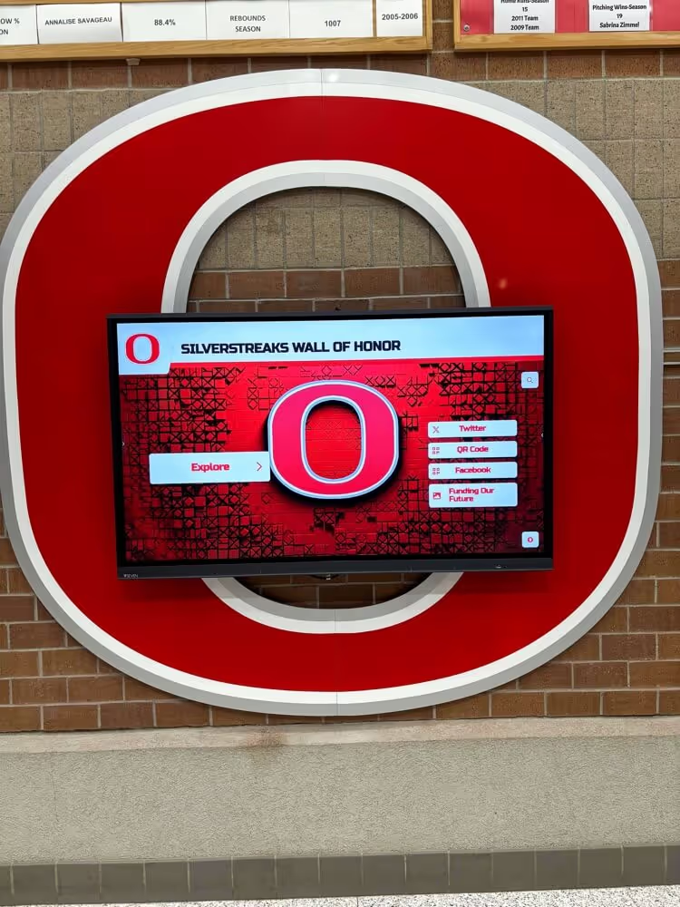
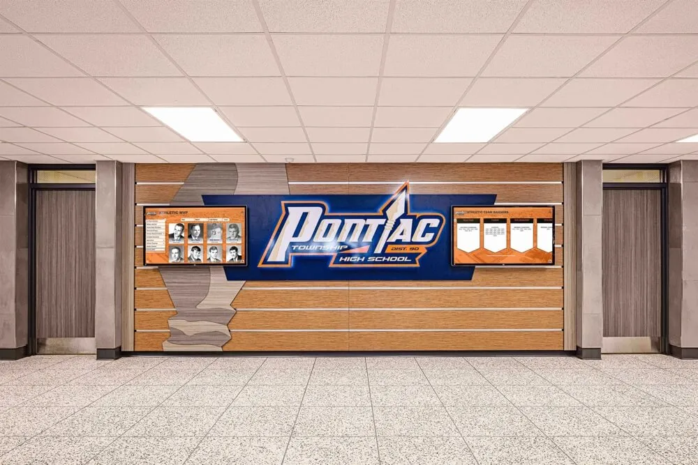
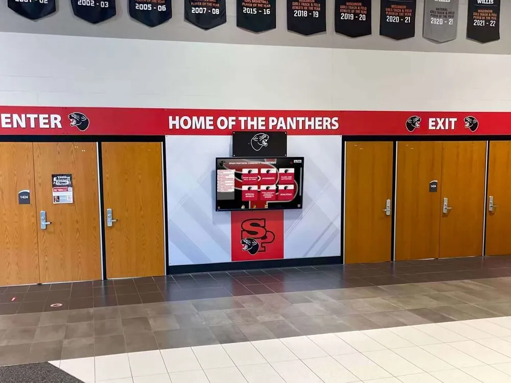
Discover how institutions integrate recognition with facility design in exciting hallway displays that demonstrate color strategy approaches.

Coordinated color palettes integrate touchscreen displays with existing institutional aesthetics and branding
User Interface Design: Creating Intuitive Interaction
User interface elements—buttons, navigation controls, search features, and interactive components—determine whether layouts feel intuitive or frustrating to diverse audiences.
Touch Target Sizing and Spacing
Physical interaction through touch requires larger, more generously spaced interface elements than mouse-based navigation.
Minimum Touch Target Standards
Research consistently demonstrates that comfortable touch targets measure at minimum 44×44 pixels (approximately 20mm), with optimal sizes ranging from 60-80 pixels (24-30mm) for public touchscreen displays where users may have less precision than personal device interactions.
Critical Sizing Considerations:
- Primary navigation buttons: 80-120px minimum dimension
- Secondary action buttons: 60-80px minimum dimension
- List items and profile cards: Full width with 60-80px minimum height
- Close/back buttons: 60-80px with clear iconography
- Search field: 60-80px height with visible tap area
- Filter toggles and checkboxes: 50-60px minimum touch area
Undersized touch targets create frustration as users repeatedly miss intended selections—particularly affecting elderly users, those with motor control challenges, or anyone attempting interaction while standing in awkward positions.
Spacing Requirements
Adequate spacing between interactive elements prevents accidental touches and supports comfortable navigation:
Maintain minimum 8-12px spacing between tappable elements (equivalent to approximately 5mm physical spacing), use 16-24px spacing for primary navigation elements requiring clear visual separation, create clear visual boundaries around grouped interactive elements, and ensure sufficient padding within buttons (text shouldn’t touch borders).
Generous spacing makes interfaces feel clean and professional while preventing the accuracy challenges that turn brief frustrations into display abandonment.
According to user experience research on kiosk design, maintaining at least 5mm of padding between tappable elements significantly reduces interaction errors and improves user satisfaction.
Navigation Patterns and Mental Models
Successful layouts match navigation patterns users already understand from other digital experiences, reducing learning curves to near zero.
Familiar Interface Conventions
Leverage established mental models from widespread applications:
Effective Pattern Examples:
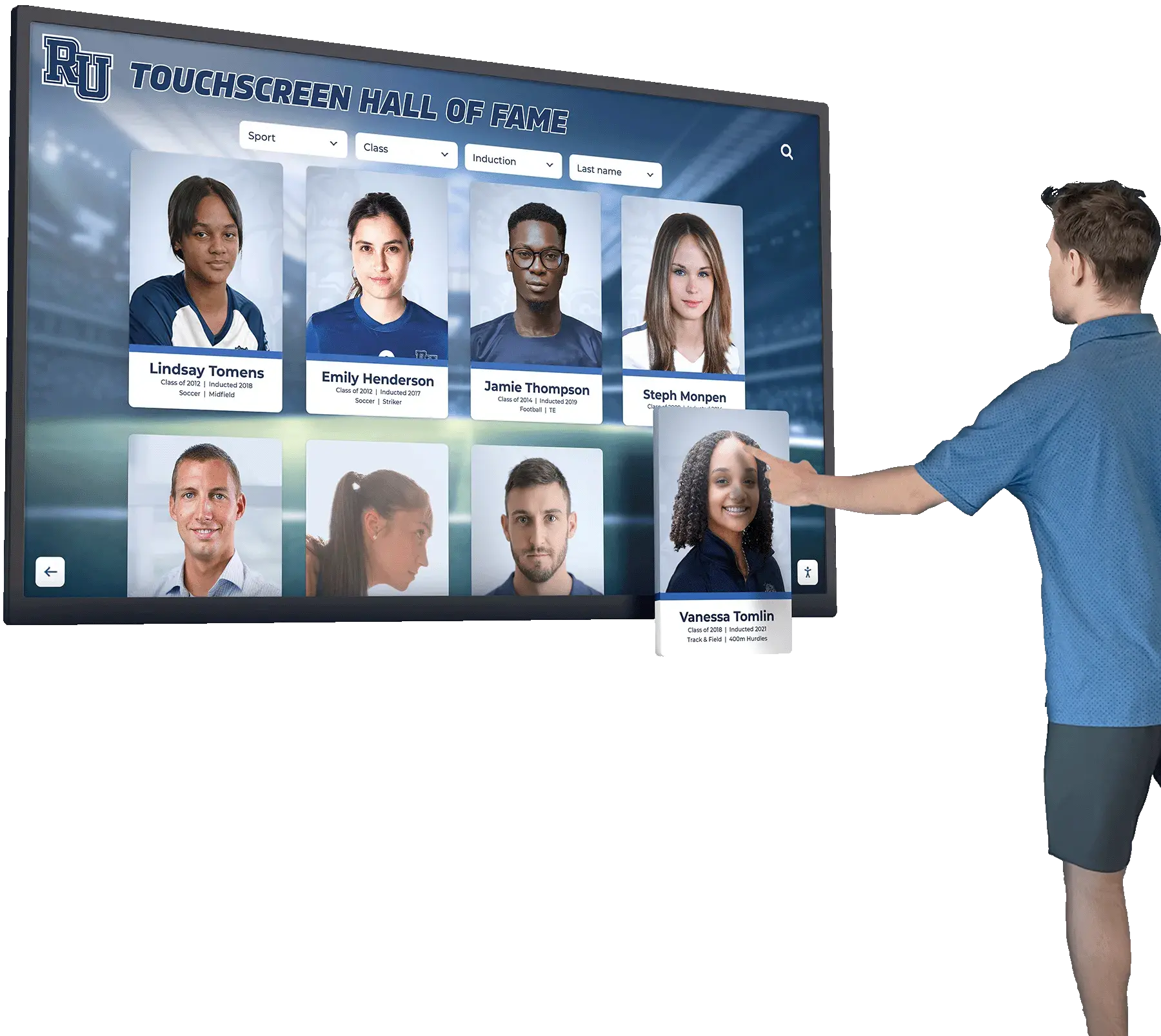
- Grid layouts: Card-based profiles in browsable grids (like streaming services)
- List views: Scrollable lists with photos and key details (like contact apps)
- Search: Prominent search bar with real-time filtering (like app stores)
- Hamburger menus: Collapsible side menus revealing full navigation (mobile apps)
- Breadcrumbs: Location indicators with back-navigation (websites)
- Tabs: Horizontal category selectors (tabbed interfaces)
- Swipe gestures: Left/right navigation through image galleries (photo apps)
These familiar patterns require no explanation—users instantly understand functionality based on experience with similar interfaces elsewhere.
Consistent Navigation Placement
Establish consistent locations for standard navigation elements throughout all screens:
- Back/home buttons: Consistent position (commonly top-left or bottom-left)
- Search: Prominent placement (typically top-right or full-width header)
- Main navigation: Fixed location (side menu or bottom navigation bar)
- Help/instructions: Unobtrusive but discoverable (corner icon or settings)

Intuitive interfaces leverage familiar interaction patterns requiring minimal learning
Consistency creates predictability—after using any single screen successfully, users can confidently navigate anywhere within the system using the same interaction patterns.
Search and Filter Design
For displays with extensive content collections, search and filtering capabilities often determine whether users successfully find desired content or abandon in frustration.
Prominent Search Placement
Make search immediately visible and accessible:
Feature search prominently on home screens (not hidden in menus), use full-width search bars in primary visual hierarchy, implement real-time filtering displaying results as users type, include clear search field affordances (magnifying glass icon, placeholder text like “Search by name…”), and provide search everywhere (accessible from any screen, not just home).
Users seeking specific individuals typically prioritize search over browsing—hidden or secondary search placement creates immediate friction for significant audience segments.
Effective Filter Design
For browsing-oriented users, well-designed filters enable efficient content narrowing:
Filter Best Practices:
- Visual prominence without overwhelming primary content
- Clear filter categories matching content organization (sport, decade, achievement type, etc.)
- Multi-select capability (combine multiple filters simultaneously)
- Active filter indicators (show current filters applied)
- Clear filter removal (easy “clear all” option)
- Result counts (show how many items match current filters)
Sophisticated filter implementation transforms potentially overwhelming content collections into manageable, explorable sets matching user interests.
Explore comprehensive search strategy in interactive hall of fame design highlighting navigation approaches.
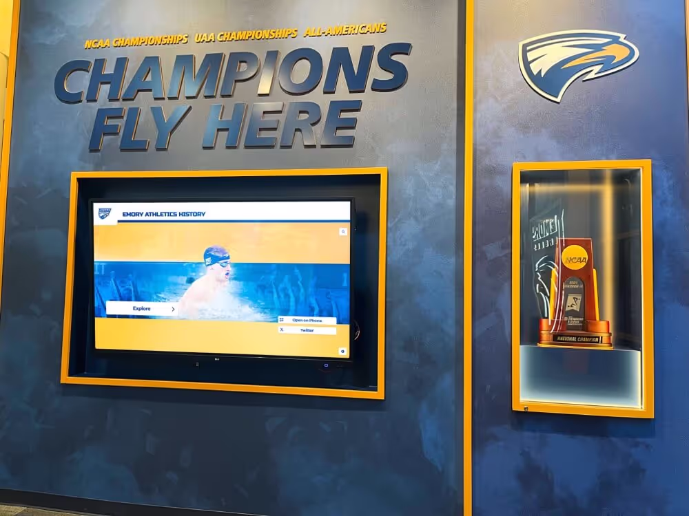
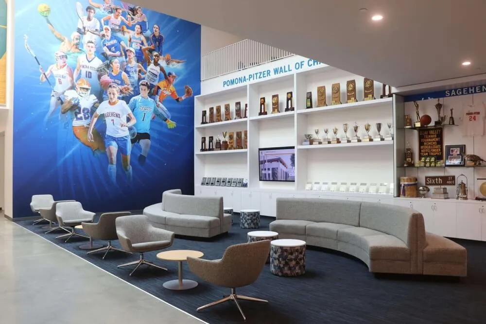
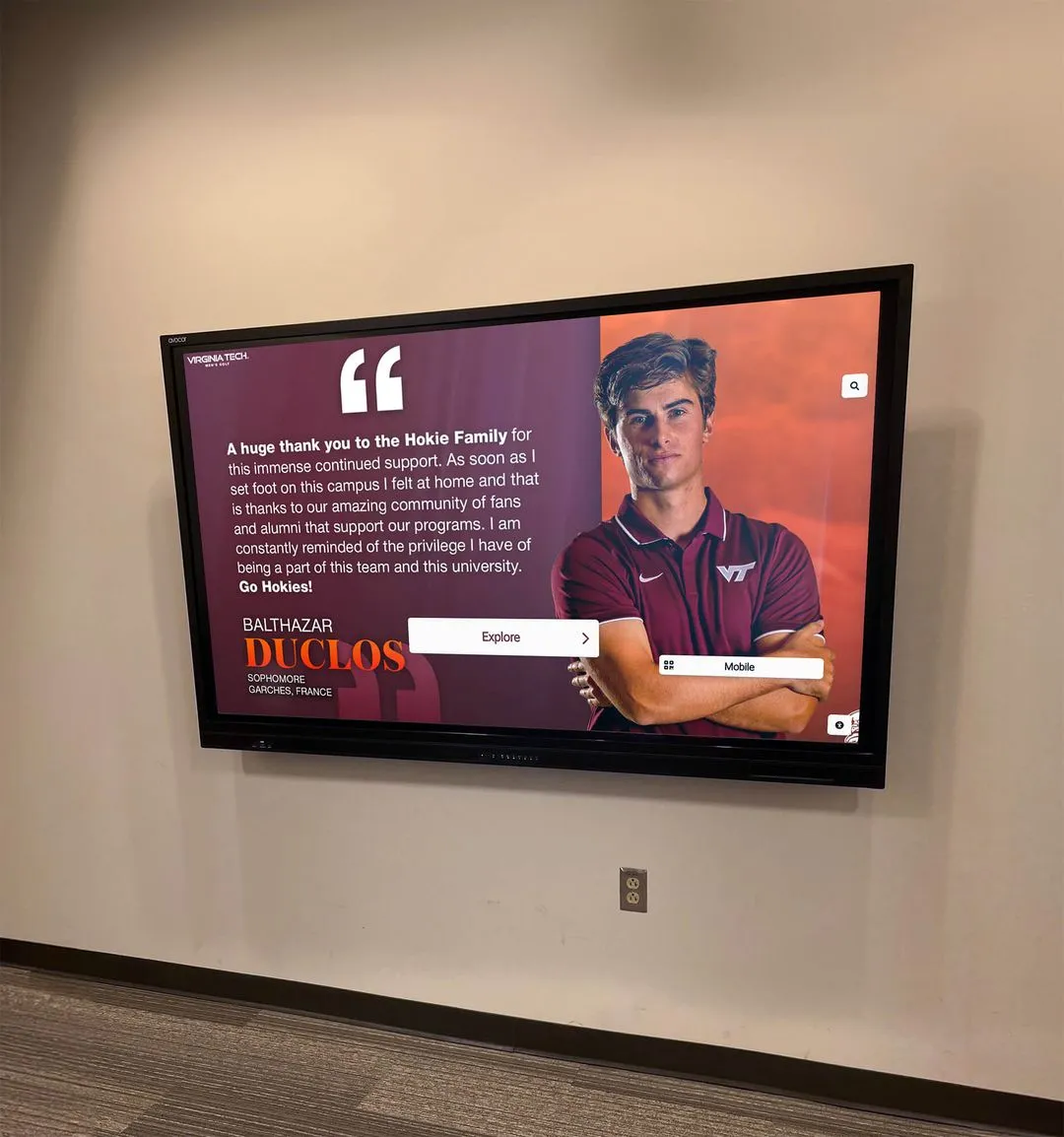
Content Presentation: Visual Storytelling for Recognition
How individual profiles, achievements, and stories are presented determines whether recognition content feels engaging and meaningful or perfunctory and forgettable.
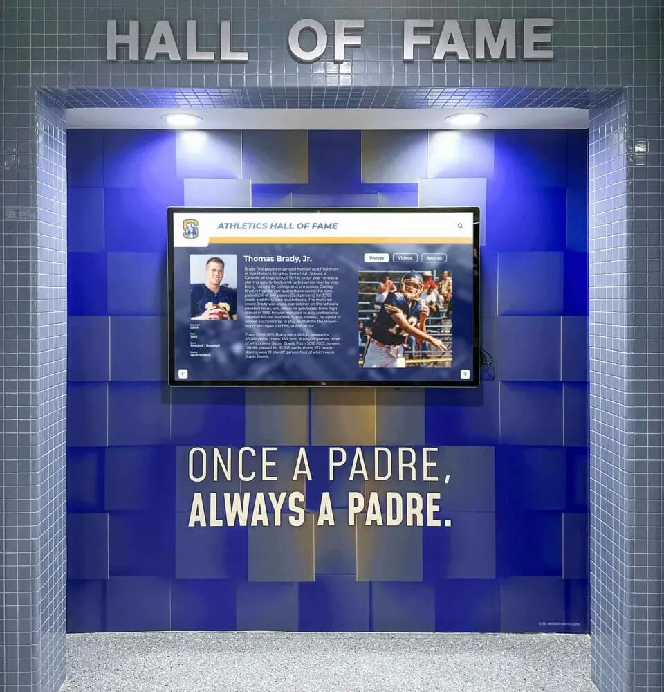
Profile Layout Design
Individual honoree profiles represent the destination for most user journeys—layout quality here directly impacts recognition effectiveness.
Essential Profile Components
Comprehensive profiles balance key information, biographical storytelling, and multimedia richness:
Core Profile Elements:
- Hero image: Large, high-quality photograph (minimum 800px wide)
- Name and headline: Clear identification with primary achievement
- Key facts: Organized presentation of achievements, years, statistics
- Biographical narrative: 150-300 word written story
- Quote or testimonial: First-person voice adding personal dimension
- Multimedia integration: Additional photos, video clips, or audio
- Related content: Links to teammates, contemporaries, or related achievements
- Social sharing: Options to share via email or social media
These elements work together creating comprehensive recognition experiences transcending simple name-and-achievement listings.
Layout Template Strategies
Consistent profile templates enable efficient content creation while maintaining visual quality across hundreds of honorees:
Establish flexible template systems accommodating variable content (some profiles rich with media, others text-focused), maintain clear visual hierarchy (most important information first), design for vertical scrolling (content extending beyond single screen), ensure readability (sufficient text size and contrast), and balance multimedia with performance (optimize image sizes preventing slow loading).
Well-designed templates enable non-designers to create professional profiles through structured content entry rather than custom layout design for each honoree.

Card-based layouts enable efficient browsing while providing essential information at a glance
Multimedia Integration Strategy
Rich media—photos, videos, and audio—dramatically increases engagement when thoughtfully integrated into layouts.
Photography Layout Considerations
High-quality imagery distinguishes professional recognition displays from amateur implementations:
Photography Standards:
- Minimum resolution: 1200px wide for featured images
- Consistent aspect ratios: Define standard crops (16:9, 4:3, or 1:1)
- Quality standards: Sharp focus, proper exposure, appropriate backgrounds
- Historical photo handling: Restoration and proper presentation of archival images
- Gallery layouts: Grid or carousel formats for multiple images per profile
- Thumbnail generation: Optimized smaller versions for browse views
Establish photography guidelines and standards before content development begins—preventing quality inconsistencies requiring extensive rework later.
Video and Audio Integration
Multimedia content provides powerful storytelling opportunities requiring careful layout treatment:
Display clear video player controls (play/pause, volume, progress indicator), design for silent autoplay with caption availability, provide clear duration indicators helping users gauge time investment, implement proper aspect ratio handling (avoid stretched or cropped video), create audio-only player interfaces for oral history content, and ensure file size optimization (preventing long load times).
Video and audio dramatically increase profile completion and engagement duration but require thoughtful implementation preventing technical frustrations.
Learn about creating video content for digital hall of fame displays including layout integration strategies.
Progressive Disclosure and Information Layering
Effective layouts reveal information progressively—providing essential details immediately while enabling deeper exploration without overwhelming initial views.
Content Layer Strategy
Organize information into progressive revelation tiers:
Layer 1 (Browse View):
- Essential identification (name, photo, primary achievement)
- Key facts (year, sport/program, basic statistics)
- Visual appeal (high-quality imagery)
Layer 2 (Summary View):
- Expanded achievement details
- Brief biographical narrative (100-150 words)
- Additional photos or media thumbnails
- Navigation to full profile
Layer 3 (Full Profile):
- Complete biographical story
- All achievements and statistics
- Full multimedia gallery
- Related content connections
- Sharing and interaction options
This layered approach prevents information overload while satisfying both casual browsers and deeply interested users—critical for serving diverse audience needs with single interface designs.
Accessibility and Inclusive Design
Exceptional touchscreen layouts serve all potential users regardless of physical abilities, technical comfort, or learning differences.
Physical Accessibility Standards
Beyond minimum ADA compliance, thoughtful accessibility design expands potential audiences while improving general usability.
Height and Reach Considerations
Display mounting and interaction zone placement significantly impact wheelchair user accessibility:
Installation Guidelines:
- Screen center height: 42-48 inches above floor for seated viewing
- Touch zone height: Primary interactive elements within 36-54 inches
- Approach clearance: Minimum 30×48 inch clear floor space in front
- Angled mounting: Slight downward tilt (5-10 degrees) improving viewing angles
- Knee clearance: If using desk-style mounting, 27-inch minimum height underneath
These specifications enable comfortable interaction for wheelchair users while remaining accessible to standing users of varying heights including children.
According to research on interactive kiosk design, maintaining primary interactive elements in the middle third of screens and implementing bottom navigation improves wheelchair accessibility while benefiting all users.
Alternative Input Methods
Consider supplementary interaction options beyond touch for users with dexterity challenges:
Voice control can enable hands-free operation when ambient noise permits, companion mobile apps allow personal device control of displays, web-accessible versions enable access without physical display interaction, and extended touch hold times can prevent accidental activation while remaining responsive.
These alternative access methods expand audience reach while demonstrating institutional commitment to inclusion.
Visual Accessibility Considerations
Ensure layouts accommodate users with vision impairments through deliberate design decisions:
Critical Elements:
- High contrast ratios (minimum 4.5:1 for text)
- Large text sizes appropriate for distance viewing
- Color coding supplemented with icons or text (colorblind accommodation)
- Clear focus indicators showing current selection
- Zoom capabilities for detailed content
- Text alternatives for image-based navigation
High contrast, large text, and clear visual hierarchy support accessibility for diverse users
Regular testing with users representing various vision capabilities helps identify accessibility gaps invisible to designers with typical vision.
Cognitive Accessibility and Simplicity
Intuitive layouts reduce cognitive load enabling successful interaction regardless of technical expertise or learning differences.
Reducing Cognitive Complexity
Simplify interfaces through strategic design decisions:
Simplification Strategies:
- Limit choices per screen (5-7 options maximum prevents decision paralysis)
- Use clear, plain language (avoid jargon or complex terminology)
- Provide visual cues reinforcing text (icons supporting comprehension)
- Maintain predictable layouts (consistency reduces learning requirements)
- Implement clear error recovery (obvious back buttons, undo options)
- Design forgiving interfaces (large touch targets reduce mistakes)
These approaches create interfaces accessible to users with cognitive differences while improving general usability for all audiences.
Progressive Enhancement Approach
Design core functionality accessible to all users, then progressively enhance with advanced features for sophisticated users:
Essential features prominently placed with obvious access, advanced capabilities available but unobtrusive (search filters, sorting options), help information discoverable but not intrusive, and expert shortcuts available without compromising simple primary paths.
This philosophy ensures inclusive design serving diverse capabilities without reducing functionality for power users.
Explore comprehensive accessibility approaches in accessible recognition display design addressing diverse user needs.
Performance Optimization: Ensuring Fluid Experiences
Even brilliantly designed layouts fail if underlying performance creates lag, stuttering, or unresponsive behavior frustrating users.
Responsiveness and Touch Feedback
Perceived responsiveness often matters more than actual processing speed—immediate feedback creates impressions of instantaneous response even when underlying operations take time.
Immediate Touch Acknowledgment
Provide instant visual feedback confirming touch registration:
Implement visual state changes on touch (button press animations, highlight effects), use subtle haptic feedback if hardware supports it, show loading indicators immediately when processing begins, and maintain responsive interface elements even during background operations.
Users tolerate brief processing delays when interfaces acknowledge input immediately—uncertainty about whether touches registered creates frustration far more than brief waits with clear feedback.
Target Response Times
Establish performance budgets for critical interaction types:
Performance Standards:
- Touch registration acknowledgment: Under 100ms (perception of direct manipulation)
- Screen transitions: Under 300ms (feels instantaneous)
- Search result display: Under 500ms (real-time feel)
- Full profile loading: Under 2 seconds (acceptable with loading indicator)
- Video playback start: Under 3 seconds (standard expectation)
Test performance on actual deployment hardware under realistic network conditions—development environments often perform better than production installations.
According to user experience research on ultra-responsive touchscreens, maintaining sub-100ms touch response creates perceptions of direct manipulation that significantly increase user engagement and satisfaction.
Learn about ultra-responsive touchscreen implementation including performance optimization strategies.
Content Loading and Image Optimization
Large high-resolution images create engaging visual experiences but can severely impact performance without proper optimization.
Image Optimization Strategies
Balance visual quality with performance requirements:
Optimization Techniques:
- Responsive image sizes: Serve appropriately sized images for display resolution
- Progressive loading: Show low-resolution placeholder while high-resolution loads
- Lazy loading: Load images only as users scroll to them
- Format selection: Use modern formats (WebP, AVIF) with JPEG fallbacks
- Compression optimization: Reduce file size without visible quality loss
- Thumbnail generation: Create optimized smaller versions for browse views
- Content delivery networks: Leverage CDN caching for faster delivery
Comprehensive image optimization often reduces load times by 60-80% while maintaining perceived visual quality—dramatically improving user experience.
Content Preloading Strategies
Anticipate likely user paths, preloading content before requests:
Preload adjacent profiles during current profile viewing, cache recently viewed content for instant back navigation, download common navigation targets during idle periods, and implement intelligent prediction based on usage patterns.
Strategic preloading creates impressions of instant content availability even with large media-rich databases.
Practical Implementation: From Design to Reality
Translating design concepts into functional touchscreen displays requires systematic implementation planning and realistic project management.
Design System Development
Create reusable design systems enabling consistent, efficient layout implementation across extensive content collections.
Component Library Creation
Develop standardized interface components supporting rapid assembly:
Essential Component Types:
- Navigation elements (menus, buttons, breadcrumbs, tabs)
- Content cards (profile summaries, achievement highlights, team entries)
- Profile templates (individual honoree layouts in various formats)
- Media players (video, audio, image gallery controls)
- Search interfaces (search bars, filter panels, result displays)
- Typography styles (heading hierarchy, body text, captions)
- Color systems (brand palette application rules)
- Interactive states (default, hover, active, selected)
Well-developed component libraries ensure visual consistency while enabling non-designers to create professional content through component assembly rather than custom design.
Documentation and Guidelines
Create clear documentation enabling consistent application:
Document component usage rules and best practices, provide visual examples demonstrating correct implementation, specify responsive behavior across screen sizes, define accessibility requirements for each component, establish content guidelines (character limits, image specifications), and create decision trees guiding layout choices.
Comprehensive documentation prevents inconsistency and enables distributed content creation without constant design oversight.
Content Development Workflow
Systematic content creation processes prevent bottlenecks while maintaining quality standards.
Content Production Pipeline
Establish efficient workflows from raw materials to published profiles:
Typical Workflow Stages:
- Content gathering: Collect biographical information, achievements, photos, media
- Content preparation: Write narratives, edit images, optimize media files
- Quality review: Verify accuracy, check image quality, ensure completeness
- Template population: Enter content into design system templates
- Technical review: Test functionality, verify responsive behavior, check performance
- Publication approval: Final review and release to display
Clear stage definitions with responsible parties and quality criteria prevent confusion while maintaining standards across potentially hundreds of profiles.
Batch Production Strategies
For large-scale recognition collections, batch processing increases efficiency:
Group similar content types (e.g., all athletes from a specific decade), develop template shortcuts for common patterns, create standardized image specifications simplifying photography, establish content length guidelines enabling consistent layout, and train multiple team members enabling parallel production.
Systematic batch approaches can reduce per-profile production time by 40-60% compared to one-off custom creation.
Explore systematic content planning and development strategies for efficient implementation.

Systematic content development enables comprehensive recognition of extensive honoree collections
Testing and Iteration Strategy
Successful layouts emerge from systematic testing and refinement based on real user behavior rather than designer assumptions.
User Testing Methods
Gather usability feedback before final implementation:
Effective Testing Approaches:
- Hallway testing: Recruit diverse staff and students for informal testing sessions
- Think-aloud protocol: Ask users to verbalize thoughts while navigating
- Task completion testing: Assign specific goals (find particular honoree, explore specific era)
- First-impression testing: Show designs briefly and gather initial reactions
- Accessibility testing: Test with users representing various abilities
- Performance testing: Monitor responsiveness under realistic conditions
Even informal testing with 5-8 diverse users reveals critical usability issues invisible to designers deeply familiar with interfaces.
Analytics-Driven Optimization
Post-launch, leverage usage data informing continuous improvement:
Monitor average session duration (longer indicates engaging layouts), interaction depth (number of profiles viewed per session), search versus browse patterns (informing navigation emphasis), feature utilization rates (which interface elements users actually use), abandonment points (where users exit), and mobile web continuation (transition from physical display to personal devices).
Data-driven iteration creates evidence-based design decisions rather than subjective preferences.
Learn about measuring digital hall of fame success including analytics approaches informing layout optimization.
Advanced Layout Strategies for Enhanced Engagement
Beyond fundamental best practices, sophisticated layout strategies create exceptional experiences that maximize recognition impact and community engagement.
Storytelling Through Timeline Visualizations
Linear timelines provide intuitive frameworks for exploring historical progression across decades of institutional achievement.
Timeline Layout Approaches
Visual timeline presentations enable chronological exploration:
Timeline Design Patterns:
- Horizontal scrolling timelines: Era-based navigation with milestone markers
- Vertical decade sections: Grouped content blocks organized by time periods
- Interactive date selectors: Calendar-style interfaces enabling specific year navigation
- Milestone highlights: Featured achievements breaking up chronological flow
- Era theming: Visual design reflecting historical periods (archival styling for older content)
Timeline layouts particularly suit institutions with rich history spanning multiple decades—enabling discovery of patterns, evolution, and institutional change over time.
Combining Timeline and Category Navigation
Sophisticated implementations offer multiple navigation approaches serving different mental models:
Allow users to explore by time period (timeline view) or by category (sport, program, achievement type), provide easy switching between navigation modes, maintain context when changing views (selected filters persist), and highlight chronological patterns within category views.
This flexibility accommodates both users thinking chronologically (“show me 1990s athletes”) and categorically (“show me all state champions”).
Discover timeline implementation in developing college history timelines demonstrating chronological design approaches.
Social and Relational Content Design
Recognition becomes more engaging when showing connections—teammates, contemporaries, mentors, and influenced successors.
Relationship Visualization
Implement layouts highlighting connections between honorees:
Show teammate relationships through grouped profiles, display mentor-mentee connections spanning generations, highlight family legacies (multiple family members honored), connect contemporary honorees from same eras, and link related achievements (school records, championship teams).
These connections create discovery opportunities beyond individual profile exploration—users find unexpected relationships and patterns increasing engagement duration.
Community Contribution Features
Enable ongoing community participation through interactive layout elements:
Allow users to submit memories or stories about honorees, implement commenting or testimonial features, enable photo contributions from alumni, create virtual “reunion” spaces for cohorts or teams, and provide sharing mechanisms encouraging social distribution.
These participatory features transform static recognition into living community resources continuously enriched through collective contribution.
Gamification and Interactive Challenges
Thoughtful gamification elements increase engagement without diminishing recognition dignity.
Achievement Discovery Challenges
Create structured exploration prompts encouraging comprehensive content discovery:
Engagement Prompts:
- “Find honorees from your graduating class”
- “Discover all state champions in a specific sport”
- “Explore achievements from different decades”
- “Identify multi-sport athletes”
- “Find all members of championship teams”
These prompts create purpose-driven exploration, increasing engagement duration while guiding users to content they might otherwise miss.
Progress Indicators and Completion Tracking
Show exploration progress encouraging continued engagement:
Display percentage of content explored, highlight newly added or recently updated profiles, implement “you might also like” recommendations, show related content based on current viewing, and create discovery streaks (consecutive exploration sessions).
Subtle gamification increases engagement without transforming recognition into trivial games—maintaining appropriate dignity while leveraging motivation psychology.
Industry-Specific Layout Considerations
Different institutional contexts require customized layout approaches addressing unique audience needs and content characteristics.
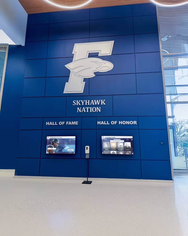
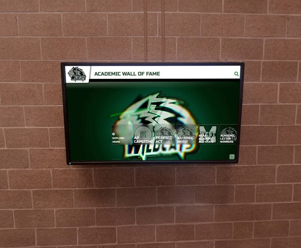
School and University Recognition Displays
Educational institutions present specific layout opportunities and challenges requiring specialized approaches.
Multi-Program Organization
Schools typically recognize achievements across diverse domains requiring clear organizational structures:
Separate major categories (athletics, academics, arts, community service), implement program-specific theming maintaining overall brand consistency, provide program leader profiles alongside student achievements, integrate school history alongside individual recognition, and balance current student inspiration with alumni legacy.
Educational institution layouts must serve both student motivation objectives and alumni engagement goals—requiring interfaces that feel relevant to dramatically different age groups.
Explore comprehensive school recognition approaches in digital hall of fame displays for schools addressing educational context needs.
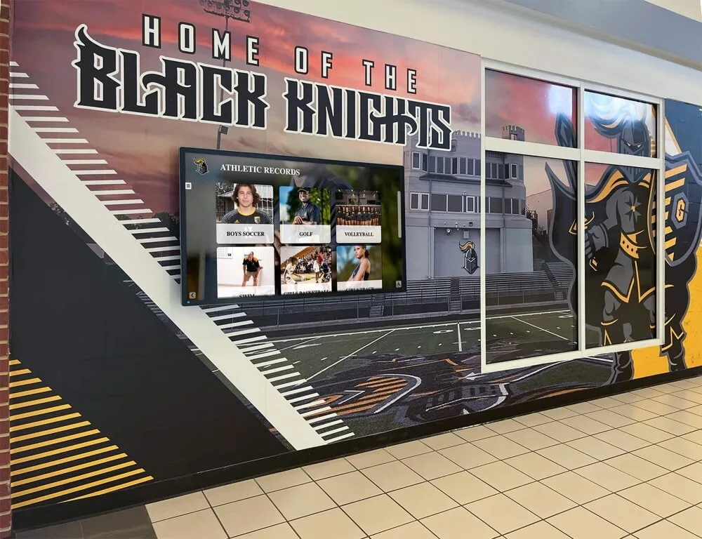
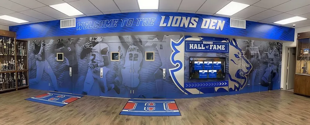
Athletic Program Hall of Fame Displays
Sports recognition benefits from specialized layouts emphasizing statistics, championships, and competitive achievements.
Statistics and Records Integration
Athletic content requires prominent data presentation:
Feature key statistics prominently in profiles (scoring records, win-loss records, championships), create dedicated record boards showing all-time leaders, implement statistical filtering (search by position, era, performance metrics), and visualize record progressions over time.

Athletic recognition displays emphasize team achievements alongside individual honors
Statistical emphasis distinguishes athletic recognition from other forms while serving sports enthusiasts seeking detailed performance information.
Team-Based Recognition
Athletic achievements often involve team accomplishments requiring dedicated presentation:
Create championship team galleries showing complete rosters, implement year-by-year team record archives, highlight coaching legacy across multiple seasons, and connect individual profiles to team achievements.
Team-focused layouts honor collective accomplishments while enabling exploration of individual contributors.
Discover athletic recognition strategies in college athletics hall of fame design demonstrating sports-specific approaches.
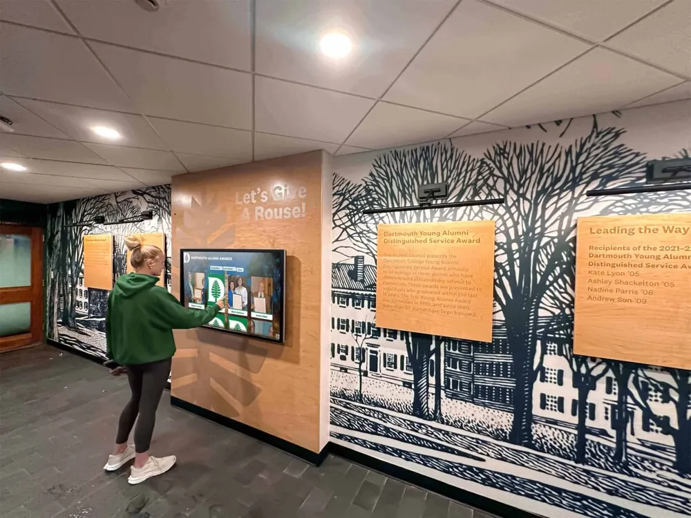
Donor Recognition Display Layouts
Philanthropic recognition displays require specialized approaches balancing stewardship, privacy, and campaign objectives.
Giving Level Organization
Donor recognition typically organizes contributors by support levels:
Implement clear giving tier hierarchies (visual emphasis reflecting contribution significance), provide anonymous recognition options respecting privacy preferences, balance individual recognition with collective impact visualization, and integrate campaign progress indicators maintaining momentum.
Donor layouts must honor generosity appropriately while avoiding appearances of exclusive elevation that might discourage broader participation.
Impact Storytelling Integration
Connect donor recognition to mission outcomes demonstrating contribution impact:
Show how donations enable specific programs or facilities, feature testimonials from beneficiaries enabled by support, visualize donor impact over time, and connect historical giving to current institutional capacity.
Impact-focused storytelling transforms donor recognition from simple acknowledgment into compelling mission communication that can inspire additional support.
Explore comprehensive donor recognition approaches in church interactive donor boards demonstrating stewardship-focused design.
Maintenance and Evolution Planning
Successful touchscreen displays require ongoing content updates and design evolution ensuring continued relevance and engagement.
Content Update Workflows
Establish sustainable processes for regular content additions and updates preventing displays from becoming outdated.
Regular Update Scheduling
Create content calendars ensuring consistent additions:
Typical Update Cycles:
- New honoree additions: Quarterly or annually following selection processes
- Achievement updates: Real-time or weekly during active seasons
- Historical content expansions: Ongoing research and digitization projects
- Multimedia enhancements: Progressive addition of photos, videos, and audio
- Profile enrichments: Periodic additions of biographical details and stories
Regular updates signal that displays represent living recognition rather than static archives—maintaining community interest and engagement.
Distributed Content Management
Assign update responsibilities across teams preventing bottlenecks:
Empower program directors with category-specific editing rights, designate student assistants for data entry and image preparation, involve librarians or archivists for historical content development, engage communication staff for writing and editing, and establish administrative oversight for quality control.
Distributed authority accelerates updates while maintaining standards through clear guidelines and review processes.
Design Refresh and Evolution
Plan periodic design updates preventing layouts from feeling dated as design trends evolve.
Incremental Evolution Approach
Avoid complete redesigns; implement gradual improvements:
Update color palettes every 2-3 years maintaining brand alignment, refresh typography reflecting contemporary legibility standards, enhance navigation based on usage analytics, modernize interactive patterns as conventions evolve, and progressively improve accessibility features.
Incremental evolution maintains familiarity while preventing dated appearances that undermine institutional impressions.
Technology Refresh Planning
Coordinate layout updates with hardware replacement cycles:
Plan major design updates when replacing displays (every 5-7 years), leverage new hardware capabilities in updated designs (higher resolutions, improved touch sensitivity), maintain backward compatibility during transition periods, and archive historical design versions as institutional records.
Strategic technology refresh planning maximizes return on layout design investments while ensuring displays remain current.
Working with Professional Design Solutions
Many institutions partner with specialized providers offering comprehensive design and implementation support for touchscreen recognition displays.
Evaluating Layout Design Services
When considering professional design partnerships, assess capabilities ensuring quality outcomes.
Essential Provider Capabilities
Effective touchscreen design providers should demonstrate:
Key Qualifications:
- Specialized experience with public touchscreen interfaces (not just web or mobile design)
- Portfolio demonstrating successful recognition display implementations
- User experience expertise specific to educational or nonprofit contexts
- Content management platform expertise enabling sustainable maintenance
- Performance optimization knowledge ensuring responsive experiences
- Accessibility compliance understanding meeting legal and ethical standards
- Iterative design process incorporating user testing and feedback
General web design firms often lack specialized touchscreen experience—recognition-specific providers understand unique requirements public interactive displays present.
Purpose-Built Recognition Platforms
Specialized solutions like Rocket Alumni Solutions provide comprehensive platforms designed specifically for institutional recognition including schools, athletic programs, and community organizations—offering pre-built design systems, proven layout templates, intuitive content management, and ongoing support enabling successful implementation without extensive design resources.
These purpose-built platforms incorporate years of user experience research and implementation learning—delivering optimized layouts that would require significant investment to develop independently.
Platform Evaluation Criteria
When assessing recognition display platforms, consider:
Design flexibility (customization supporting your brand while maintaining usability), content capacity (unlimited profiles supporting comprehensive recognition), multimedia support (photos, videos, audio integration), search and filtering capabilities, mobile web accessibility extending recognition beyond physical displays, analytics and reporting informing optimization, training and support ensuring successful adoption, and proven implementation track record with similar institutions.
Comprehensive evaluation prevents platform limitations from constraining recognition objectives.
Explore purpose-built solutions at Rocket Alumni Solutions offering specialized recognition display design and management platforms.
Conclusion: Layout Design as Recognition Strategy
Digital hall of fame touchscreen display layout represents far more than aesthetic decision-making—it functions as strategic recognition architecture determining whether your investment in interactive technology delivers meaningful return through sustained community engagement, effective achievement celebration, and strengthened institutional culture. When institutions systematically plan information architecture matching user mental models, implement visual hierarchies guiding attention and understanding, design intuitive interfaces serving diverse technical comfort levels, optimize performance creating responsive interaction experiences, and establish sustainable content management enabling ongoing evolution, they create recognition displays that captivate audiences rather than collecting dust after initial novelty fades.
The layout strategies explored throughout this guide provide frameworks for designing exceptional touchscreen recognition experiences—from fundamental principles of touch interaction and visual hierarchy through advanced approaches incorporating timeline visualization, relational content, and industry-specific customization. Whether implementing displays independently or partnering with specialized providers, understanding layout design principles enables informed decisions supporting recognition objectives while avoiding common pitfalls that undermine engagement and accessibility.
Design Your Stunning Digital Hall of Fame Display
Discover how purpose-built recognition platforms can help you implement professionally designed touchscreen displays that engage audiences, honor achievements, and strengthen institutional culture through proven layout strategies and comprehensive support.
Explore Recognition SolutionsFrom basic single-display installations in school lobbies to comprehensive multi-location recognition networks documenting complete institutional histories, organizations of all sizes and types are discovering that strategic layout design transforms touchscreen technology from interesting novelty into powerful recognition tool serving fundamental community-building objectives. Solutions like Rocket Alumni Solutions provide platforms specifically designed for institutional recognition—offering proven layout templates, intuitive content management, and comprehensive support enabling successful implementation without requiring extensive design expertise or technical resources.
Start wherever current priorities and resources permit—whether implementing comprehensive custom designs or beginning with proven templates while planning future refinement—then systematically optimize based on user feedback and engagement analytics. Every layout decision supporting intuitive navigation creates better user experiences. Every interface refinement reducing confusion enables deeper exploration. Every accessibility enhancement expands audience reach. Every performance optimization prevents frustration that ends sessions prematurely.
Your institution’s achievements deserve recognition displays that honor excellence appropriately through engaging, accessible, professional layouts reflecting the quality of accomplishments being celebrated. With thoughtful planning, evidence-based design, and systematic implementation, you can create stunning digital hall of fame touchscreen displays that captivate audiences, strengthen community bonds, and preserve institutional legacy for generations to come.
Ready to begin? Explore how Rocket Alumni Solutions can help you design and implement professionally optimized touchscreen recognition displays featuring proven layouts, intuitive interfaces, and comprehensive support enabling successful celebration of your institution’s unique achievements and extraordinary individuals.