
A digital hall of fame ARIA-pressed audit is a structured accessibility review that confirms every stateful toggle control on a recognition display—favorites buttons, comparison selectors, audio toggles, filter chips, and view-switchers—correctly exposes its current pressed or unpressed state through the aria-pressed attribute so screen readers can announce it without requiring the label text to change. When aria-pressed is missing or set to a static value, a screen reader user who activates a “Save to Favorites” button hears only “Save to Favorites, button” on both activation and deactivation—there is no audible feedback that the control changed state. Adding or correcting aria-pressed to toggle between "true" and "false" dynamically solves this without touching the visible label, which is the correct pattern under WCAG 4.1.2 (Name, Role, Value).
This checklist walks school administrators, athletic directors, facilities and IT teams, and recognition-program owners through a complete digital hall of fame ARIA-pressed audit. It covers what aria-pressed does and why it matters for recognition interfaces, which toggle controls to target, a pre-audit inventory checklist, a numbered audit procedure, a findings table to capture results, common failure patterns and fixes, a FAQ, and a brief comparison of what built-in ARIA support looks like across recognition platform types.
The aria-pressed attribute is one of the simplest ARIA state attributes to implement and one of the most commonly omitted in custom-built or vendor-supplied digital recognition interfaces. A toggle button in an HTML document has no native pressed state equivalent—unlike a native <input type="checkbox">, which communicates checked state automatically. Buttons styled as toggles rely on aria-pressed to communicate their current state to assistive technologies. When that attribute is absent or static, the button is effectively invisible in terms of state to any visitor using a screen reader, switch device, or voice control software. For a school hall of fame kiosk in a public lobby, that gap affects not just students with visual impairments but any visitor relying on voice control tools or refreshable Braille displays.

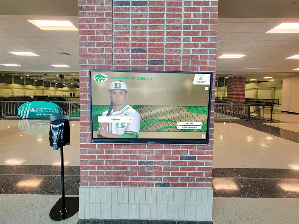
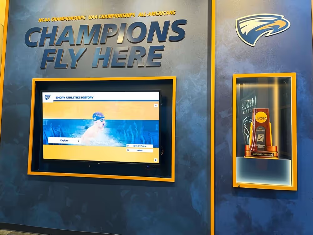
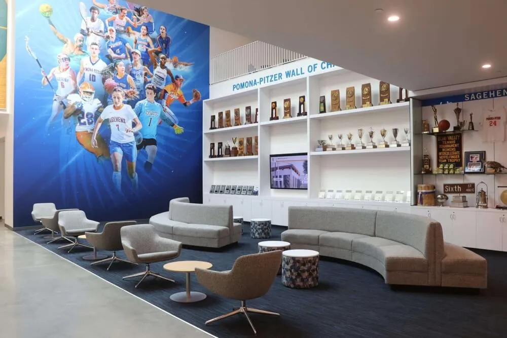
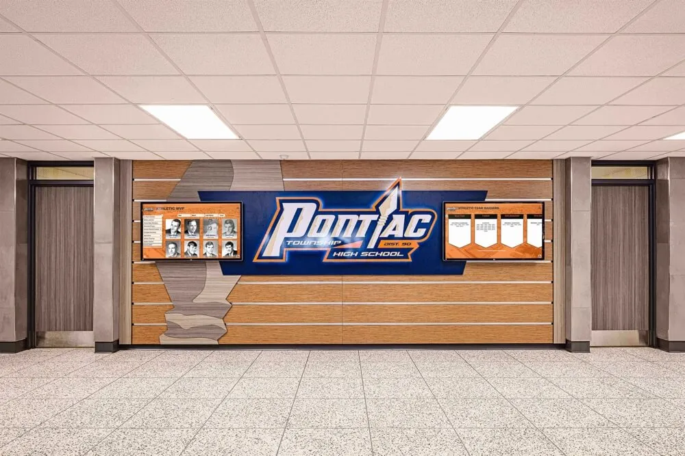
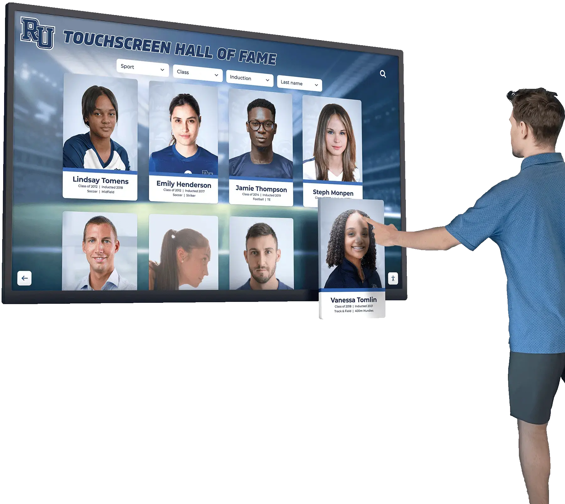
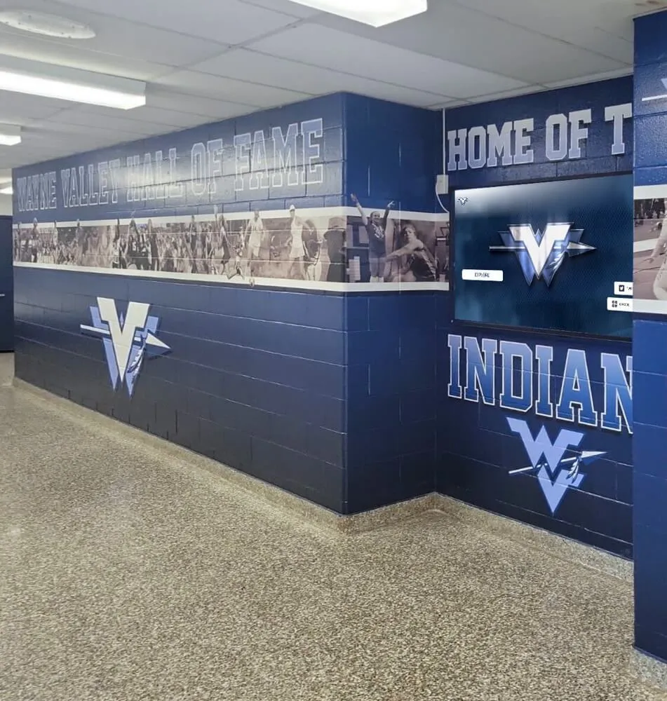
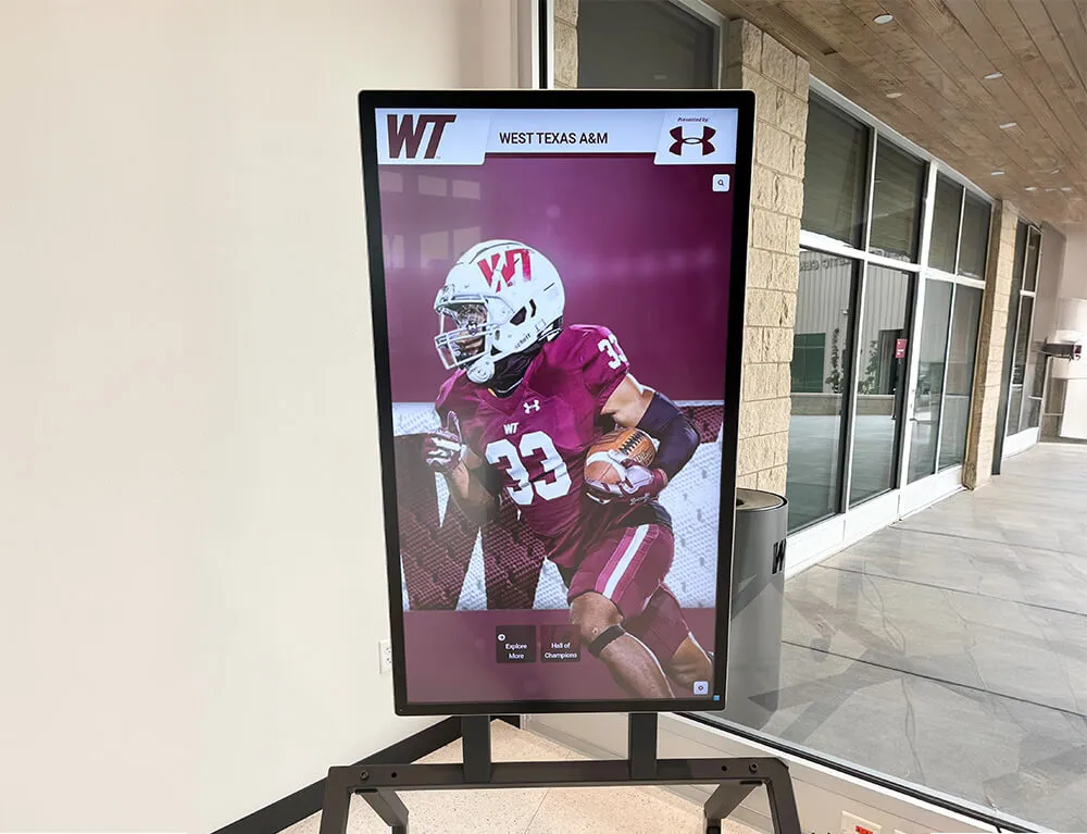
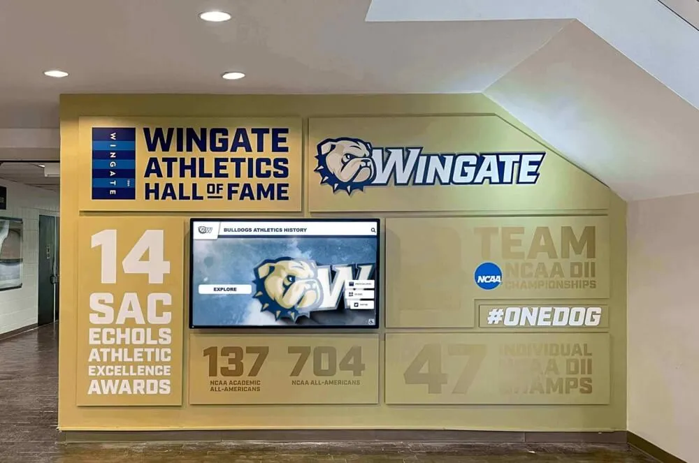
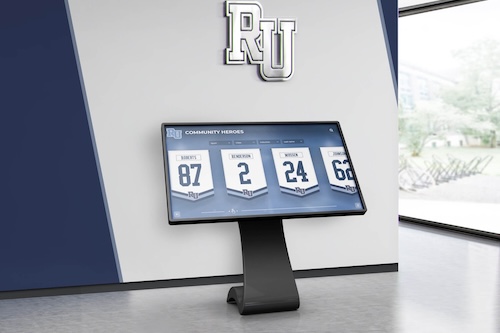
A recognition display touchscreen in a school lobby is used by visitors with a wide range of abilities—toggle controls that lack correct aria-pressed markup are invisible in terms of state to screen reader users and voice control software, even when the visual design clearly shows an active or inactive state
What ARIA-Pressed Is and Why Toggle Controls in Hall of Fame Displays Need It
The HTML specification defines <button> as an interactive element that performs an action when activated. It does not define a button that stays in one of two persistent states—pressed or not pressed—as a native element. That persistent-state concept is layered on top via the WAI-ARIA specification’s aria-pressed attribute, which takes one of three values:
aria-pressed Value | Meaning | Screen Reader Announcement |
|---|---|---|
"false" | Toggle is currently not pressed | “button, Save to Favorites” (or similar, not pressed) |
"true" | Toggle is currently pressed / active | “button, Save to Favorites, pressed” |
"mixed" | Toggle reflects a mixed or indeterminate state | “button, Compare, mixed” |
For a digital hall of fame interface, the controls that need aria-pressed are the ones a visitor can activate once to turn on and activate again to turn off—and where knowing the current state matters to understand what the display is showing. If a visitor adds an athlete to a comparison panel and then navigates away and back, they need to hear “Compare, pressed” to know that athlete is already in the comparison set. Without aria-pressed, they hear “Compare, button” every time, with no audible indication of what they did before.
Interactive digital signage touchscreens in school and campus settings increasingly offer filtering, favoriting, and comparison features that match what you would find on a web application—and those features carry the same ARIA requirements that web applications carry.
Toggle Controls to Audit on a Digital Hall of Fame Display
Not every button on a recognition display is a toggle. The first step in an aria-pressed audit is identifying which controls are stateful toggles and which are action buttons (which should not have aria-pressed at all). Applying aria-pressed to a non-toggle button—for example, a “Go Back” button—is itself an accessibility error that will confuse screen reader users.
Controls that typically require aria-pressed:
- Favorites or Save button: Adds or removes an athlete profile, inductee, or award from a saved list. State persists across navigation within the session.
- Comparison selector: Marks a profile for side-by-side comparison. Once pressed, the profile is “in” the comparison set; pressing again removes it.
- Audio guide toggle: Turns ambient narration or audio description on or off for a hall of fame exhibit section.
- View-mode switcher: Switches between grid and list views, or between “by year” and “by sport” display modes. Each option button in the set is a toggle.
- Filter chips: Each active filter (e.g., “Football,” “State Champions,” “All-State”) is toggled on or off independently.
- Expanded / collapsed section toggle: A “Show All Records” button that expands or collapses a section is a toggle if it persists its state.
- Caption/transcript toggle: Shows or hides captions on tribute videos.
- High-contrast or large-text mode button: Activates an accessibility mode; stays active until explicitly turned off.
Controls that should NOT have aria-pressed:
- Navigation buttons (“Back,” “Home,” “Next Athlete”)
- Form submission buttons (“Search,” “Submit Feedback”)
- Link-styled buttons that navigate to a new screen
- One-time action buttons (“Print This Profile,” “Share”)
A control inventory is the foundation of the audit. Without it, teams either miss toggle controls or incorrectly apply aria-pressed to action buttons, both of which are audit failures.
Pre-Audit Inventory Checklist
Before running the technical audit, complete this inventory. It ensures the audit covers every toggle control on the display and establishes a baseline for tracking findings.
Display environment:
- Identify every screen or view in the recognition display that a visitor can reach from the home screen
- For each screen, identify every button and note whether it is a toggle (stateful) or an action button (stateless)
- Record the visible label text for each toggle control
- Record whether each toggle’s visual design clearly shows an active state (filled icon, color change, border change) vs. an inactive state
- Confirm which framework or rendering engine the display uses (native HTML, React, Angular, Vue, or a proprietary display runtime) since this affects where
aria-pressedmust be set in the codebase - Confirm whether a screen reader can be connected to or enabled on the display for live testing
Testing tools to prepare:
| Tool | Purpose | Platform |
|---|---|---|
| Browser DevTools (Accessibility panel) | Inspect computed ARIA attributes on individual elements | Chrome, Firefox, Edge |
| axe DevTools browser extension | Automated scan for aria-pressed violations | Chrome, Firefox |
| NVDA + Firefox | Screen reader announcement testing | Windows |
| VoiceOver + Safari | Screen reader announcement testing | macOS, iOS |
| Accessibility Insights for Web | Guided manual checks including ARIA state attributes | Chrome |
aria-pressed grep search | Find all aria-pressed occurrences in source code | Codebase |
If the recognition display runs in a kiosk browser that does not expose DevTools directly, connect a development instance of the same interface on a standard browser for the audit, then verify fixes on the kiosk before closing the audit.
Section 1: Automated Scan for ARIA-Pressed Violations
Step 1 — Run an automated accessibility scanner on each screen of the display interface.
In Chrome with axe DevTools installed, open the recognition display interface in a standard browser window. Navigate to each screen and run the axe scan. Export the results to a spreadsheet.
Automated scanners reliably catch:
- Buttons with
aria-pressedset to a non-boolean string value (e.g.,aria-pressed="yes"instead ofaria-pressed="true") - Buttons with
aria-presseddeclared as an attribute but never updated by JavaScript when the button is activated - Buttons missing
aria-pressedthat have a visual active/inactive state based on class names or data attributes
Automated scanners will not catch:
- A toggle button where
aria-pressedis correctly present but never changes from its initial value (a “static”aria-pressedthat does not reflect live state) - A button where
aria-pressedis set correctly but the accessible name is also changed on toggle (a label-change pattern that violates WCAG 1.3.3)
Step 1 checklist:
- Run automated scan on: home screen, athlete profile screen, search/filter screen, comparison screen, audio/video tribute screen, and any settings or accessibility mode screen
- Export findings and flag all items involving
aria-pressed,button, or “4.1.2” violations - Note any buttons that the scanner flags as having no accessible name (these are separate violations but often co-occur with
aria-pressederrors)
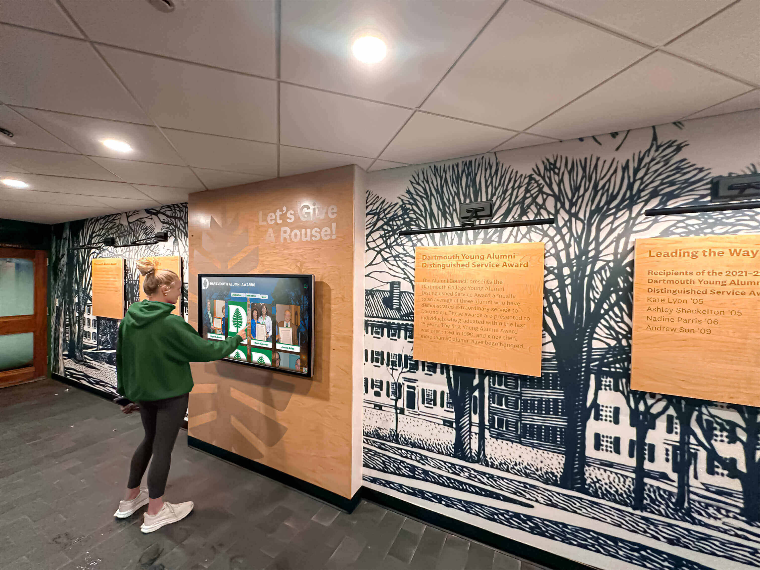
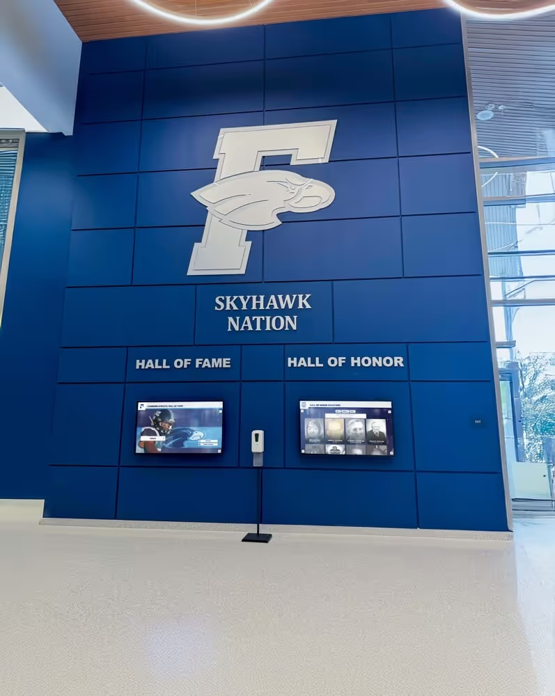
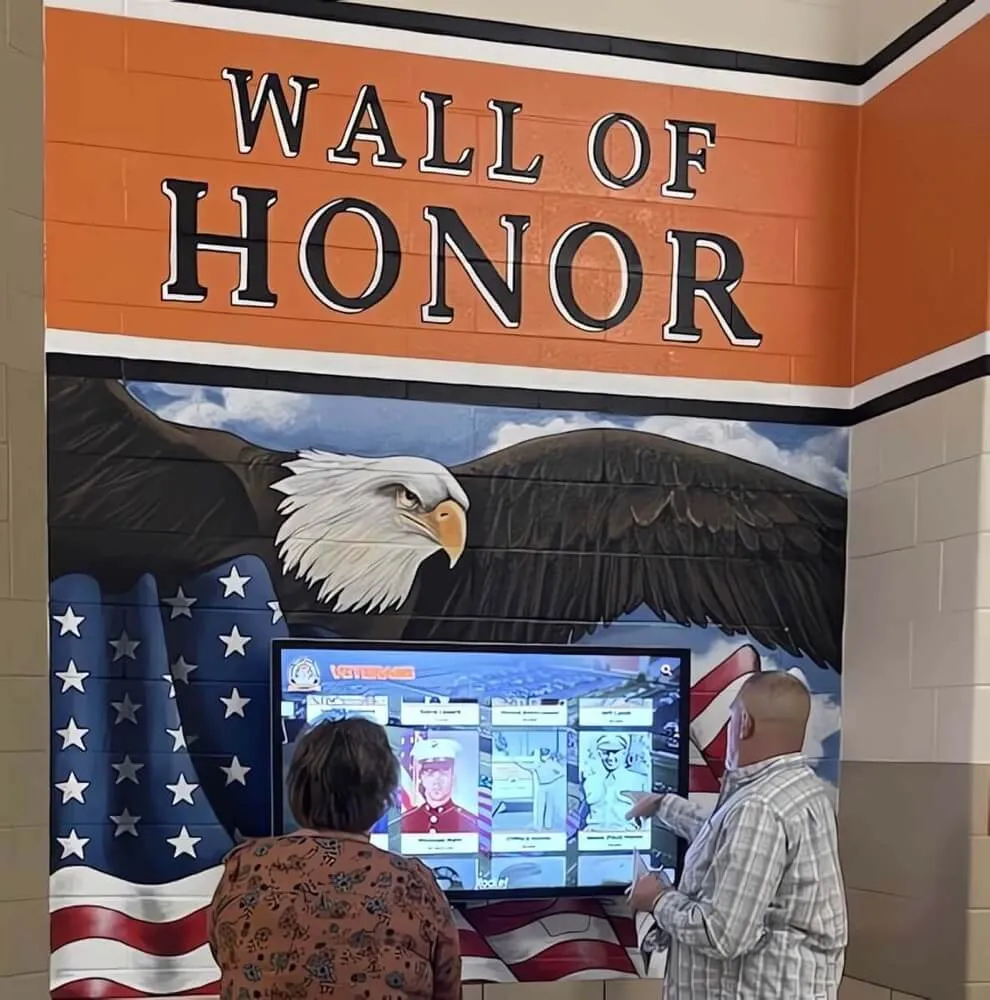
A student interacting with a recognition display in a school hallway—when a toggle control like "Add to Favorites" is activated, the screen reader must announce the new state ("pressed") immediately, which requires the aria-pressed attribute to update in the DOM at the moment the button is clicked
Section 2: Manual State-Change Verification
Automated scanners tell you whether aria-pressed is present; they cannot confirm that it changes value correctly when the button is activated. Manual verification is required for every toggle control.
Step 2A — Inspect initial state in DevTools.
For each toggle control identified in the inventory:
- Open the Accessibility panel in Chrome DevTools (right-click the button, select Inspect, then open the Accessibility tab)
- Confirm
aria-pressedis listed as a computed accessibility property - Record the initial value:
"true","false", or"mixed" - Confirm the initial value matches the visual state of the button (if the button appears inactive,
aria-pressedshould be"false"; if it appears active, it should be"true")
Step 2B — Activate the toggle and re-inspect.
- Click or tap the toggle button once
- Re-open the Accessibility panel (it updates in real time)
- Confirm
aria-pressedchanged to the opposite value - Activate the toggle a second time and confirm
aria-pressedreturns to its original value - Repeat for every toggle control in the inventory
Step 2C — Verify with a screen reader.
- Connect NVDA (Windows) or enable VoiceOver (macOS/iOS) on the test browser
- Navigate to each toggle control using Tab key alone (no mouse or touch)
- Confirm the screen reader announces the button’s label and current state on focus (e.g., “Save to Favorites, toggle button, not pressed”)
- Activate the toggle and confirm the screen reader announces the new state immediately (e.g., “pressed”)
- Confirm the screen reader does NOT announce a label change (the label text must stay the same; only the state changes)
Step 2 findings log:
| Control | Screen | Initial aria-pressed | State changes on activation? | Screen reader announces state? | Pass / Fail |
|---|---|---|---|---|---|
| Favorites button | Athlete profile | ||||
| Compare button | Athlete profile | ||||
| Audio toggle | Video tribute | ||||
| Grid/List view switch | Search results | ||||
| Filter: Football | Filter panel | ||||
| Filter: All-State | Filter panel | ||||
| Caption toggle | Video player | ||||
| High-contrast mode | Accessibility settings |
Section 3: Label-Stability Verification
A specific ARIA-pressed failure pattern in digital recognition displays occurs when a developer solves the “how does the user know it changed?” problem by changing the button label text rather than updating aria-pressed. The button might read “Save to Favorites” when inactive and “Remove from Favorites” when active. This is an anti-pattern for toggle buttons because:
- WCAG 4.1.2 expects state changes to be communicated through state attributes, not by replacing the accessible name
- Voice control users who have said “click Save to Favorites” will not be able to re-activate the same button by saying the same phrase—the button is now named “Remove from Favorites”
- Screen readers announce both the label change and any
aria-pressedchange, creating a redundant or confusing announcement
The correct pattern is a single, stable label (“Favorites” or “Save to Favorites”) with aria-pressed toggling between "false" and "true". Supporting context can be added via aria-describedby if needed, but the accessible name itself should not change.
Step 3 checklist:
- For each toggle control, confirm the accessible name is identical in the active and inactive states
- If the visible label text changes (e.g., “Save” → “Saved”), confirm whether the change is cosmetic (icon only, or supplemental text) while the core accessible name remains stable—or whether the accessible name itself changes
- Flag any control where
aria-labeloraria-labelledbyreferences different text in the two states - Flag any control where the button’s text node content changes in the DOM on activation
Reviewing the search tokenization patterns in a digital hall of fame is related work that often surfaces the same toggle controls—filter chips used in search are among the most common aria-pressed failure sites on recognition display interfaces.
Section 4: Focus Management and Keyboard Operability
An aria-pressed audit extends naturally to confirming that the toggle controls are keyboard operable and that focus is managed correctly after activation.
Step 4 checklist:
Keyboard operability:
- Tab to each toggle control in the keyboard tab order—confirm it receives a visible focus indicator
- Press Space or Enter to activate the toggle—confirm it activates (Space is the standard keyboard activation for buttons; Enter also commonly works)
- Confirm the toggle does NOT navigate to a new page or screen on activation (a toggle should modify state in place, not route to a different view)
- Confirm focus remains on the toggle button after activation—the browser should not move focus elsewhere when a toggle is activated
Focus indicator visibility:
- Confirm the focus ring or focus outline is visible on the toggle in both active and inactive states
- Confirm the focus indicator has sufficient contrast against the background (3:1 ratio per WCAG 2.1 SC 1.4.11)
- Confirm the focus indicator is not removed or suppressed for mouse users in a way that would affect keyboard users
Tab order logic:
- Confirm toggle controls appear in the tab order in a logical sequence relative to the content they affect
- For a set of filter chips (multiple toggles), confirm all chips in the set are in the tab order and that the order matches the visual sequence
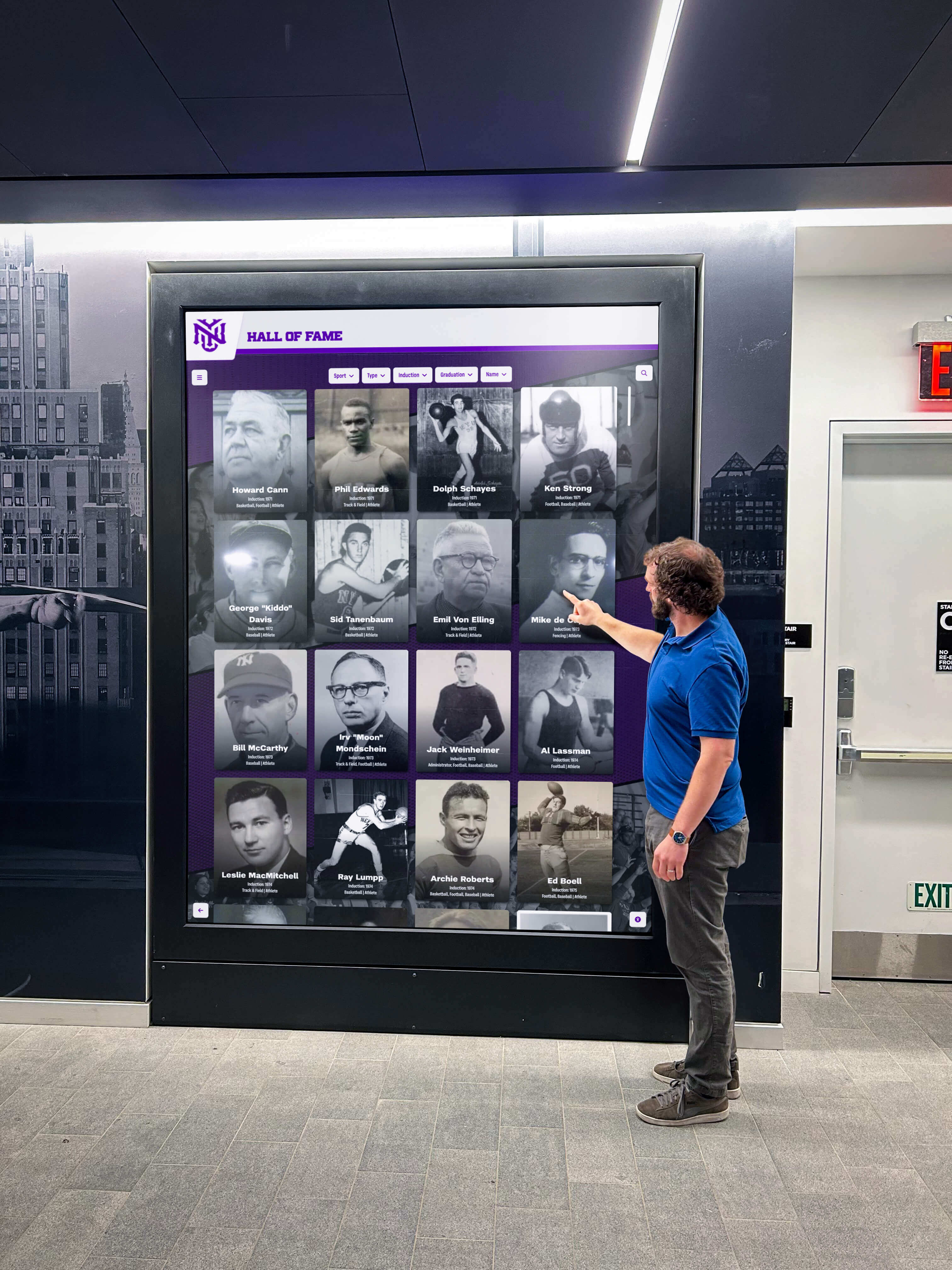
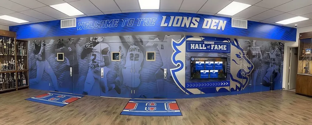
Every interaction a touchscreen user performs by tapping must also be reachable and operable by a keyboard-only user—toggle controls that are reachable only by touch are inaccessible to visitors who navigate using keyboards, switch devices, or voice control
Section 5: Common Failure Patterns and Fixes
The following table summarizes the most common aria-pressed failure patterns found in digital hall of fame interfaces and the correct fix for each.
| Failure Pattern | Example | Correct Fix |
|---|---|---|
aria-pressed absent entirely | <button class="fav-btn active">Save to Favorites</button> | Add aria-pressed="false" to the button’s initial HTML; toggle to "true" in the click handler |
aria-pressed present but static | <button aria-pressed="false">Compare</button> (never changes) | Update aria-pressed in JavaScript: btn.setAttribute('aria-pressed', btn.getAttribute('aria-pressed') === 'true' ? 'false' : 'true') |
aria-pressed set to non-boolean string | aria-pressed="yes" or aria-pressed="on" | Replace with aria-pressed="true" or aria-pressed="false"—only these boolean strings and "mixed" are valid |
| Label changes instead of state change | Button text changes from “Save” to “Saved” | Keep label text stable; communicate state only through aria-pressed; update class/icon for visual feedback |
aria-pressed applied to a non-toggle button | <button aria-pressed="false">Go Back</button> | Remove aria-pressed from all non-toggle buttons—it signals a persistent two-state control |
| Role missing for custom toggle | <div onclick="toggle()" class="btn">Audio</div> | Add role="button" and tabindex="0" to the div, then add aria-pressed and keyboard event handling |
| Focus lost after activation | Toggle activation moves focus to a notification banner | Return focus to the toggle button after the state change completes |
React / component-library specific note: In React, aria-pressed must be passed as a prop that reflects a state variable:
<button
  aria-pressed={isFavorited}
  onClick={() => setIsFavorited(!isFavorited)}
>
  {isFavorited ? "★ Favorited" : "☆ Save to Favorites"}
</button>
If the button text changes on state change (as in this example), verify that the core label—“Favorited” vs. “Save to Favorites”—is stable enough for voice control users to activate by consistent phrase. The better pattern is a stable label with an icon change:
<button
  aria-pressed={isFavorited}
  onClick={() => setIsFavorited(!isFavorited)}
>
  <span aria-hidden="true">{isFavorited ? "★" : "☆"}</span>
  Save to Favorites
</button>
Core web vitals and front-end quality checks for hall of fame websites often surface the same components that ARIA audits target—interactive widgets, filter panels, and media controls are the places where both performance and accessibility issues concentrate.
Section 6: Comparison Panel and Multi-Select Toggle Patterns
The comparison panel is the most complex toggle pattern typically found on digital recognition displays. A visitor selects two or three athlete profiles for side-by-side comparison, and each “Compare” button is an independent toggle that must communicate its individual state—and the buttons must also communicate how many items are selected and whether the comparison view is available.
Comparison toggle audit checklist:
- Each “Compare” button has
aria-pressed="false"initially andaria-pressed="true"when the profile is in the comparison set - When the maximum number of items for comparison is reached, additional “Compare” buttons are either disabled (
aria-disabled="true") or communicate that they cannot be added (viaaria-describedbypointing to a message like “Comparison is full—remove one to add another”) - The count of currently selected comparison items is communicated to screen readers, either as live region text (
aria-live="polite") adjacent to the comparison panel, or as part of the compare button’s accessible description - When the visitor opens the comparison view, focus moves to the comparison panel and can be returned to the profile list via a clear “Close Comparison” action
- “Remove from comparison” buttons in the comparison panel are distinct from the “Compare” toggle on the profile card—both should have
aria-pressedwhere appropriate
Filter chip multi-select pattern:
When filter chips function as a multi-select group (any combination of filters can be active simultaneously), each chip is an independent toggle:
- Each chip has
aria-pressed="false"or"true"based on current filter state - The group of chips has a group label (e.g.,
<fieldset><legend>Filter by Sport</legend>...</fieldset>orrole="group"witharia-labelledby) - Activating a chip updates the displayed athlete list AND updates the chip’s
aria-pressedvalue in the same user interaction
If filter chips behave as a single-select group (only one filter can be active at a time), they should use role="radio" with aria-checked rather than aria-pressed—a finding to flag if the current implementation uses aria-pressed on a single-select group.

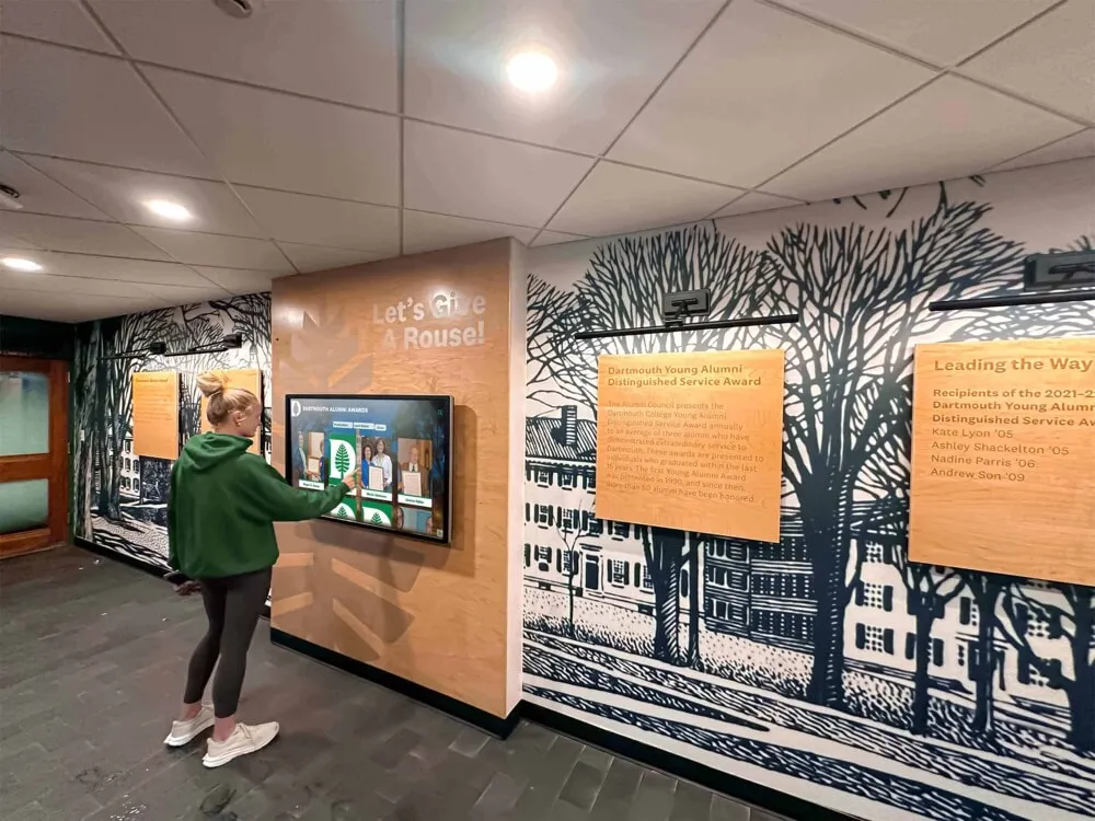
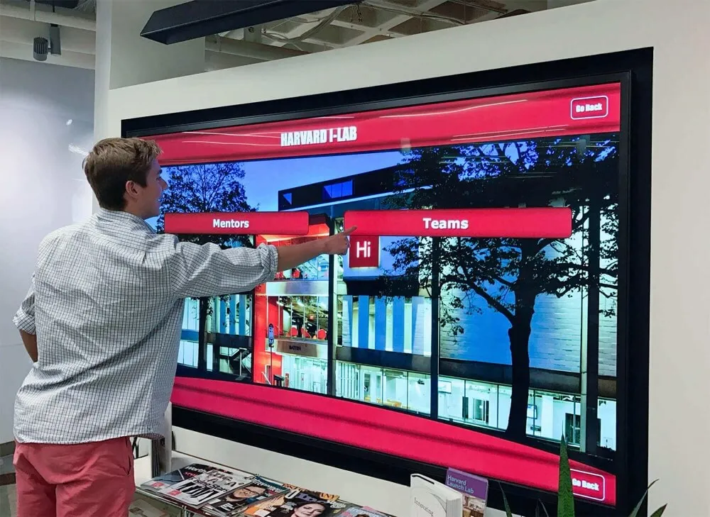
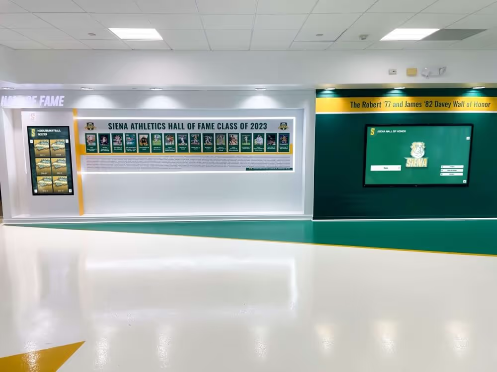
Selecting an athlete profile on a touchscreen recognition display often triggers a state change in a related toggle control—when a comparison or favorites button updates its visual appearance, its aria-pressed attribute must update in the same operation so assistive technologies receive the correct state
Section 7: Post-Audit Documentation and Remediation Tracking
An aria-pressed audit produces value only if its findings drive remediation. The post-audit documentation converts raw findings into actionable tickets for developers.
Findings summary template:
| Control | Screen | Failure Type | Severity | Developer Notes | Status |
|---|---|---|---|---|---|
| Favorites button | Athlete profile | aria-pressed absent | High | Add aria-pressed to button element; toggle in click handler | Open |
| Compare button | Search results | aria-pressed static | High | aria-pressed declared in template but never updated in JS | Open |
| Filter: Football | Filter panel | Label changes on toggle | Medium | Stabilize label to “Football”; communicate state via aria-pressed only | Open |
| Audio toggle | Video tribute | Non-boolean value | Medium | Replace aria-pressed=“on” with aria-pressed=“true”/“false” | Open |
| Grid/List view switch | Search results | PASS | — | aria-pressed updates correctly; stable label | Closed |
Severity guidance:
- High:
aria-pressedabsent or static on a control that is used in primary user flows (favorites, comparison, primary filters). A screen reader user cannot determine whether their action succeeded. - Medium:
aria-pressedpresent but malformed, or label changes accompanying a valid state change. The screen reader may announce something, but not the correct or expected pattern. - Low:
aria-pressedapplied to a non-toggle button. The button still works, but the screen reader announces “toggle button” for a control that is not a toggle, which can confuse users.
Remediation verification:
After developers address findings:
- Re-run the automated scan on each affected screen to confirm automated violations are resolved
- Re-run the manual state-change check (Section 2) for each corrected control
- Re-run the screen reader announcement test for each corrected control
- Re-run the keyboard operability check (Section 4) for each corrected control
- Update the findings summary table to “Closed” for each verified fix
A digital hall of fame software inventory register that tracks which software version each display is running makes it easier to confirm that a fix deployed to the platform version running on your displays, not just to the most recent release.
Section 8: ARIA-Pressed in Rocket Alumni Solutions vs. Custom-Built Displays
School recognition programs evaluating digital hall of fame platforms sometimes ask how accessibility patterns like aria-pressed compare across platform types. The comparison below reflects patterns observable in production interfaces—not vendor claims.
| Characteristic | Rocket Alumni Solutions Platform | Custom-Built or DIY Recognition Interface |
|---|---|---|
| Initial ARIA-pressed implementation | Platform-level; toggle controls in athlete profiles, comparison panels, and filter chips use ARIA state attributes by default in the current release | Depends entirely on the developer who built the feature; varies from correct to completely absent |
| Remediation pathway | File an accessibility support ticket; platform update applies to all schools using the platform simultaneously | Requires identifying the owning developer, scoping the fix, testing it, and deploying it—timeline depends on developer availability |
| Audit scope | Audit the platform interface once; findings apply across all deployments | Must audit each custom deployment independently; shared codebase issues may or may not have been forked by individual schools |
| Version consistency | All schools on the current platform version share the same ARIA implementation | Custom deployments may be running different versions of the same base theme or may have diverged significantly |
| Regression risk | Platform updates are tested for ARIA regressions before release | Each custom update is a potential regression point; regression testing is the school’s responsibility |
| Documentation availability | Platform vendor can provide a VPAT or ARIA compliance statement | Documentation is produced by the school’s own development team, if at all |
This comparison is not a claim that any platform is free of ARIA issues—it reflects where remediation effort lands and how quickly a fix reaches affected displays. A school running a platform-level solution that has an aria-pressed bug can report it once and receive a fix for all displays simultaneously. A school running a custom interface must scope and deploy the fix independently for each affected installation.
The digital hall of fame software and digital signage guide covers platform selection considerations that include accessibility support as a procurement criterion—relevant for schools choosing between platform and custom development paths.
Frequently Asked Questions
Why does my toggle button have aria-pressed in the HTML but the screen reader still does not announce the state?
The most common cause is that aria-pressed is set to a static value in the HTML template and is never updated by JavaScript when the button is activated. Inspect the DOM after clicking the button—if the aria-pressed attribute value has not changed, the JavaScript click handler is not updating it. The fix is to add button.setAttribute('aria-pressed', newState) or the equivalent reactive property update in your framework at the point where the visual state changes.
Should I use aria-pressed or aria-checked for my toggle controls?
Use aria-pressed on <button> elements that toggle between two states independently. Use aria-checked on elements with role="checkbox", role="radio", or role="switch". Filter chips styled as buttons should use aria-pressed. If you have a true on/off switch (like an audio guide toggle), role="switch" with aria-checked is the more semantically precise pattern and is now broadly supported in modern screen readers. Both patterns are WCAG-compliant; consistency across a single interface is more important than choosing between them.
Our favorites button has both a label change (“Save” → “Saved”) and an aria-pressed update. Is that wrong?
It creates a redundant announcement. Screen readers will announce both the label change and the state change, which can sound like “Saved, toggle button, pressed”—grammatically awkward and confusing. The better pattern is a stable label with only aria-pressed communicating state, and visual feedback handled by icon or color changes that are marked aria-hidden="true". If changing the label is a design requirement you cannot override, ensure the new label is still a clear name for the control (not just “★”), and test with NVDA and VoiceOver to confirm the announcement is understandable.
Our display runs on a custom proprietary runtime, not a standard web browser. Does aria-pressed apply?
If the runtime is a web view (Chromium-based kiosk browser, Electron, etc.), standard HTML ARIA applies and should be audited exactly as described here. If the runtime is a native application using non-HTML UI components, the ARIA-pressed concept still applies but is implemented through the native accessibility API (e.g., accessibilityTraits on iOS, UIA_TogglePatternId on Windows). Contact your display vendor to confirm how their native runtime exposes toggle-button state to accessibility services.
How often should we audit aria-pressed on a recognition display?
Run the full audit whenever the display software receives a major update, when new interactive features are added (a new filter panel, a new comparison mode), or when the underlying framework is upgraded. For stable displays without frequent updates, an annual audit is a reasonable baseline. Between audits, train content managers to test any new toggle control they add using the two-step check: open DevTools, activate the button, confirm aria-pressed changed value.
Do visitors actually use screen readers on a public lobby touchscreen?
More visitors do than most administrators expect. Visitors who use screen readers on phones will sometimes use a Bluetooth keyboard with a lobby touchscreen if keyboard access is available. Voice control users—who use tools like Dragon NaturallySpeaking or iOS Switch Control—are also affected by aria-pressed errors, since voice control interfaces rely on accessible names and roles to target controls. Beyond dedicated assistive technology users, a visitor who wants to hear what the display is saying while their hands are full benefits from any audio feedback the system provides.
Digital yearbook and signage content strategies that engage visitors rely on the same interactive UI patterns—favorites, comparison, filtering—that make ARIA-pressed audits relevant beyond school-specific settings.
ARIA-Pressed Quick Reference for Recognition Display Teams
| Control Type | Correct ARIA Pattern | What to Check |
|---|---|---|
| Favorites / Save button | <button aria-pressed="false">Save to Favorites</button> | aria-pressed toggles between “false” and “true” on click |
| Comparison selector | <button aria-pressed="false">Compare</button> | State updates when profile enters or leaves comparison set |
| Audio / narration toggle | <button role="switch" aria-checked="false">Audio Guide</button> | aria-checked toggles; label remains stable |
| Filter chip (multi-select) | <button aria-pressed="false">Football</button> | Each chip independent; updates on activation |
| Filter option (single-select) | <input type="radio"> or role="radio" with aria-checked | Use radio pattern, not aria-pressed, for single-select groups |
| View-mode switcher | <button aria-pressed="true">Grid View</button> / <button aria-pressed="false">List View</button> | Only one pressed at a time; both must update on switch |
| Caption toggle | <button aria-pressed="false">Captions</button> | Toggles with caption state; stable label |
| Accessibility mode button | <button aria-pressed="false">High Contrast</button> | Persists across page navigation in the session |
Digitizing archives and historical materials for hall of fame displays is the content side of the recognition program; an ARIA-pressed audit is the interface side—both contribute to a display that serves all visitors, including those who rely on assistive technologies to access the information the display contains.
Championship graphics and recognition print assets are the physical counterpart to digital hall of fame interfaces—schools that invest in quality physical recognition materials benefit from ensuring the digital interface that accompanies them meets the same standard of accessibility.
Rocket Alumni Solutions builds interactive touchscreen halls of fame, digital trophy displays, and recognition platforms for schools that want recognition technology that works for every visitor—including those who navigate with keyboards, screen readers, or voice control software. If your school is evaluating a recognition display platform and wants to understand how ARIA states, keyboard navigation, and screen reader compatibility are handled before deployment—rather than discovering gaps after installation—a live walkthrough gives your team those answers with the interface running in front of you.
See Accessible Toggle Controls in a Live Recognition Display Demo
If your school is planning or evaluating a digital hall of fame and wants to verify that interactive controls—favorites, comparison panels, filters, audio toggles—communicate their state correctly to assistive technologies, a live demo gives your team a direct look at how the interface behaves with a screen reader connected. Rocket Alumni Solutions builds recognition display platforms designed for inclusive use, with ARIA state attributes, keyboard navigation, and screen reader compatibility built into the interface.