Designing touchscreen experiences that truly engage users requires far more than simply digitizing existing content—it demands understanding the fundamental psychology of touch interaction, creating intuitive interfaces that feel natural to explore, and implementing design principles that sustain attention rather than causing frustration within seconds of first contact. The difference between touchscreens that captivate audiences and those users abandon immediately often comes down to thoughtful design choices addressing how people naturally interact with touch technology in public environments.
Walk into schools, museums, or community centers with interactive displays and you’ll witness dramatically different user behaviors: some touchscreens draw crowds of engaged users exploring content for extended periods with confident, purposeful interactions, while others sit unused despite prominent placement, or worse—attract brief taps from frustrated users who abandon them after unsuccessful attempts to navigate confusing interfaces or unresponsive controls.
This comprehensive guide explores how to design touchscreen experiences that truly engage users through evidence-based interaction design, proven interface patterns, strategic content organization, and optimization techniques—demonstrating why organizations implementing professional interactive displays report engagement rates 5-8 times higher than static recognition alternatives when systems incorporate fundamental design principles that honor how people naturally interact with touch technology.
Modern touchscreen experiences don’t achieve engagement through technology alone—they succeed by combining responsive hardware, intuitive interaction design, compelling content architecture, and continuous optimization based on actual user behavior patterns observed in real-world deployments across educational and institutional environments.

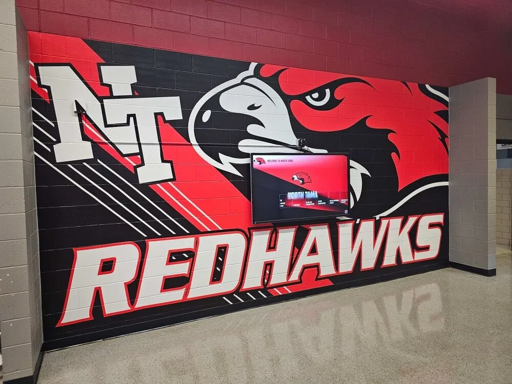
Well-designed touchscreen experiences create natural, confident interaction that sustains engagement far beyond initial curiosity
Understanding Touchscreen User Psychology and Behavior
Before exploring specific design techniques, understanding how people psychologically approach and interact with touchscreen displays provides essential foundation for creating engaging experiences rather than frustrating experiments.
The First Three Seconds: Initial User Assessment
Research on interactive display usage reveals that users make critical decisions about engagement within the first 3-5 seconds of encountering a touchscreen, determining whether the system appears worth exploring or should be ignored entirely.
Critical Initial Assessment Factors
Users unconsciously evaluate several elements during this brief window:
- Is this touchscreen active and functional? Visual motion, animated elements, or clear “touch here” prompts signal availability
- What purpose does this serve? Clear titles, recognizable content categories, or visible example content communicate value
- Will I understand how to use this? Familiar interface patterns, visible navigation elements, and intuitive organization suggest accessibility
- Is anyone else using it successfully? Social proof from other users reduces perceived risk of failure or embarrassment
- Do I have time to explore? Perceived content depth and navigation complexity affect commitment decisions
According to research on user behavior with interactive kiosks in educational settings, systems failing to communicate purpose and usability within this critical window lose 60-80% of potential users who simply walk past without engaging, highlighting the importance of immediate clarity in touchscreen design.
Design Implications
Effective touchscreen experiences address these assessment factors explicitly:
- Attract screens showing dynamic preview content when not in active use
- Clear, prominent headlines communicating primary purpose immediately
- Visible, recognizable interface elements following established touch conventions
- Strategic placement encouraging observation before interaction commitment
- Content organization suggesting quick wins and immediate value discovery
Organizations implementing solutions like Rocket Alumni Solutions benefit from professionally designed attract modes and landing screens specifically optimized for this critical first-impression phase, dramatically increasing initial engagement rates compared to static home screens showing minimal context.
Touch Interaction Patterns and Ergonomics
People interact with touchscreens using established physical patterns shaped by smartphone usage, creating expectations that public displays must honor to feel natural rather than awkward or uncomfortable.
Natural Touch Zones and Reach Considerations
Vertical Reach Patterns:
Large format touchscreens create different accessibility zones:
- Optimal zone (4-5.5 feet height): Most comfortable reach for average users; place primary navigation and key content here
- Extended reach (5.5-6.5 feet): Accessible but requires arm extension; suitable for secondary content or visual-only displays
- Lower zone (3-4 feet): Comfortable but psychologically less important; works well for returning to home or less frequent actions
- Inaccessible zones: Content above 6.5 feet or below 3 feet creates accessibility issues for many users
Horizontal Reach Patterns:
- Center screen: Most natural interaction zone requiring minimal body movement
- Near edges: Requires lateral arm extension; suitable for navigational elements
- Corners: Difficult reach points; avoid placing critical interactive elements here

Proper placement and interface design ensure comfortable interaction without physical strain
Touch Target Sizing and Spacing
Physical finger dimensions dictate minimum usable touch target sizes:
- Minimum touch target: 44x44 pixels (approximately 9-10mm) prevents frequent miss-taps
- Recommended target: 60x60 pixels (12-13mm) accommodates diverse user hand sizes comfortably
- Ideal spacing: 8-12 pixels between adjacent targets reduces accidental activation
- Large format consideration: Scale targets proportionally—larger displays viewed from greater distances require proportionally larger touch zones
Poorly sized touch targets create the single most common source of user frustration in touchscreen interfaces, causing users to doubt system responsiveness when their taps consistently activate wrong elements or miss intended targets entirely.
Learn about comprehensive approaches to ultra-responsive touchscreen implementation that ensure hardware and software work together creating reliable, natural interaction.
Cognitive Load and Information Architecture
Even beautifully designed interfaces fail when underlying information architecture overwhelms users with choices or obscures desired content through complex navigation hierarchies.
The Paradox of Choice in Touchscreen Design
Research in decision psychology reveals that excessive choice creates paralysis rather than empowerment:
- 3-7 options: Optimal choice architecture enabling quick decision-making without overwhelming analysis
- 8-12 options: Acceptable but begins requiring more cognitive processing and decision time
- 13+ options: Creates overwhelming feeling causing many users to abandon exploration rather than invest effort navigating complexity
Progressive Disclosure Principles
Well-designed touchscreen experiences reveal complexity gradually:
- Home screen: 3-5 primary content categories with clear, distinct labels and visual differentiation
- Category screens: 5-10 subcategories or featured content items showing logical organization
- Detail screens: Rich, comprehensive information about specific items users explicitly selected
- Related content: 2-4 contextually relevant suggestions encouraging continued exploration
This progressive disclosure approach prevents overwhelming initial presentations while still providing access to extensive content libraries through intuitive, manageable steps that feel natural rather than complex.
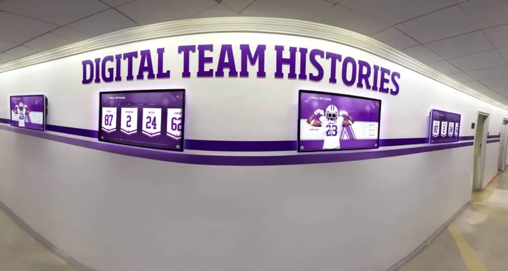
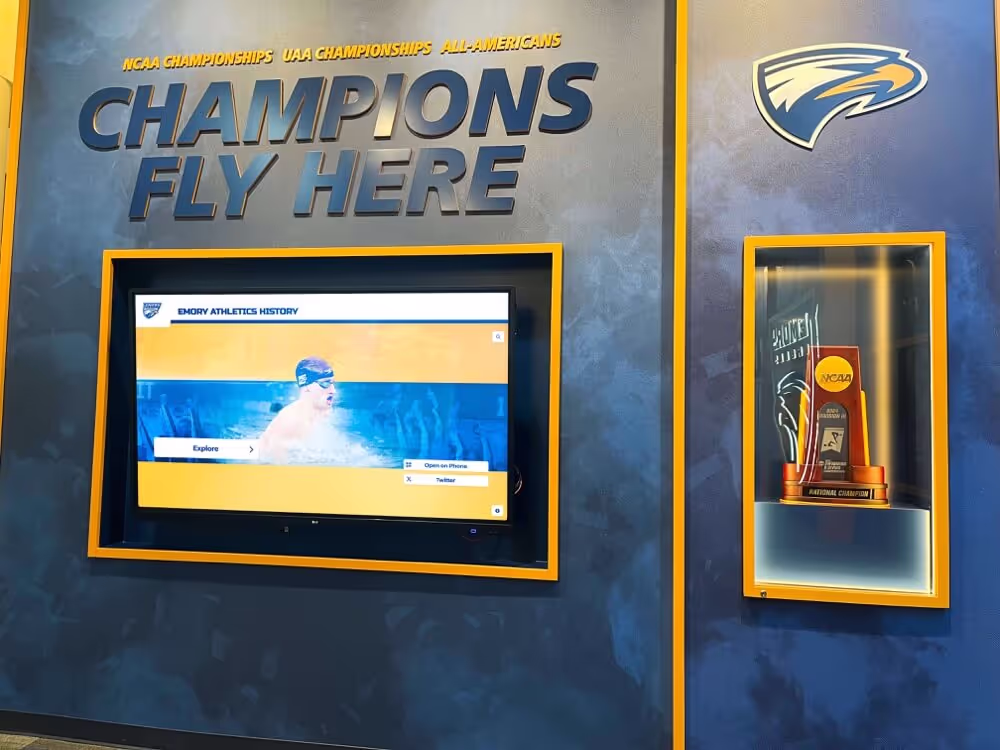
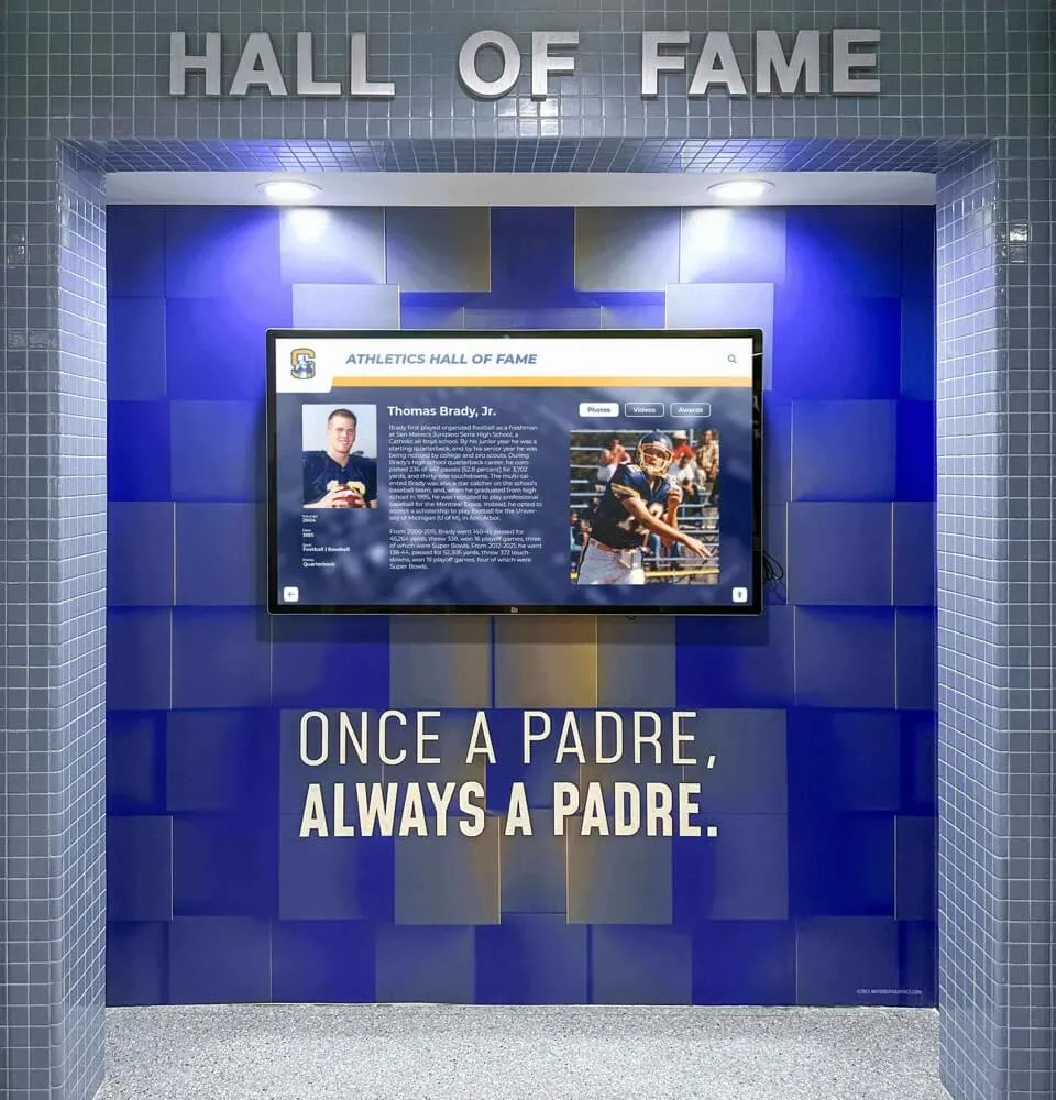
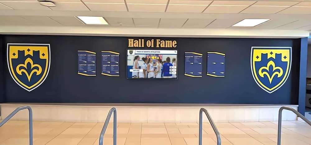
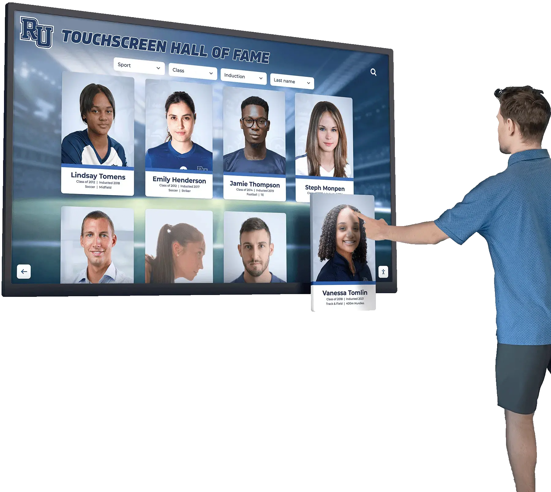
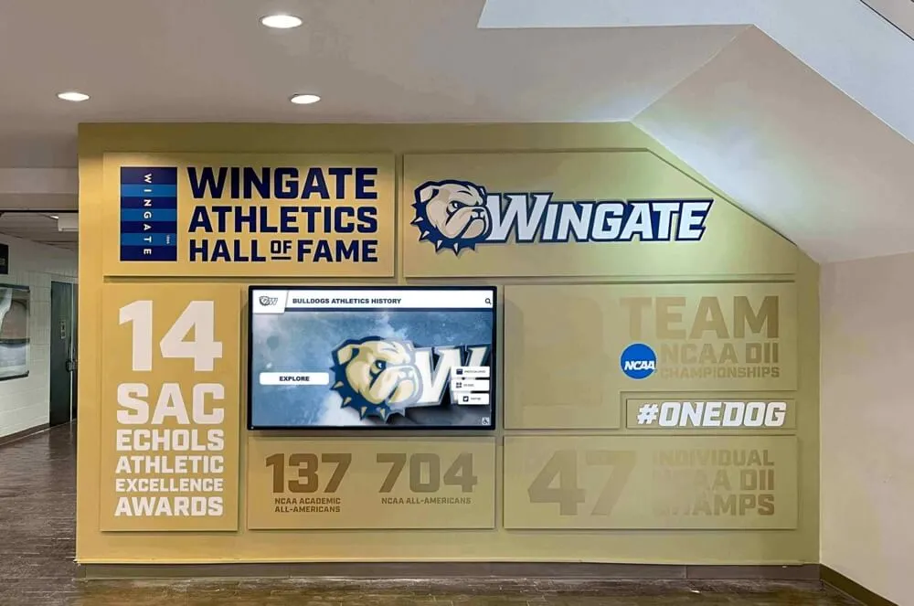
Organizations implementing digital recognition displays commonly make the mistake of presenting entire databases on initial screens—hundreds of athletes, alumni, or honorees displayed simultaneously—creating overwhelming visual noise that discourages exploration rather than inviting it. Solutions like Rocket Alumni Solutions structure content through intuitive category navigation that makes discovering specific individuals or achievements feel simple regardless of database size.
![]()
Clear category organization enables users to quickly find relevant content without feeling overwhelmed by choices
Core Design Principles for Engaging Touchscreen Experiences
Translating psychological understanding into practical design requires applying specific principles proven to increase engagement and reduce abandonment across diverse interactive display implementations.
Principle 1: Immediate Responsiveness and Feedback
Users expect instantaneous response to touch input based on smartphone conditioning—any perceptible delay creates doubt about whether touches registered correctly, leading to frustrated multiple taps or complete abandonment.
Critical Response Timing Thresholds
- 0-100 milliseconds: Perceived as instantaneous; users feel direct manipulation confidence
- 100-200 milliseconds: Noticeable but acceptable; meets minimum responsiveness expectations
- 200+ milliseconds: Creates frustration and doubt; users question system function
Multi-Modal Feedback Strategies
Well-designed interfaces provide multiple simultaneous feedback channels:
Visual Feedback:
- Immediate highlight or color change on touched elements
- Smooth, fluid animations showing state transitions (not abrupt changes)
- Progress indicators during longer loading operations
- Clear visual confirmation of completed actions
Haptic Feedback:
- Subtle vibration confirming touch registration (when hardware supports)
- Different vibration patterns distinguishing action types (selection vs. scrolling)
- Tactile confirmation particularly valuable for users with visual impairments
Audio Feedback:
- Soft confirmation sounds for touch events (with user control)
- Distinct sounds for different interaction types (navigation vs. media playback)
- Audio cues supporting accessibility for vision-impaired users
Modern touchscreen platforms architected for responsive performance demonstrate measurably higher engagement than systems with noticeable latency—even when content quality remains identical. This response time difference explains why purpose-built solutions consistently outperform generic digital signage adapted for interaction without proper optimization.
Discover detailed analysis of touchscreen response time impact on user retention demonstrating the critical relationship between performance and engagement.
Principle 2: Intuitive Navigation and Way-Finding
Users should never feel lost or uncertain about how to explore content or return to previous screens—navigation must remain obvious and consistent throughout all interaction contexts.
Essential Navigation Elements
Every touchscreen interface should incorporate:
Persistent Home Button:
- Always visible, consistent location (typically top-left or bottom-center)
- Large enough to tap confidently (minimum 60x60 pixels)
- Clear “home” iconography or labeling removing ambiguity
- Returns users to main menu from any screen depth
Breadcrumb Navigation:
- Shows current location within information hierarchy
- Enables jumping back to any previous level directly
- Particularly important for deep content structures
- Reduces feeling of being “lost” in complex databases
Back Button:
- Complements breadcrumbs for single-step backward navigation
- Familiar pattern from web and mobile experiences
- Consistent position (typically top-left adjacent to home)
- Clear visual design distinguishing from other controls
Category Indicators:
- Visual cues showing current content category or section
- Color coding, icons, or headers providing constant context
- Helps users maintain orientation during exploration
- Reinforces content organization logic
Search Functionality:
- Prominently accessible from home screen
- Large, touch-friendly keyboard interface
- Real-time results appearing as users type
- Filters enabling refinement of large result sets
Organizations implementing comprehensive recognition databases benefit enormously from robust search capabilities—users visiting displays often seek specific individuals, achievements, or eras, and direct search provides faster, more satisfying paths than sequential browsing through categorized content.
Principle 3: Visual Hierarchy and Content Priority
Screen real estate on touchscreens remains limited despite large format displays—effective design prioritizes information based on user goals and content importance rather than attempting equal emphasis for all elements.
Establishing Clear Visual Hierarchy
Size and Scale:
- Primary elements (headlines, featured content, key actions) use substantially larger sizing
- Secondary elements (supporting information, metadata, timestamps) scale proportionally smaller
- Tertiary elements (legal text, auxiliary functions) minimize size while maintaining readability
Color and Contrast:
- High contrast for critical interactive elements ensuring visibility and touch target clarity
- Reduced contrast for supporting information avoiding visual competition with primary content
- Consistent color language (blue for links/navigation, green for confirmation, red for alerts/reset)
- Brand-appropriate palette maintaining institutional identity while ensuring usability
Whitespace and Grouping:
- Generous spacing around distinct content blocks clarifying relationships and boundaries
- Grouped related elements through proximity and visual enclosure
- Sufficient whitespace preventing crowded, overwhelming presentations
- Strategic use of dividers or background colors distinguishing major sections
Typography Hierarchy:
- Three clear levels: Primary headers (48-72pt), secondary headers (32-42pt), body text (24-32pt)
- Large format displays require substantially larger text than desktop interfaces
- Viewing distance considerations—text must remain legible from 3-6 feet away
- Highly legible typefaces avoiding decorative fonts that reduce readability
Learn about designing stunning digital hall of fame layouts that effectively balance visual appeal with functional usability.

Effective visual hierarchy guides users naturally toward primary content while maintaining access to supporting information
Principle 4: Multimodal Content Presentation
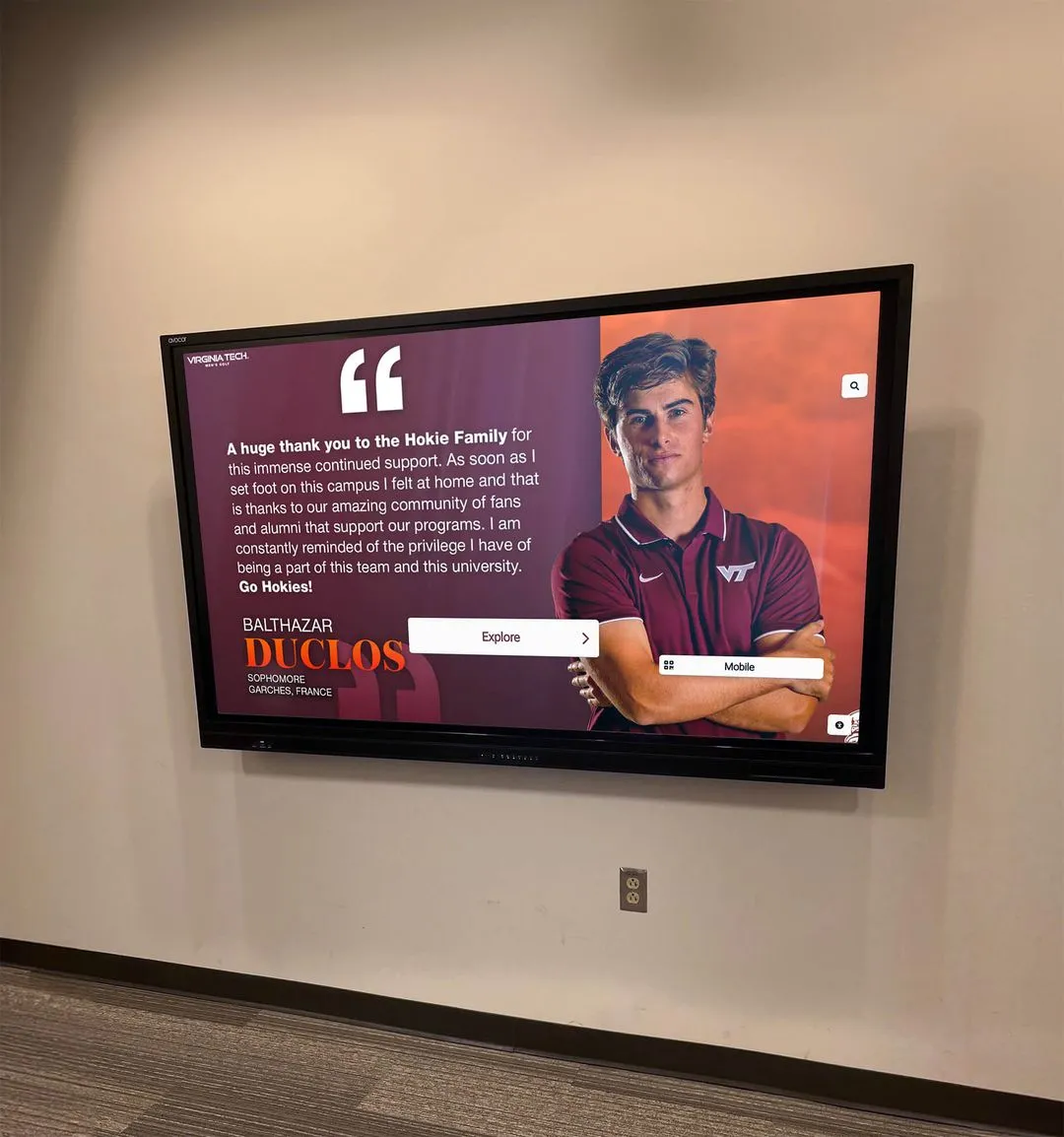
Rich, engaging touchscreen experiences integrate multiple content types—text, images, video, audio—creating comprehensive storytelling that maintains interest far longer than single-medium presentations.
Strategic Media Integration
High-Quality Imagery:
- Professional photography at appropriate resolution for display size
- Action shots, portraits, and historical images creating visual interest
- Image galleries enabling user-controlled exploration of multiple photos
- Captions providing context without cluttering primary visual presentation
Video Content:
- Short highlight clips (30-90 seconds) maintaining attention without requiring excessive time commitment
- Autoplay with tap-to-pause control giving users immediate agency
- Closed captions supporting accessibility and silent viewing in some environments
- Clear start/stop/replay controls for user-directed viewing
Audio Elements:
- Interview clips, historic broadcasts, or ambient sound enhancing immersion
- User-activated (not autoplay) avoiding disruption in public spaces
- Volume controls and mute options ensuring user comfort
- Visual indicators showing audio availability encouraging discovery
Text Content:
- Concise, scannable writing appropriate for standing reading distance
- Strategic use of bold text, bullets, and short paragraphs improving readability
- Progressive disclosure—essential details immediately visible, “read more” for interested users
- Consistent voice and tone reflecting institutional character
Data Visualization:
- Statistics, records, and achievements presented through clear charts and infographics
- Interactive elements enabling users to explore data from multiple angles
- Visual representations making numbers more engaging and memorable than tables
- Comparisons and context helping users understand significance of achievements
Organizations implementing digital recognition systems like Rocket Alumni Solutions benefit from integrated media management automatically optimizing images, video, and content for touchscreen presentation—ensuring professional quality without requiring extensive technical expertise from content administrators.
Principle 5: Accessibility and Inclusive Design
Truly engaging touchscreen experiences remain usable by diverse audiences including users with visual, motor, or cognitive differences—accessibility isn’t optional compliance but fundamental design quality.
Visual Accessibility Considerations
Contrast and Readability:
- Minimum 4.5:1 contrast ratio for body text (7:1 for WCAG AAA compliance)
- Minimum 3:1 contrast for interactive elements and icons
- Avoid color as sole information channel (use icons, text labels, or patterns additionally)
- Test visibility in actual lighting conditions where displays will operate
Text Sizing and Spacing:
- Minimum 24pt body text for large format touchscreens
- 1.5x line spacing improving readability for users with dyslexia or visual processing differences
- Adequate letter spacing (tracking) preventing character crowding
- Resizable text options when technically feasible
Motor Accessibility Considerations
Generous Touch Targets:
- Minimum 60x60 pixels with 12-pixel spacing accommodates tremor and reduced fine motor control
- Consistent target sizing throughout interface avoiding small exceptions
- Positioning critical interactive elements within comfortable reach zones
- Avoid gestures requiring precision (pinch, multi-finger swipes) relying on simple taps
Timing and Pace:
- No time limits on interaction or forced progression without user control
- Generous timing for double-taps or multi-step interactions
- Clear ability to pause, replay, or restart any timed content
- User-controlled content progression rather than auto-advancing screens
Cognitive Accessibility Considerations
Clear Language and Instructions:
- Plain language avoiding jargon or institutional abbreviations
- Explicit instructions for any non-obvious interactions
- Consistent terminology throughout interface avoiding synonyms that might confuse
- Visual instructions supplementing or replacing text-only guidance
Predictable Behavior:
- Interactive elements behaving consistently throughout application
- Standard conventions (home button, back button) appearing in expected locations
- Clear labeling removing ambiguity about element functions
- Confirmation dialogs for destructive or navigation-resetting actions
Explore comprehensive guidance on creating accessible interactive displays ensuring all community members can engage regardless of individual capabilities.

Accessible design ensures confident interaction across diverse user populations without requiring special modes or assistance
Content Strategy for Sustained Engagement
Hardware and interface design create potential for engagement, but compelling content strategy determines whether users remain interested beyond initial curiosity or abandon exploration after brief sampling.
Balancing Depth and Discoverability
Touchscreen content architectures must simultaneously provide immediate value to casual users while offering depth satisfying dedicated explorers seeking comprehensive information.
Layered Content Approach
Surface Layer (Home/Category Screens):
- Featured highlights showcasing most compelling content
- Clear categories providing logical exploration paths
- Visual variety through images, motion, and varied layouts
- Rapid content rotation maintaining freshness for repeat visitors
- 3-5 primary entry points preventing overwhelming choice
Middle Layer (Profile/Collection Screens):
- Complete but concise summaries providing core information
- Rich media (photos, video thumbnails, key statistics) creating visual interest
- Clear calls-to-action inviting deeper exploration
- Related content suggestions encouraging continued browsing
- 5-8 distinct content elements per screen maintaining focus
Deep Layer (Detailed Views):
- Comprehensive information satisfying dedicated interest
- Extensive photo galleries, full video content, complete statistics
- Historical context, related achievements, and connections
- Social sharing capabilities enabling users to save or promote discoveries
- Unlimited depth based on available information
This layered approach ensures casual browsers find immediate value without requiring navigation of complex information, while interested users can voluntarily dive as deep as desired—meeting diverse audience needs through single adaptive architecture.
Dynamic Content and Seasonal Relevance
Static content becomes invisible to regular visitors through familiarity—effective touchscreen experiences incorporate dynamic elements maintaining freshness and encouraging repeat engagement.
Content Rotation Strategies
Featured Content Cycling:
- Regularly rotating featured profiles, achievements, or historical moments
- Highlighting different aspects of collection based on season, anniversaries, or current events
- Algorithm-driven selections ensuring all content receives periodic promotion
- Manual curation enabling strategic emphasis of particular stories or themes
Timely Connections:
- Sports season tie-ins highlighting relevant teams and achievements
- Anniversary recognition connecting current dates to historical events
- Recent additions prominently featured encouraging discovery of new content
- Holiday or event-specific content creating temporal relevance
Fresh Content Indicators:
- “New” badges on recently added profiles or information
- “Trending” or “Popular” indicators showing frequently viewed content
- “Today in History” features connecting calendar to institutional moments
- Search trending showing what other users are currently exploring
Organizations implementing cloud-based platforms benefit from instant content updates maintaining relevance without requiring physical access to displays—adding new honorees, correcting information, or refreshing featured content happens remotely through web interfaces accessible from any device.
Learn about effective content refresh strategies for digital recognition displays maintaining sustained engagement through strategic content management.
Search and Personalization Capabilities
Large content databases require powerful discovery tools enabling users to quickly locate specific information matching personal interests without exhaustive browsing.
Robust Search Implementation
Search Interface Design:
- Prominent search access from home screen and navigation bars
- Large, touch-friendly on-screen keyboard optimized for standing use
- Real-time results appearing as users type (search-as-you-type)
- Clear results organization showing matches across different categories
- Filters enabling refinement by date, sport, achievement type, or other relevant dimensions
Search Intelligence:
- Fuzzy matching accommodating misspellings and name variations
- Synonym recognition (understanding “football” and “soccer” as context-appropriate)
- Partial matching (finding “Johnson” even when users type “John”)
- Historical search data informing auto-complete suggestions
- Popular search highlighting showing what others commonly seek
Personalized Experience Elements:
- “You might also like” suggestions based on current viewing
- “Others who viewed this also viewed” social discovery
- Recently viewed history enabling quick return to previously explored content
- Saved favorites or bookmarks (with optional account/email capture)
- Custom tours or recommended paths based on user-indicated interests
These discovery enhancements transform large databases from intimidating haystacks into navigable, personalized experiences where users feel confident finding needles matching their specific interests—dramatically increasing satisfaction with content depth rather than being overwhelmed by scope.

Powerful search and filtering capabilities enable quick discovery of specific content within extensive databases
Technical Implementation Considerations
Design excellence remains theoretical until technical implementation delivers reliable, performant experiences matching design intent in real-world deployment conditions.
Platform Selection and Software Architecture
Organizations face numerous technology options for touchscreen implementation—selecting appropriate platforms significantly impacts long-term success, maintenance burden, and capability evolution.
Purpose-Built vs. Adapted Solutions
Purpose-Built Recognition Platforms:
Solutions designed specifically for interactive recognition like Rocket Alumni Solutions provide:
- Pre-configured templates reducing setup complexity and timeline
- Optimized information architecture for common recognition use cases
- Built-in search, filtering, and navigation patterns tested across hundreds of deployments
- Cloud-based content management enabling remote updates without technical expertise
- Responsive design automatically adapting content for various screen sizes
- Analytics dashboards revealing engagement patterns informing optimization
- Ongoing platform enhancements driven by customer feedback and usage data
- Specialized support understanding educational and institutional contexts
Generic Digital Signage Adapted for Interaction:
General-purpose platforms require extensive customization:
- Complex configuration requiring significant technical expertise
- Generic templates requiring substantial design customization
- Manual development of navigation, search, and interactive features
- Higher ongoing technical maintenance burden
- Limited analytics specific to interactive engagement
- General support unfamiliar with recognition-specific needs
Web-Based vs. Native Applications:
Web-Based Platforms:
- Browser-based operation requiring no software installation
- Automatic updates without device-specific deployment
- Cross-platform compatibility (Windows, Chrome OS, Android, iOS)
- Easier content management through familiar web interfaces
- Dependent on network connectivity for optimal performance
Native Applications:
- Platform-specific development (separate Windows, Android, iOS versions)
- Potentially better performance and offline capability
- More complex update procedures requiring app redistribution
- Higher development and maintenance costs
- Tighter integration with device-specific features
Modern cloud-based web platforms generally provide optimal balance of capability, ease of management, and total cost of ownership for most institutional touchscreen implementations.
Explore comprehensive guidance on selecting digital hall of fame software platforms comparing different technological approaches and their implications.
Hardware Selection and Integration
Software design excellence requires appropriate hardware foundations delivering responsive performance and reliable operation in institutional environments.
Display Specifications
Screen Size Considerations:
- 43-55 inches: Appropriate for smaller spaces or supplementary displays
- 55-65 inches: Standard size for main recognition displays in typical lobbies
- 65-75+ inches: Large spaces requiring visibility from distance or multiple simultaneous users
Touch Technology Options:
- Projected capacitive (PCAP): Superior responsiveness and multi-touch but higher cost
- Infrared: Good responsiveness at lower cost, scales well to large formats
- Resistive: Older technology with poor responsiveness, avoid for public applications
Display Quality:
- Commercial-grade rated for 16-24 hour daily operation (not consumer TVs)
- Minimum 1080p resolution; 4K preferred for larger formats or detailed content
- Anti-glare coating for installations with ambient lighting or windows
- Brightness minimum 350 nits for indoor installations; 500+ for bright environments
Computing Hardware Requirements:
- Minimum: Intel Core i5/Ryzen 5, 8GB RAM, 256GB SSD
- Recommended: Intel Core i7/Ryzen 7, 16GB RAM, 512GB SSD
- Dedicated graphics beneficial for video-heavy content
- Fanless or low-noise designs appropriate for quiet environments
Installation Considerations:
- Wall mounting vs. freestanding kiosks based on space and traffic patterns
- Height positioning placing center screen at 4.5-5 feet for optimal ergonomics
- Wired ethernet strongly preferred over WiFi for reliability
- Power conditioning and surge protection safeguarding expensive equipment
- Security measures preventing tampering in public environments
Learn detailed recommendations for choosing interactive touchscreen hardware suitable for institutional environments requiring reliable long-term operation.
Ongoing Optimization and Maintenance
Initial implementation quality provides starting point, but sustained engagement requires ongoing optimization based on actual usage patterns and regular technical maintenance.
Usage Analytics and Improvement
Key Engagement Metrics:
- Daily and hourly usage patterns revealing peak engagement times
- Average session duration indicating content engagement depth
- Most-viewed content showing audience interests and priorities
- Search patterns revealing what users seek but struggle finding
- Navigation paths showing how users move through information
- Abandonment points identifying interface or content problems
Optimization Actions:
- Promote successful content more prominently
- Improve discoverability for frequently searched but hard-to-find information
- Simplify navigation paths showing high abandonment
- Refresh or enhance underperforming content categories
- Test alternative layouts or navigation patterns measuring impact
- Adjust featured content rotation based on measured interest
Technical Maintenance Requirements:
Daily/Automated:
- System health monitoring alerting to problems
- Automatic restarts during off-hours clearing accumulated resource usage
- Content synchronization ensuring latest information displays
- Backup procedures protecting against data loss
Weekly:
- Physical screen cleaning maintaining touch sensitivity and visual quality
- Visual inspection confirming proper operation and no physical damage
- Review error logs identifying recurring technical issues
- Update featured content maintaining freshness
Monthly:
- Software updates applying security patches and feature enhancements
- Deep analytics review identifying trends and optimization opportunities
- Content accuracy review correcting errors or outdated information
- User testing with representative community members gathering qualitative feedback
Quarterly:
- Hardware inspection checking cables, cooling, and component condition
- Comprehensive content audit ensuring quality and completeness
- Strategic planning for content additions and feature enhancements
- Stakeholder reviews gathering institutional feedback and priorities
Organizations implementing professional touchscreen platforms benefit from vendor-provided monitoring, maintenance guidance, and support services—reducing internal burden while ensuring systems maintain optimal performance throughout their operational lifetime.

Professional installation and ongoing maintenance ensure displays deliver consistent, reliable engagement year after year
Industry-Specific Design Considerations
While core touchscreen design principles apply universally, different institutional contexts create specific requirements affecting design priorities and content strategy.
Educational Institutions (K-12 Schools and Universities)
Schools and universities implement touchscreen displays primarily for recognition, engagement, and connection purposes—design should emphasize discovery, inspiration, and pride.
Design Priorities:
- Youth-appropriate aesthetics and interaction patterns reflecting student digital fluency
- Robust search enabling alumni to quickly locate their own profiles or teammates
- Multimedia emphasis showcasing athletic highlights, achievements, and memorable moments
- Social sharing capabilities encouraging organic promotion through student networks
- Mobile-responsive web extensions enabling exploration beyond physical displays
Content Considerations:
- Comprehensive coverage across athletics, academics, arts, and activities demonstrating inclusive recognition
- Historical depth connecting current students to institutional legacy and traditions
- Achievement context helping younger students understand significance of excellence
- Role model profiles inspiring current students through relatable success stories
- Regular updates maintaining currency and demonstrating ongoing recognition commitment
Explore comprehensive approaches to implementing digital halls of fame in educational settings addressing specific institutional needs and constraints.
Athletic Organizations and Sports Facilities
Athletic-focused implementations emphasize performance data, competitive achievements, and visual excitement through action imagery and video highlights.
Design Priorities:
- Statistics and records prominently featured satisfying performance-oriented audiences
- Video integration showcasing championship moments and signature plays
- Team and individual balance honoring both collective and personal achievements
- Historical comparison features enabling users to explore records across eras
- Real-time integration showing current season information alongside historical context
Content Considerations:
- Complete statistical documentation supporting claims and enabling verification
- Multi-sport coverage demonstrating institutional athletic breadth
- Coaching recognition honoring leadership contributions alongside athlete achievements
- Facility history connecting physical spaces to memorable moments
- Championship documentation preserving complete tournament or season narratives
Learn about specialized athletic digital recognition systems addressing unique requirements of competitive sports programs.
Alumni and Donor Recognition
Displays focused on alumni engagement or donor recognition emphasize connection, gratitude, and relationship-building alongside pure achievement celebration.
Design Priorities:
- Professional aesthetic appropriate for development and advancement contexts
- Career and post-graduation information demonstrating institutional impact on life trajectories
- Class and cohort organization facilitating reunion engagement and connection
- Giving integration recognizing philanthropy alongside achievements
- Contact and networking features enabling continued engagement beyond display interaction
Content Considerations:
- Professional accomplishments and post-institutional achievements
- Family and generational connections showing multi-generation legacies
- Mentorship and institutional support activities demonstrating ongoing engagement
- Strategic featured content highlighting development priorities and opportunities
- Privacy controls appropriate for personal information in semi-public contexts
Discover comprehensive strategies for alumni engagement through digital recognition supporting advancement and development objectives.
Measuring Touchscreen Experience Success
Understanding whether touchscreen implementations achieve intended engagement and institutional objectives requires systematic measurement combining quantitative analytics and qualitative assessment.
Quantitative Engagement Metrics
Modern touchscreen platforms provide concrete data revealing actual usage patterns and engagement depth.
Critical Performance Indicators:
Usage Frequency:
- Daily interactions showing community adoption
- Unique users vs. total interactions revealing breadth vs. depth of engagement
- Peak usage times informing content scheduling and refresh timing
- Comparison to baseline (foot traffic) showing penetration rate
Engagement Depth:
- Average session duration (target: 3-5 minutes for recognition displays)
- Screens per session showing exploration depth
- Video completion rates indicating content engagement quality
- Return visit frequency demonstrating sustained interest
Content Performance:
- Most-viewed profiles or content categories revealing audience interests
- Search patterns showing what users actively seek
- Social sharing frequency indicating memorable discoveries
- Underperforming content requiring enhancement or promotion changes
Technical Performance:
- Touch response latency maintaining under 100ms threshold
- Error rates and exception frequency indicating technical issues
- Network performance ensuring reliable content delivery
- System uptime confirming operational reliability
Organizations implementing professional platforms benefit from built-in analytics dashboards visualizing these metrics without requiring complex external tools or technical expertise to access fundamental engagement data.
Qualitative Impact Assessment
Numbers reveal behavior patterns but not underlying motivations, satisfaction, or cultural impact—qualitative assessment provides essential context for optimization decisions.
Stakeholder Feedback Collection:
Direct User Observation:
- Watching actual user interactions identifying pain points and confusion
- Noting which features users discover vs. overlook despite availability
- Observing social behaviors (groups vs. individuals, discussion patterns)
- Identifying technical issues affecting real-world experience
Survey and Interview Feedback:
- User satisfaction surveys (on-display or follow-up email)
- Alumni feedback on recognition quality and completeness
- Student perspectives on inspiration and awareness impacts
- Administrative assessment of recognition efficiency improvements
Cultural Impact Indicators:
- Community awareness and conversation about recognized achievements
- Enhanced institutional pride observable in stakeholder communications
- Prospective student and family engagement during campus visits
- Alumni engagement metrics (event attendance, giving, networking activity)
Comparative Assessment:
- Before/after implementation comparison of recognition visibility and awareness
- Comparison to peer institutions’ recognition approaches
- Cost-benefit analysis relative to traditional recognition investments
- Long-term sustainability and maintenance burden assessment
Regular assessment combining quantitative and qualitative methods enables continuous refinement ensuring touchscreen displays achieve maximum impact while remaining aligned with evolving institutional priorities and user expectations.

Successful implementations become integrated into community life, generating regular engagement and serving as institutional gathering points
Conclusion: Creating Touchscreen Experiences That Truly Engage
Designing touchscreen experiences that truly engage users requires far more than attractive visual design or impressive hardware—it demands deep understanding of touch interaction psychology, disciplined application of proven interface principles, strategic content architecture that balances immediate value with deep exploration, and ongoing optimization based on measured real-world usage patterns.
The difference between touchscreens that captivate audiences for 5-8 minute exploration sessions and those abandoned after frustrated 15-second attempts often comes down to fundamental design choices: intuitive navigation that honors established touch conventions, responsive performance creating confidence in system reliability, visual hierarchy that guides attention without overwhelming, content organization that makes discovery feel simple rather than complex, and accessibility considerations ensuring all community members can engage successfully.
Create Touchscreen Experiences That Truly Engage Your Community
Discover how professionally designed interactive recognition displays combine proven interface design, engaging content strategy, and responsive technology delivering experiences that sustain attention and achieve institutional objectives.
Explore Professional SolutionsThe strategies explored in this comprehensive guide provide frameworks for designing touchscreen interfaces that honor human psychology and interaction patterns, organizing content that serves diverse user needs, selecting technology platforms that deliver reliable performance, and maintaining systems through ongoing optimization. From initial assessment behavior and touch ergonomics to progressive disclosure and multimodal content integration, these principles work together creating experiences where technology disappears enabling focus on compelling content rather than interface navigation.
Whether your organization seeks to replace underperforming existing displays struggling to generate engagement, implement new interactive recognition systems for the first time, or enhance current implementations approaching their full potential, prioritizing evidence-based design principles ensures investment in touchscreen technology that achieves intended recognition and engagement objectives rather than creating expensive digital monuments that communities ignore.
Your institution deserves interactive experiences that honor achievements while engaging communities through intuitive, accessible, responsive design. Solutions like Rocket Alumni Solutions combine professionally designed interfaces optimized through hundreds of implementations with purpose-built recognition platforms addressing specific institutional needs—delivering engaging touchscreen experiences that become valued community gathering points rather than neglected technology experiments.
Ready to create touchscreen experiences that truly engage rather than frustrate? Professional interactive recognition platforms provide the design expertise, proven interface patterns, optimization guidance, and ongoing support ensuring your investment delivers sustained community engagement achieving recognition objectives for years to come.